The Miles Davis Quintet – Miles


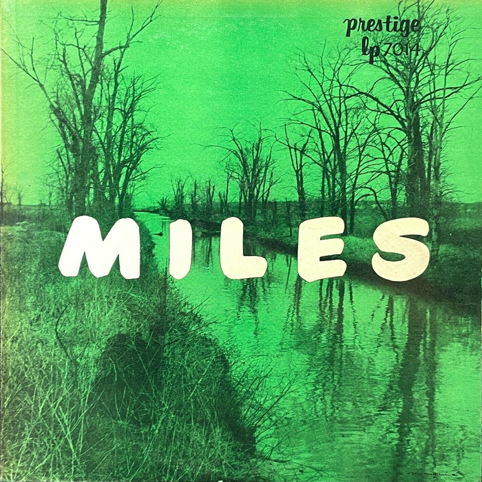
This curious sleeve doesn’t fit in with the rest of the mid-1950s cool jazz aesthetic. Duotone photography was commonly used in the genre, but that’s where the familiarity ends. The lime green color (later issues were blue); the large, brushy title, set dead center; and the bleak scene of arthritic trees along a nondescript canal – it’s all a bit mysterious. It gives off similar vibes to Marcus Keef’s spooky cover for Black Sabbath. The only sense I can make of the image choice is that Miles Davis’ quintet recorded this session in the fall (November 16, 1955).
Source: oa.letterformarchive.org Image: Letterform Archive. License: All Rights Reserved.
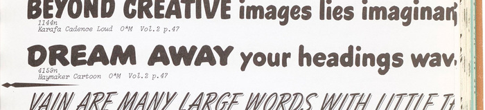
Haymaker Cartoon from Photo-Lettering’s One Line Manual of Styles, 1971.
The typeface is Haymaker Cartoon, an extrabold sign painter’s or showcard writer’s “casual” that appears in Photo-Lettering’s 1965 catalog, but must have been available a decade earlier to be used here.

While the back cover (set almost entirely in Vogue) doesn’t include attribution, Discogs credits the design to Gil Mellé, a musician and painter who created a handful of 1950s covers for Blue Note and Prestige featuring dynamic abstract art. While I love Mellé’s work, this minimalist oddball stands out, and that charms me.
Thanks to Gary Hornseth for bringing this gem to my attention via the lovely Jazz Tome website!
This post was originally published at Fonts In Use