Milee identity
Published April 20, 2023
By FontsInUse
Contributed by Zero Morales
Source: emmeand.co EMME & Co. License: All Rights Reserved.


Source: emmeand.co EMME & Co. License: All Rights Reserved.
Source: emmeand.co EMME & Co. License: All Rights Reserved.
Source: emmeand.co EMME & Co. License: All Rights Reserved.
Source: emmeand.co EMME & Co. License: All Rights Reserved.
Source: emmeand.co EMME & Co. License: All Rights Reserved.
Source: emmeand.co EMME & Co. License: All Rights Reserved.
Source: emmeand.co EMME & Co. License: All Rights Reserved.
Source: emmeand.co EMME & Co. License: All Rights Reserved.
This post was originally published at Fonts In Use
Source: emmeand.co EMME & Co. License: All Rights Reserved.
Naming, creative and art direction and brand design by EMME & Co:
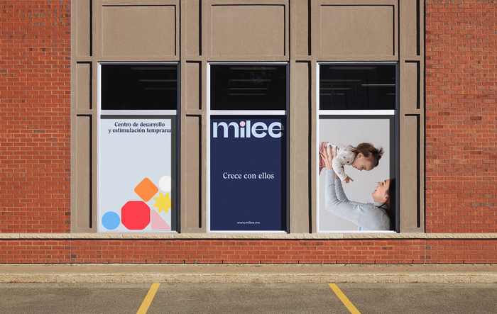
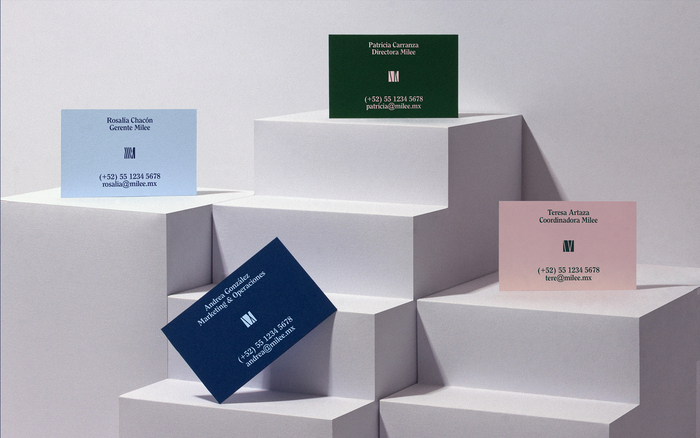
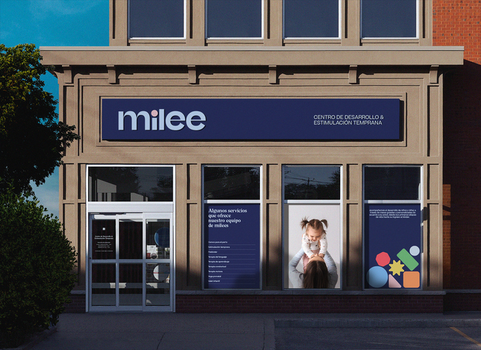
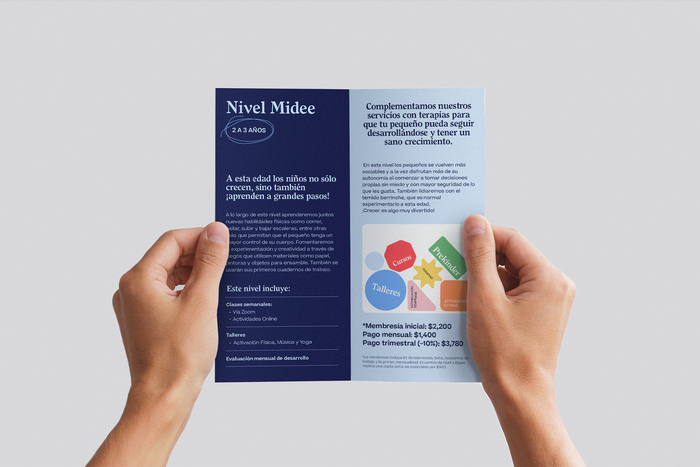
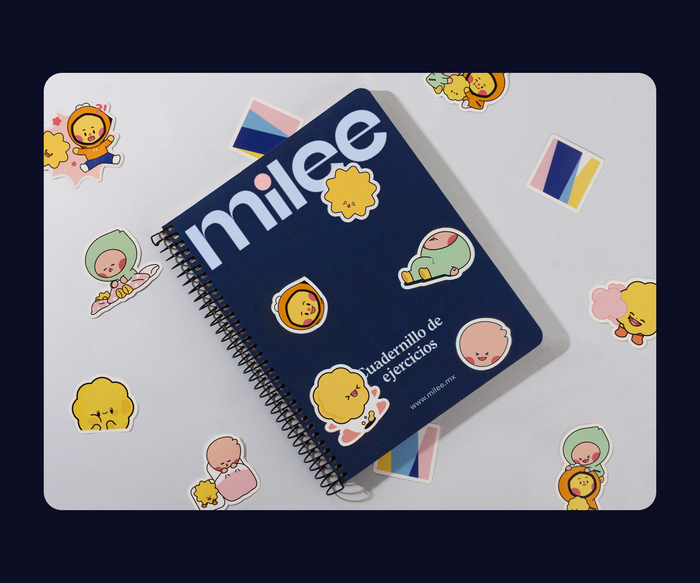
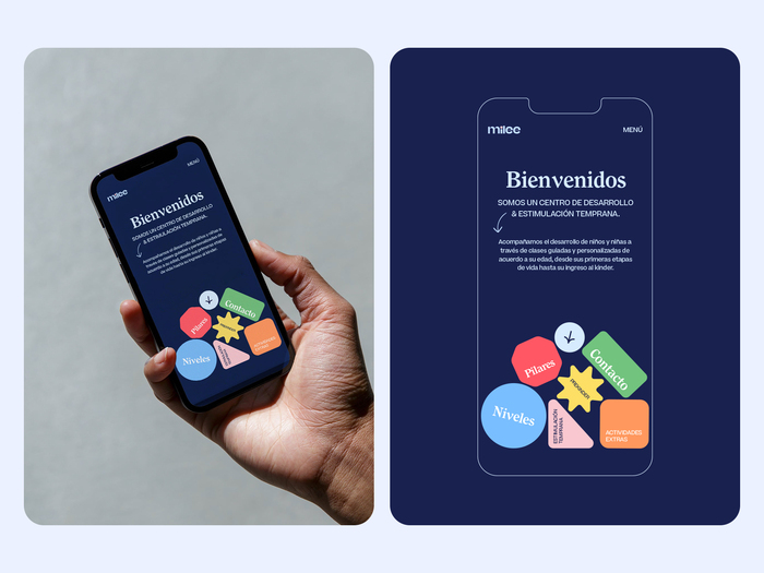
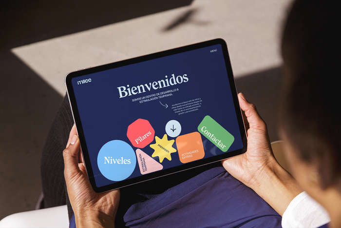
Milee is an Institute of Development & Early Stimulation located in Mexico formerly known as Ducky. Our challenge was to create a brand that could resonate with a local audience by a strong storytelling & a visual system that could connect with people.
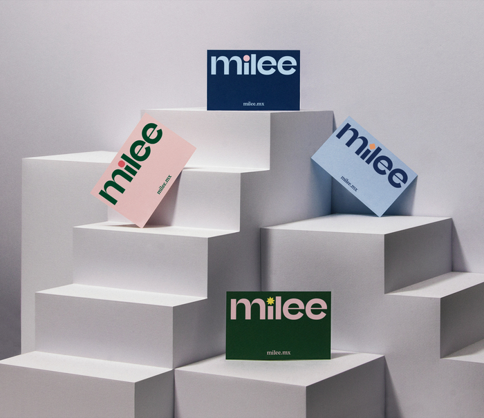
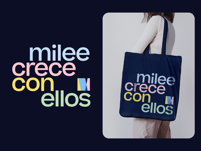
As a result, we build a playful, colorful, and interactive brand with a wide color palette, contrasts and a cheerful and dynamic logo.
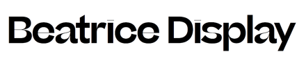
The new brand typefaces for MIlee are Beatrice by Sharp Type and Clearface by Monotype. Together they gather an enjoyable brand, with a design system that reveals a series of collateral that helps the user connect with the brand.
Source: emmeand.co EMME & Co. License: All Rights Reserved.
Source: emmeand.co EMME & Co. License: All Rights Reserved.
Source: emmeand.co EMME & Co. License: All Rights Reserved.
Source: emmeand.co EMME & Co. License: All Rights Reserved.
Source: emmeand.co EMME & Co. License: All Rights Reserved.
Source: emmeand.co EMME & Co. License: All Rights Reserved.
Source: emmeand.co EMME & Co. License: All Rights Reserved.
Source: emmeand.co EMME & Co. License: All Rights Reserved.
This post was originally published at Fonts In Use
Read full story.
WRITTEN BY
FontsInUse
An independent archive of typography.