Megaplex
Published April 9, 2025
By FontsInUse
Contributed by Sean O'Connor

Source: matchstic.com License: All Rights Reserved.


Source: matchstic.com License: All Rights Reserved.

Source: matchstic.com License: All Rights Reserved.

Source: matchstic.com License: All Rights Reserved.

Source: matchstic.com License: All Rights Reserved.

Source: matchstic.com License: All Rights Reserved.

Source: matchstic.com License: All Rights Reserved.

Source: matchstic.com License: All Rights Reserved.

Source: matchstic.com License: All Rights Reserved.

Source: matchstic.com License: All Rights Reserved.
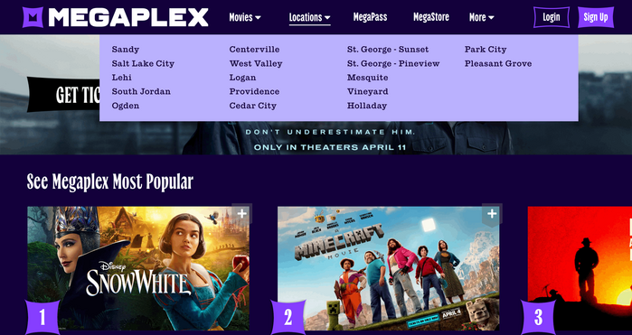
Source: megaplex.com License: All Rights Reserved.

Source: megaplex.com License: All Rights Reserved.

Source: megaplex.com License: All Rights Reserved.
This post was originally published at Fonts In Use
Source: matchstic.com License: All Rights Reserved.
As Megaplex expands from being a cinema to an entertainment destination with a more diverse array of offerings including bowling, arcade, and dining, they needed an identity that was reflective of that – an identity that expressed this “more is more” sentiment. The core message Matchstic developed, “Live life larger”, informed much of the visuals from the oversized floating objects to the expressive headline font Salo, which can flex from bold and utilitarian sans to a more editorial, and premium-leaning serif. Overall, the identity is vibrant and contemporary, ushering in a new chapter of this Utah-based entertainment mainstay.
Source: matchstic.com License: All Rights Reserved.
Source: matchstic.com License: All Rights Reserved.
Source: matchstic.com License: All Rights Reserved.
Source: matchstic.com License: All Rights Reserved.
Source: matchstic.com License: All Rights Reserved.
Source: matchstic.com License: All Rights Reserved.
Source: matchstic.com License: All Rights Reserved.
Source: matchstic.com License: All Rights Reserved.
Source: matchstic.com License: All Rights Reserved.
Source: megaplex.com License: All Rights Reserved.
Source: megaplex.com License: All Rights Reserved.
Source: megaplex.com License: All Rights Reserved.
This post was originally published at Fonts In Use
Read full story.
WRITTEN BY
FontsInUse
An independent archive of typography.