Meant To Be book series, Hyperion Avenue

Source: books.disney.com Copyright © Hyperion Avenue. License: All Rights Reserved.
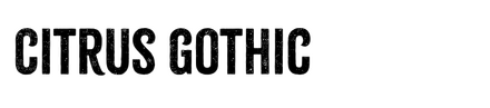
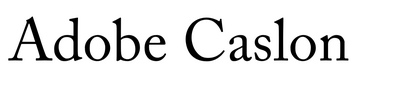
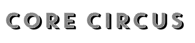
Hyperion Avenue, an imprint of Disney Publishing Worldwide, has reimagined the fairytales we all know and love into an adult series of contemporary, escapist rom-coms with a twist. The book covers resemble movie posters, with large type taking center stage and a small storytelling vignette hinting at which of our beloved princesses is getting a modern-day retelling. Citrus Gothic from Adam Ladd Design, with its hand-drawn, textured look, blends nicely with the illustration style to complete the main composition. Core Circus, a geometric sans serif from S-Core, carries the tagline and author credit, while Adobe Caslon rounds out the typographic hierarchy in the endorsement blurbs nicely.
Design by Marci Senders with illustration by Stephanie Singleton.

Source: books.disney.com Copyright © Hyperion Avenue. License: All Rights Reserved.

Source: books.disney.com Copyright © Hyperion Avenue. License: All Rights Reserved.

Source: books.disney.com Copyright © Hyperion Avenue. License: All Rights Reserved.

Source: books.disney.com Copyright © Hyperion Avenue. License: All Rights Reserved.
This post was originally published at Fonts In Use