Maldita Envidia
Source: www.behance.net Estudio Cariño. License: All Rights Reserved.


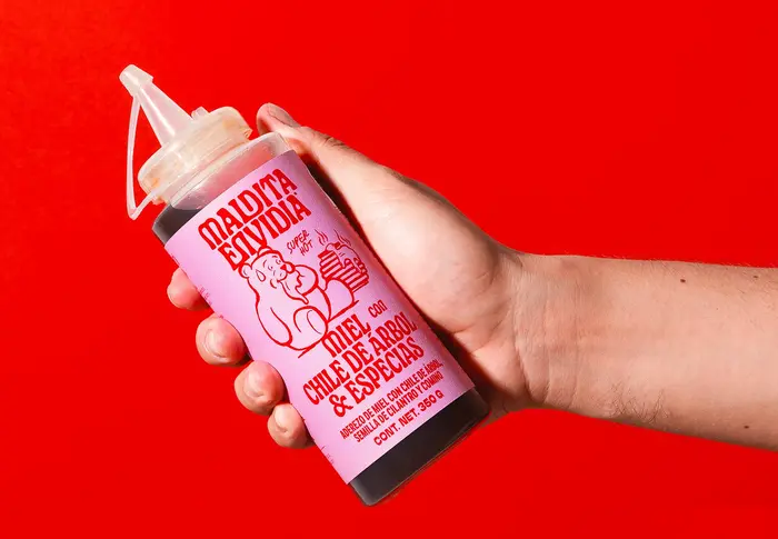
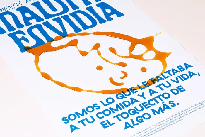
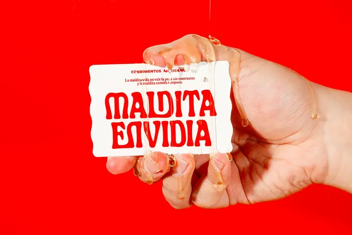
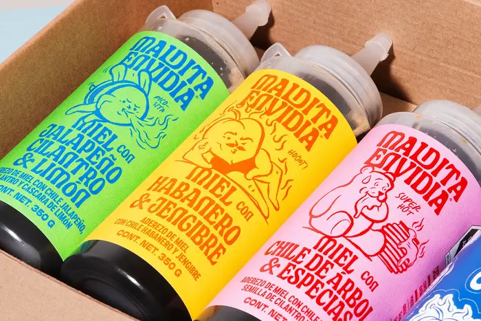
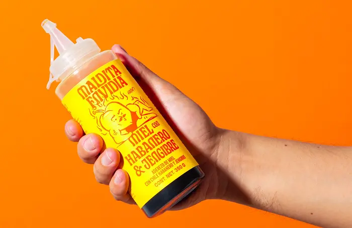
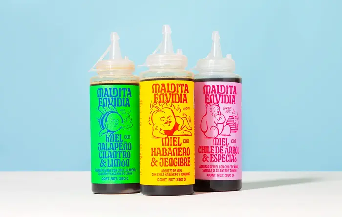
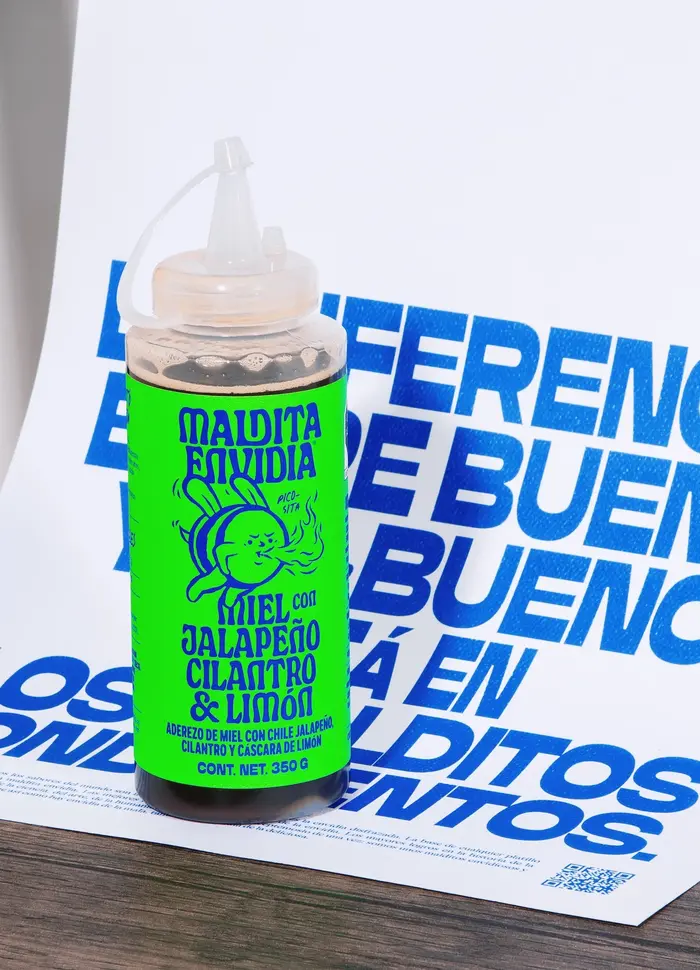
Maldita Envidia (meaning “Damn Envy”) is a Mexican dressing brand whose visual identity, crafted by Guadalajara-based Estudio Cariño, playfully subverts the concept of envy, framing it as a positive drive for culinary discovery. The branding is designed to stand out on crowded retail shelves, drawing inspiration from the high-contrast, hand-painted cardboard signs found in traditional Mexican street markets.
For its brand identity, the studio says:
The graphic identity was developed the same way a dressing is prepared: with small touches—sometimes just a pinch, sometimes bold and dominant.
In order to do that, the wordmark uses Pouler by Alexandre Créquer, with some custom ligatures and a variation on the A for the logotype. In addition, they used Balacar from The Designers Foundry, GT Haptik from Grilli Type, and Quick Writers by Letterhead Studio. GT Alpina carries longer texts.
Source: www.behance.net Estudio Cariño. License: All Rights Reserved.

Source: www.behance.net Estudio Cariño. License: All Rights Reserved.
Source: www.behance.net Estudio Cariño. License: All Rights Reserved.

Source: www.behance.net Estudio Cariño. License: All Rights Reserved.
Source: www.behance.net Estudio Cariño. License: All Rights Reserved.
Source: www.behance.net Estudio Cariño. License: All Rights Reserved.

Source: www.behance.net Estudio Cariño. License: All Rights Reserved.
Source: www.behance.net Estudio Cariño. License: All Rights Reserved.
Source: www.behance.net Estudio Cariño. License: All Rights Reserved.

Source: www.behance.net Estudio Cariño. License: All Rights Reserved.
This post was originally published at Fonts In Use