Lonely Planet
Lonely Planet. License: All Rights Reserved.
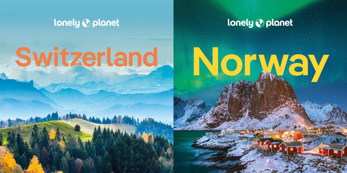
Cover pages (detail) of the Switzerland and Norway travel guides by Lonely Planet, set in Pangea SemiBold


The story of the travel publisher Lonely Planet begins in the summer of 1972. The newly married Australian-British couple Maureen and Tony Wheeler had just completed a trip to Asia that lasted several weeks. Black in Melbourne, their circle of friends kept pestering them with questions about their trip, so they decided to write a book about it and publish it themselves. The success of Across Asia on the Cheap laid the foundation for what was to become Lonely Planet.
Today, the Australian publisher claims to be the world’s largest provider of independent travel and language guides. They publish 650 titles with a total print run of around 55 million copies. The company employs over 400 people in its offices in Melbourne, Oakland, London and Paris and has a staff of around 150 authors.
In 2022, Lonely Planet commissioned the New York creative studio Garrett Elizabeth Office with a comprehensive redesign of the brand. The aim was to modernize the travel guides and website and make them more attractive to both long-time users and a new generation of travelers.
Following the relaunch of the brand, the internal design team set out to find a new corporate typeface. They came across Fontwerk’s multilingual Pangea Collection via an internet search and were fascinated by the story of an “adventurous” font that goes on a world tour with extensive language development. Ultimately the decisive factor in the decision was Pangea’s sustainable licensing model: 25 percent of Christoph Koeberlin’s designer royalties go towards rainforest conservation and large-scale reforestation projects.
Shortly afterwards, Lonely Planet began the complete redesign of all printed materials. For this purpose, the publisher licensed Pangea and Pangea Text Regular, Italic, SemiBold and Bold. In order not to delay the new editions of the travel guides, city maps and maps, the design team even received some Pangea Condensed weights before their official publication. The serif used for body copy is Matthew Carter’s Miller. The Lonely Planet website was also refreshed and – until recently – was set in six Pangea styles.
Lonely Planet. License: All Rights Reserved.
Lonely Planet. License: All Rights Reserved.
Lonely Planet. License: All Rights Reserved.
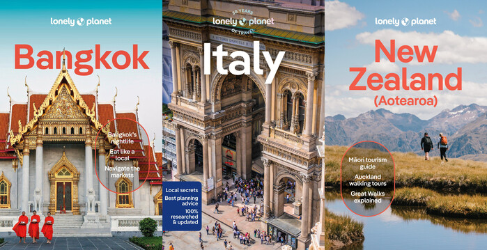
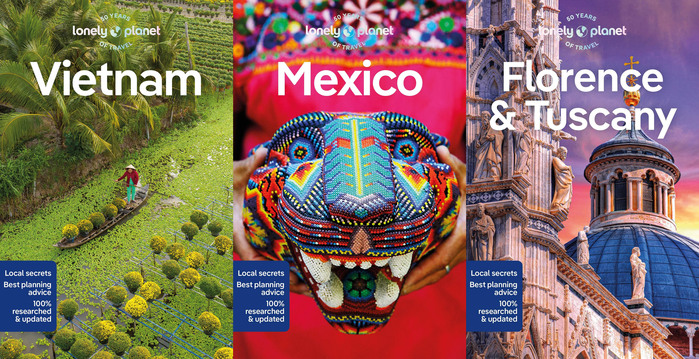
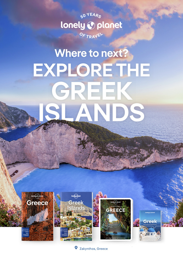
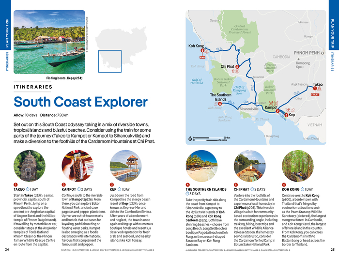
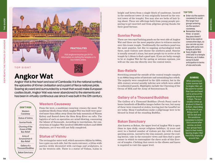
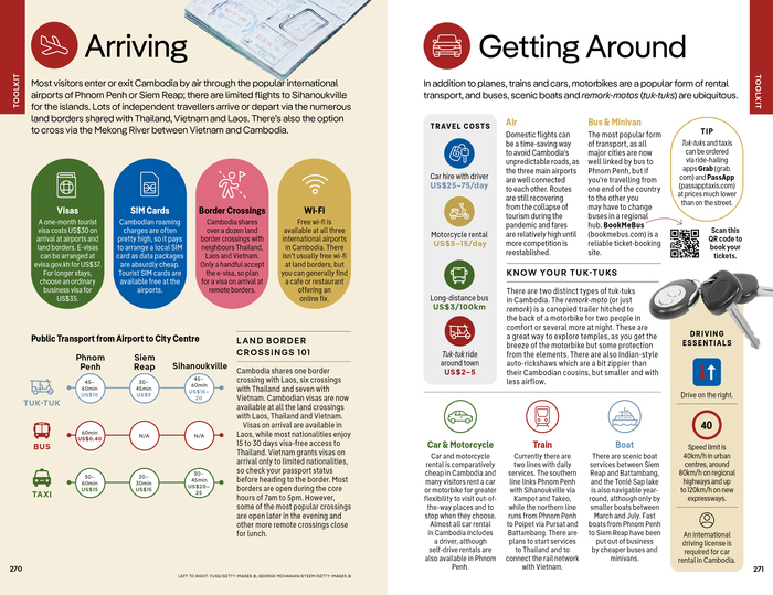
The Lonely Planet travel guides are aimed at individual travelers who want to get off the beaten track.
Lonely Planet. License: All Rights Reserved.
Lonely Planet. License: All Rights Reserved.
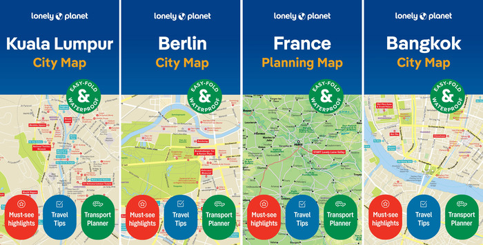
Lonely Planet’s updated city plans and maps have been using Pangea and Pangea Condensed for years.
Lonely Planet. License: All Rights Reserved.
Lonely Planet. License: All Rights Reserved.
Lonely Planet. License: All Rights Reserved.
Lonely Planet. License: All Rights Reserved.
Lonely Planet. License: All Rights Reserved.
Lonely Planet. License: All Rights Reserved.
Lonely Planet. License: All Rights Reserved.
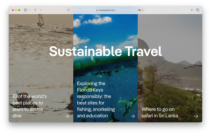
Lonely Planet’s international website has also been converted to the Pangea font family.
This post was originally published at Fonts In Use