Listen to the Warm by Rod McKuen
Source: www.ebay.com kmokev-4tjfvpyql. License: All Rights Reserved.


Imagine you meticulously drew a new typeface and as soon as it’s released, a user specifies it like this:
Squeezed. Slanted. And very tightly spaced. Oh, and for the author’s name, please double down on that slanting – because you can that with phototype, can’t you? While you’re at it, scale down the C, but don’t worry about optical compensation.
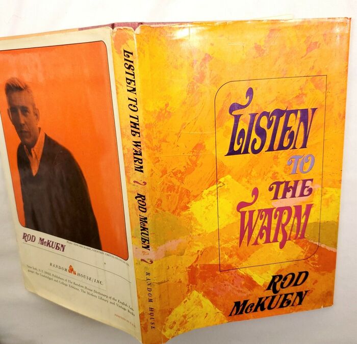
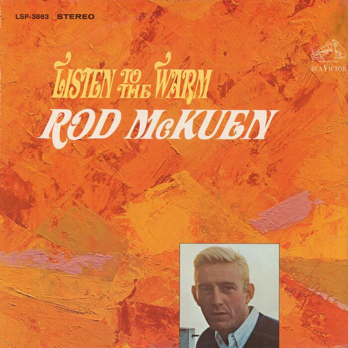
Ouch. That’s what Dave Davison must have felt, in case he saw this early application of his Davison Art Nouveau. And the chances he did are high: Listen to the Warm by poet Rod McKuen wasn’t only issued in book form by Random House, with 80,000 copies in print in 1967, “outstripping the top fiction seller”. It was also made into a record by RCA Victor, featuring the same coarse handling of Davison’s delicate typeface.
The name of the culprit is not quite clear: the book design is credited to Carl Weiss, but that usually applys to the interior only. The jacket art is by Robert Shore, but did he specify the typography, or was he exclusively responsible for the bright dabs of paint? If it’s this Robert Shore, then probably the latter. To close on a positive note, I do like the fact that isolated swashes were used as separators on the spine.
Hat tip to Justin Hoggard.
Source: www.ebay.com vinylc73 (edited). License: All Rights Reserved.
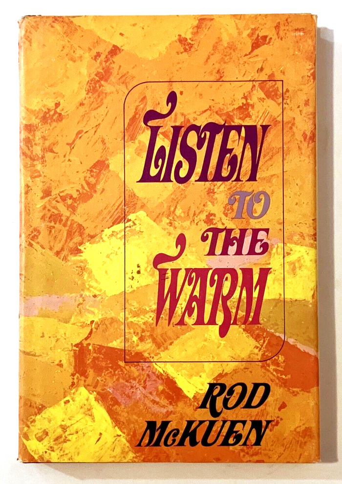
Book jacket, with one word per line. The swashes were included in Davison Art Nouveau.

Source: www.ebay.com vinylc73 (edited). License: All Rights Reserved.
The title lockup is repeated on cover, embossed. The text on the inner flap is set in Caledonia.
Source: archive.org Internet Archive. License: All Rights Reserved.
Album cover [More info on Discogs]
This post was originally published at Fonts In Use