Läderach

Source: laderach.com License: All Rights Reserved.

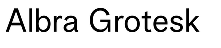
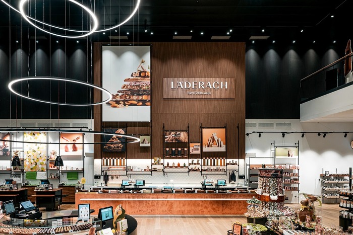
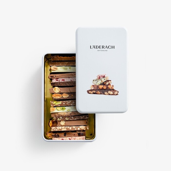
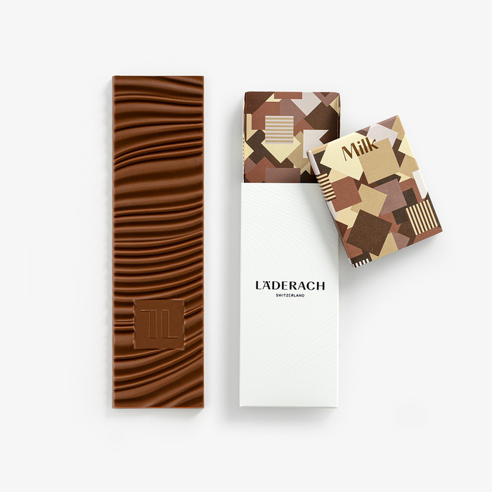
Albra Grotesk and Albra Sans by Rellence are used for the brand identity of Läderach across packaging and brand communication. The Swiss chocolate maker, founded in 1962, is known for its high-quality, bean-to-bar production carried out entirely in Switzerland. The family-run company offers a wide range of products, including its signature FrischSchoggi, pralines, and seasonal specialties.
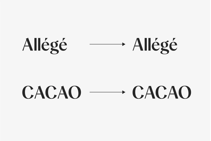
Läderach approached us to customize Albra Sans for their new updated visual identity. The primary focus was on the uppercase A, inspiring us to redesign the distinctive A of Albra into a more neutral, toned-down version with a flat apex. This redesign aims to provide long uppercase words with a more harmonized cap rhythm, seamlessly complementing the aesthetics of the new Läderach logo.
Source: rellence.com License: All Rights Reserved.

License: All Rights Reserved.
Source: laderach.com License: All Rights Reserved.

Source: laderach.com License: All Rights Reserved.
Source: laderach.com License: All Rights Reserved.

License: All Rights Reserved.
Source: laderach.com License: All Rights Reserved.
Source: laderach.com License: All Rights Reserved.
Source: laderach.com License: All Rights Reserved.
This post was originally published at Fonts In Use