La Société Bleue
Published February 13, 2026
By FontsInUse
Contributed by Arthur Calame
Source: www.instagram.com Hochburg. License: All Rights Reserved.


Source: www.instagram.com Hochburg. License: All Rights Reserved.
Source: www.instagram.com Hochburg. License: All Rights Reserved.
Source: www.instagram.com Hochburg. License: All Rights Reserved.
Source: www.instagram.com Hochburg. License: All Rights Reserved.
Source: www.instagram.com Hochburg. License: All Rights Reserved.
This post was originally published at Fonts In Use
Source: www.instagram.com Hochburg. License: All Rights Reserved.
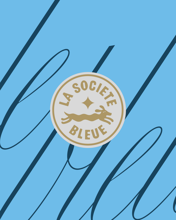
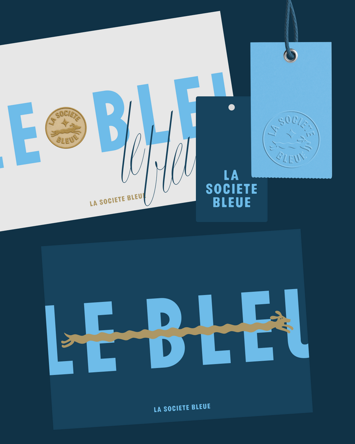
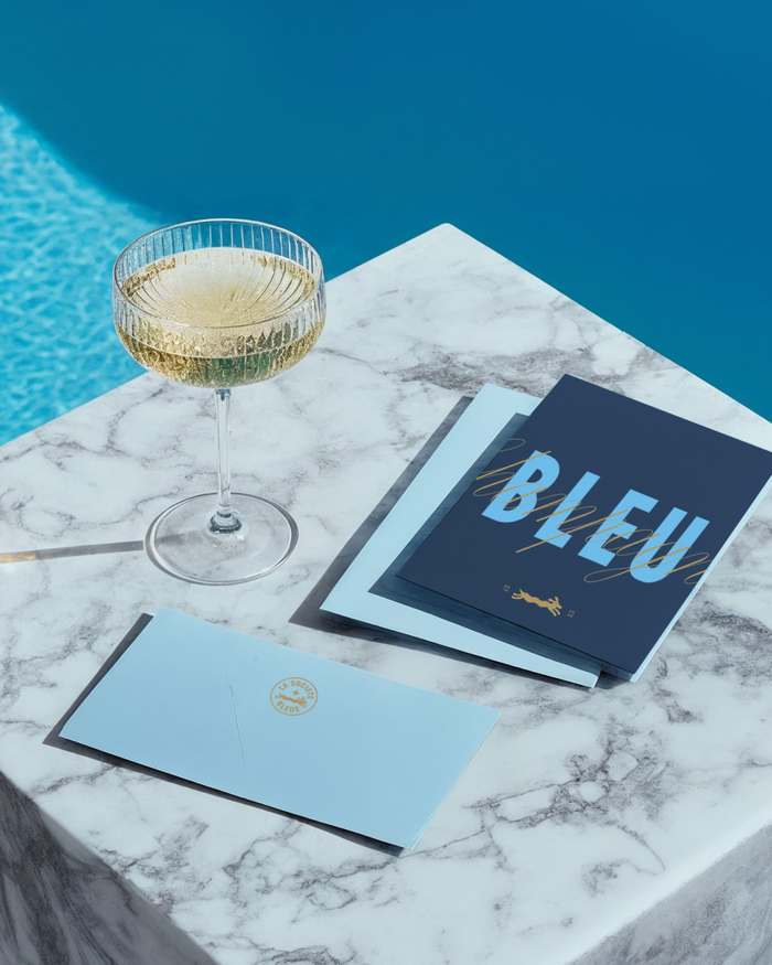
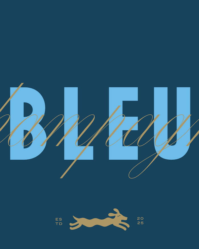
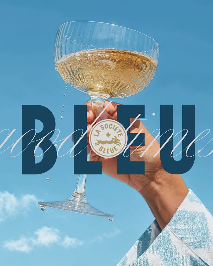
La Société Bleue feels like an afternoon on the Riviera. The name sets the tone: French, clear, elegant. Blue as a mood, a color, and a symbol. In the branding of the Stuttgart-based brand of cashmere pullovers, this translates into a finely tuned color system based on different shades of blue complemented by gold accents. The colors elegantly convey depth and character.
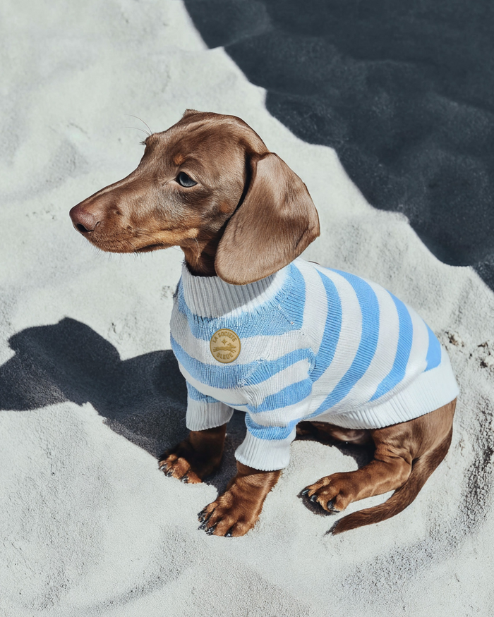
The logo itself combines maritime lightness with a touch of vintage using Maroni in its Regular weight. It’s complemented by the teckel symbol – abstracted, stylized, as a figure. It appears on labels, clothing, and accessories; as a mascot, key signet, and well-thought-out element in the visual system. The accompanying typefaces are Carta Nueva and Sign Maker JNL.
Source: www.instagram.com Hochburg. License: All Rights Reserved.
Source: www.instagram.com Hochburg. License: All Rights Reserved.
Source: www.instagram.com Hochburg. License: All Rights Reserved.
Source: www.instagram.com Hochburg. License: All Rights Reserved.
Source: www.instagram.com Hochburg. License: All Rights Reserved.
This post was originally published at Fonts In Use
Read full story.
WRITTEN BY
FontsInUse
An independent archive of typography.
More from FontsInUse