La Lettre d’imprimerie by Francis Thibaudeau
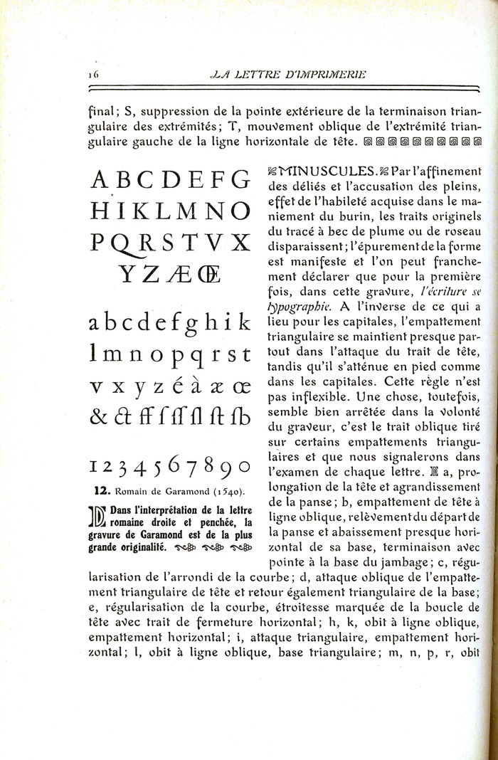
Photo: Craig Eliason. License: Public Domain.


Francis Thibaudeau published two major works in the early 1920s that were important contributions to type history: La Lettre d’imprimerie, a two-volume set from 1921; and Manuel français de typographie moderne, its 1924 follow-up. The first of these was one of the first attempts to categorize typeface designs more systematically. Thibaudeau constructed a matrix of categories based on the shape of the serif.
For both of these publications Thibaudeau chose Auriol as the body type. Auriol, based on the lettering of illustrator George Auriol, has been celebrated as the quintessential Art Nouveau display type. But the Parisian Peignot et Fils foundry that produced the Auriol fonts intended their project as a complete typographic system including types for body text.
Thibaudeau had been installed as typographer at Peignot et Fils in 1900—a year before the foundry began development of the Auriol types—and remained in the employment of the foundry and its successors for the rest of his life. For his La Lettre d’imprimerie book, it is hardly surprising that he would choose a Peignot foundry font. But why Auriol, when Peignot’s catalog offered a broad range of more conventional text types?
Because the topic of La Lettre d’imprimerie is the history of letterform tradition, Thibaudeau the typographer must have quickly realized the potential confusion between the textual elements offered as illustrations of that tradition and the textual elements that were the body of his own commentary. Auriol avoided blending with the Garamond or Didot exemplars reproduced next to it. In fact Auriol forewent consistent serifs or terminals that would slot it into Thibaudeau’s classification system: one might say it was an “outside the box” type.
Thibaudeau not only set the text of his books in Auriol and sung the praises of the types within; he also dedicated La Lettre d'imprimerie to George Auriol.
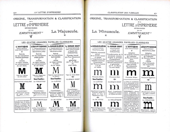
Photo: Craig Eliason. License: Public Domain.
This post was originally published at Fonts In Use