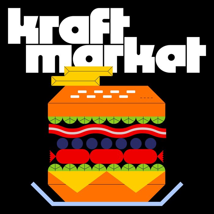
Kraft Market

Daniel & Andrew Studio. License: All Rights Reserved.


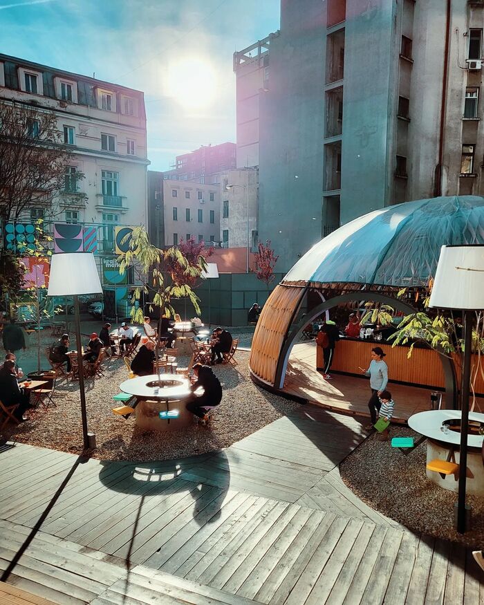
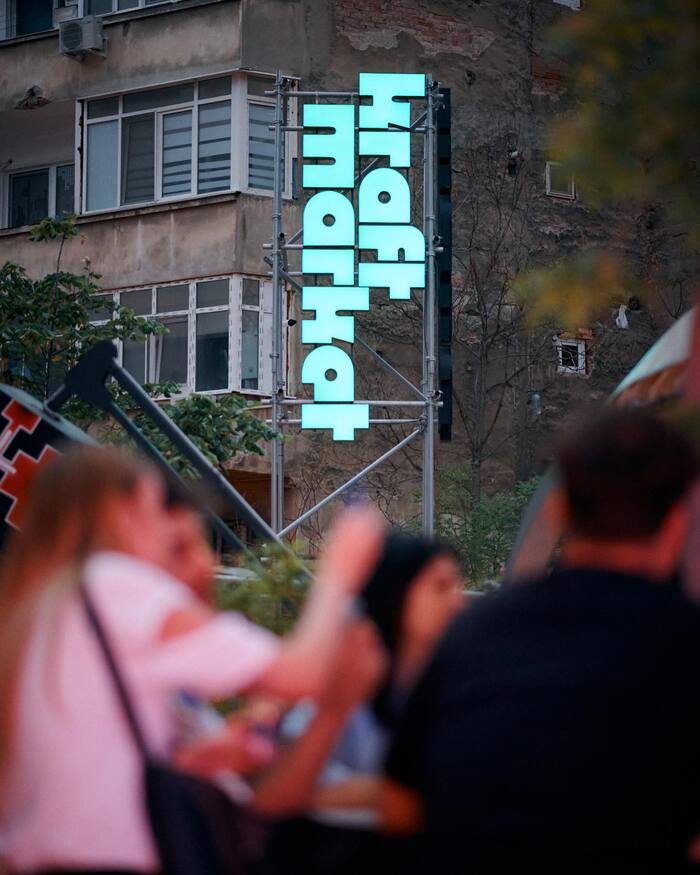
Kraft Market is a new urban terrace in the heart of Bucharest, Romania. With environmental and graphic design by Daniel & Andrew Design Studio, the market makes extensive use of my typeface Megazoid… I couldn’t be happier with how they have put it to use!
A note from Daniel & Andrew Design Studio:
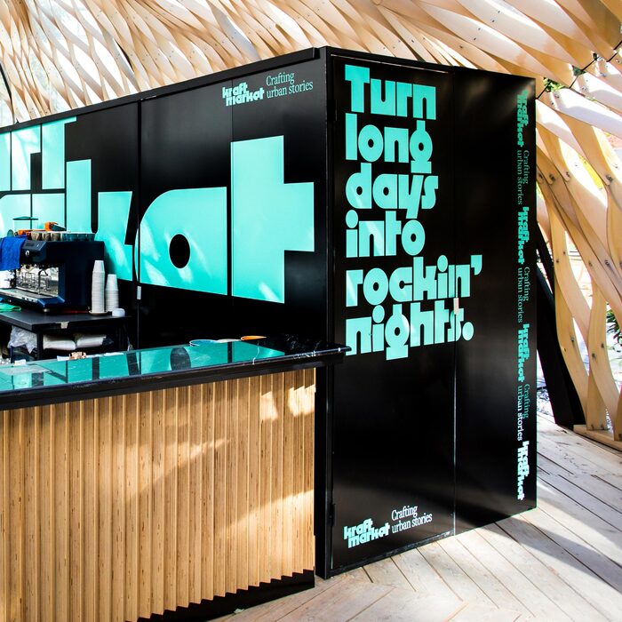
Kraft Market combines the experience of an urban garden with the commitment to tell the story of the craftsmanship community. Megazoid typeface perfectly checks all the boxes of this identity and wordmark. It has a beautiful structure made of raw elements, that creates a memorable tension between readability and abstraction. This expresses in a visual manner both the unique profile of the space and what it means to build something handmade.
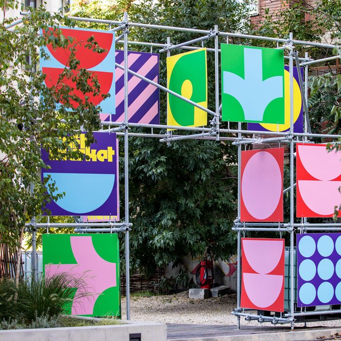
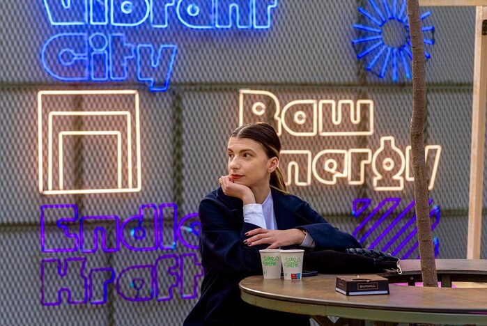
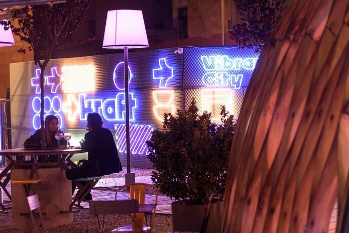
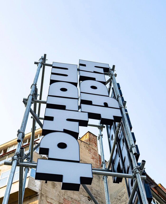
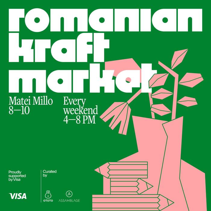
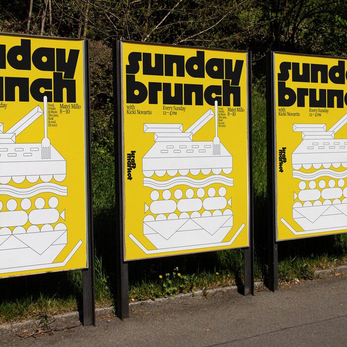
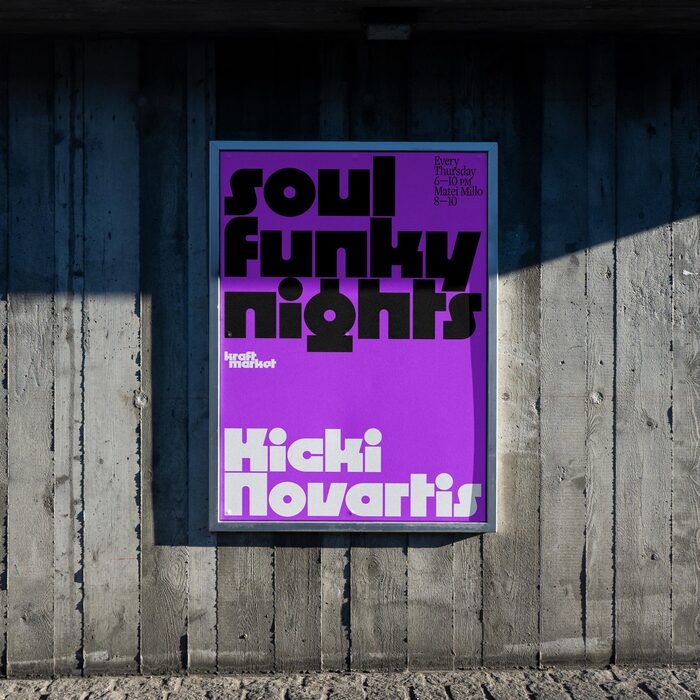
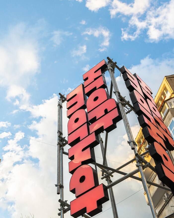
Kraft Market’s logo and headlines take advantage of Megazoid’s alternate single-story a and rounded e, which softens its appearance slightly. Freight Text serves as a companion face, used for supporting text and some headlines. The type is accompanied by bright colors, bold geometric patterns, and simple but effective illustrations. The environmental graphics include large illuminated signs and neon.
The lovely illustrations were done by Alina Georgescu, and Kaustik served as the production studio on the project.
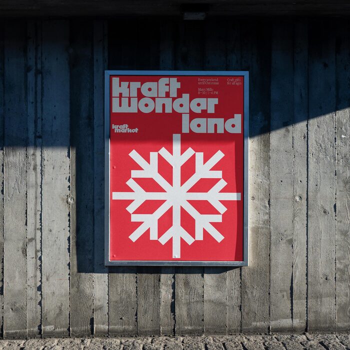
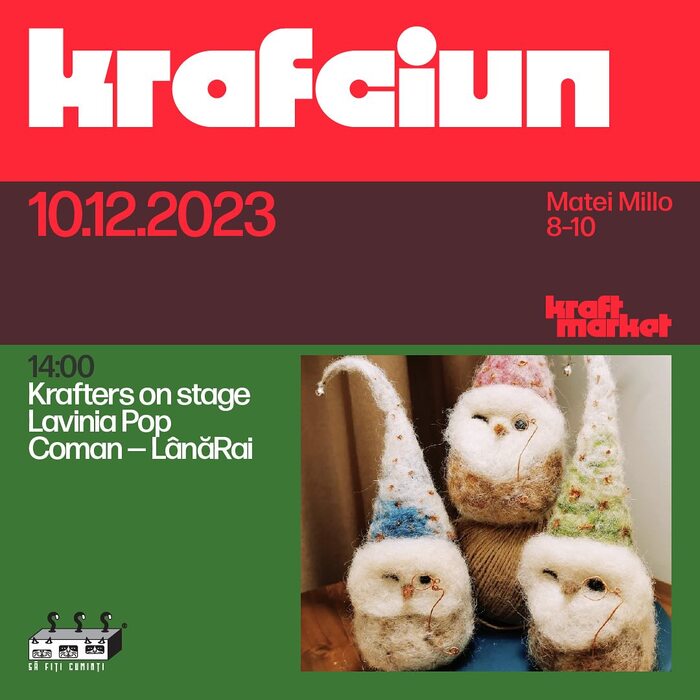
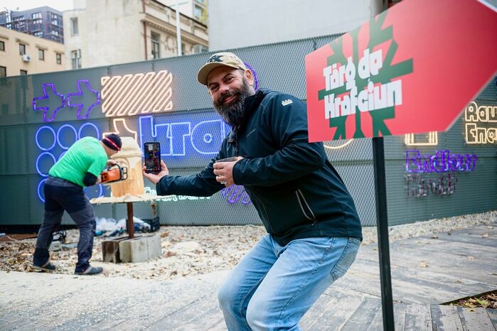
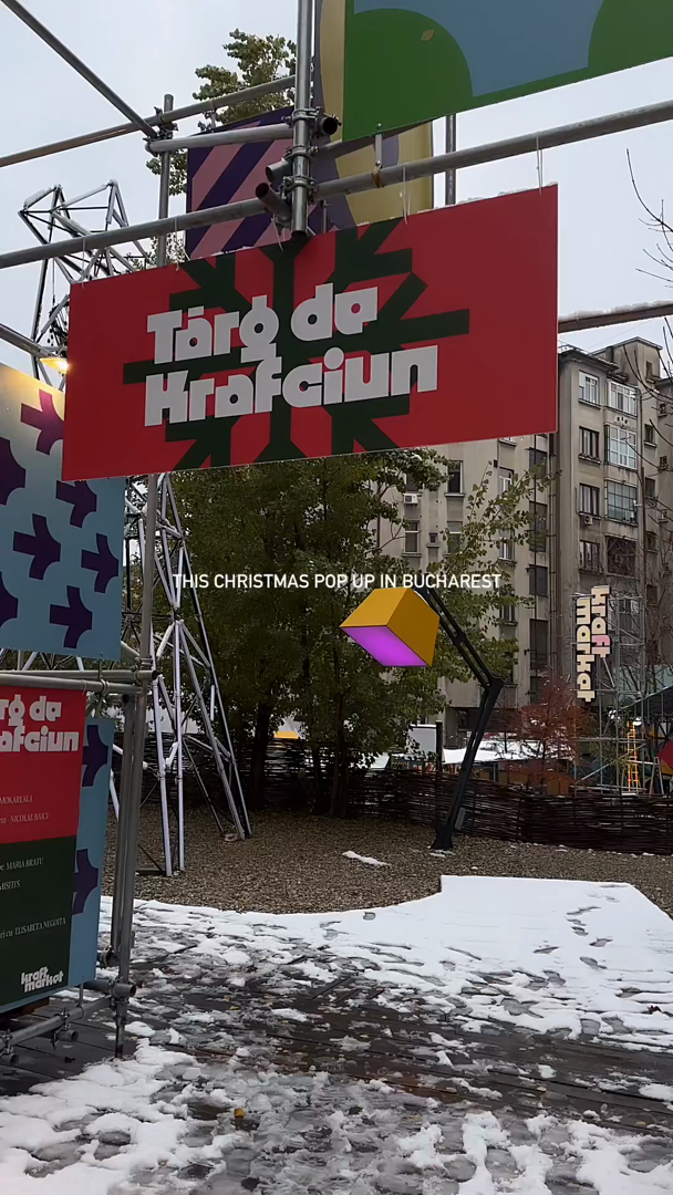
The market’s visual language has grown to include a Christmas pop-up (Târg de Krafciun), which features some beautiful three-dimensional uses of Megazoid, as well as Forma DJR for informational text.

Daniel & Andrew Studio. License: All Rights Reserved.
Daniel & Andrew Studio. License: All Rights Reserved.
Daniel & Andrew Studio. License: All Rights Reserved.
Source: www.facebook.com Kraft Market. License: All Rights Reserved.
Source: www.facebook.com License: All Rights Reserved.
Daniel & Andrew Studio. License: All Rights Reserved.
Source: www.facebook.com Kraft Market. License: All Rights Reserved.
Source: www.facebook.com Kraft Market. License: All Rights Reserved.
Source: www.facebook.com License: All Rights Reserved.
Daniel & Andrew Studio. License: All Rights Reserved.
Poster (photo mockup from Mockup Maison)

License: All Rights Reserved.
Poster (photo mockup from Bendito Mockup)
License: All Rights Reserved.
Poster (photo mockup from Mockup Maison)
License: All Rights Reserved.
Poster (photo mockup from Mockup Maison)
License: All Rights Reserved.
Source: www.facebook.com Kraft Market. License: All Rights Reserved.
Source: www.facebook.com Kraft Market. License: All Rights Reserved.
License: All Rights Reserved.
Source: www.facebook.com Kraft Market. License: All Rights Reserved.
Source: www.instagram.com License: All Rights Reserved.
This post was originally published at Fonts In Use