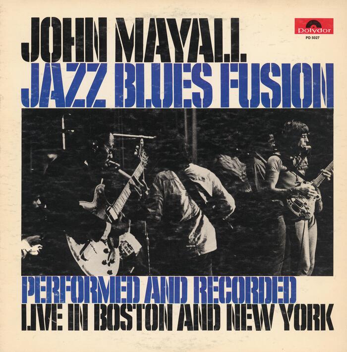
John Mayall – Jazz Blues Fusion album art
Source: archive.org Internet Archive. License: All Rights Reserved.


From Wikipedia:
Jazz Blues Fusion is a live album by John Mayall. The first side is from a gig in Boston at the Boston Music Hall on 18 November 1971, and the second side was selected from two concerts at Hunter College, New York, on 3 and 4 December 1971.
The stencil caps used on the front cover are a bit of a mystery to me. On first look, they are from Filmotype Quiet. One characteristic glyph in that typeface is the low-waisted R with the curved leg. Unlike the P, the R on the album cover has a higher waistline, though, and no curved exit stroke. Was there an alternate? Quiet’s K likewise has a curved terminal – the one in “New York” doesn’t.
As soon as you zoom in on the bridges, things get messier. Not only are they a tad wider than in Quiet. In several glyphs, they are positioned differently. This includes A, H, M, V, W, Y, and Z.
It looks like the font in use is a close follower (or precursor?) of Quiet, of unknown origin. It’s neither Cargo Stencil Bold (Photo-Lettering), M-6 (VGC), 11-2 QU Mod Stencil (Lettergraphics), or Expo (Typeshop) – these all match the original Quiet. Maybe Britton Walters has the answer. In 2001, he made a digital font named G.I. Jerk … which is a match for the letterforms seen on the album cover from 1972.
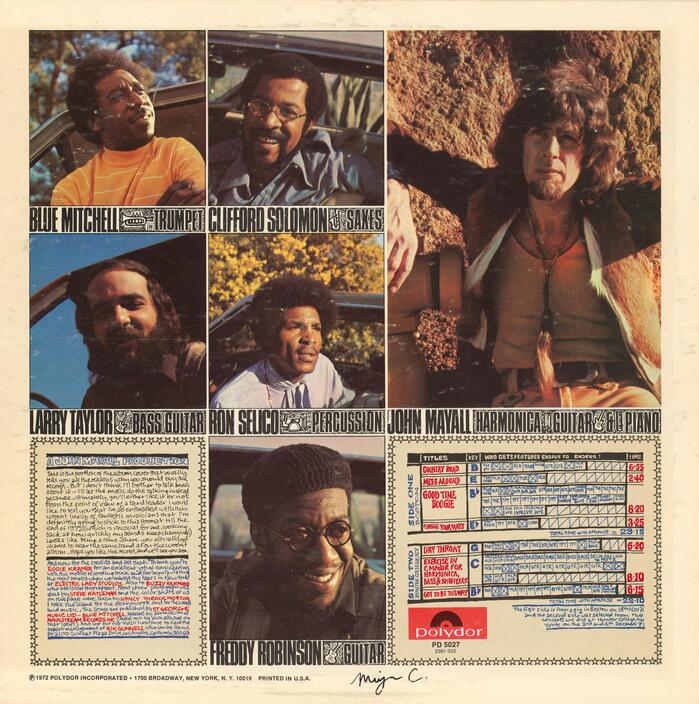
No cover designer is credited. Photography by Steve Katleman (front) and Nancy Throckmorton (back).
John Mayall died at his home in California on 22 July 2024, at the age of 90. RIP.
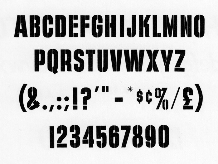
Photo: Florian Hardwig. License: CC BY-NC-SA.
For comparison: glyph set for M-6, VGC’s (presumably direct) copy of Filmotype Quiet, as shown in a 1969 catalog.
Source: archive.org Internet Archive. License: All Rights Reserved.
The narrow sans used for the credits on the back cover is Compacta.
This post was originally published at Fonts In Use