Integrity album art and logotype (1989–1995)
License: All Rights Reserved.
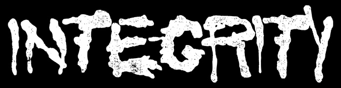
Band logo

Logotype and assorted album covers and merchandise for the hardcore punk pioneers Integrity.
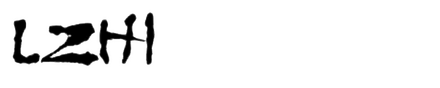
The band has been active since 1988. Formed in Cleveland, Ohio, it’s based in Belgium since 2003. A few logo versions have been used over the years, this one being the most recognizable. It is made using the uppercase letters of Lzh1, designed by Lizabeth Brenner and released by Chartpak for dry transfer lettering in 1986 as a winner in a type design competition held at the time. The band identity and the zine Schism (2005) share this common typographic background and are among the few known uses of the typeface.
Further inspection revealed that a non-official digital version of the font named Radical was available in the early 1990s through Silver Graphics, though both Lzh1 and Radical are discontinued.
Out of curiosity brought by the investigation of an analog source and band fandom, I have released a new and improved digital version of the typeface, available as INTEGRITY.

License: All Rights Reserved.
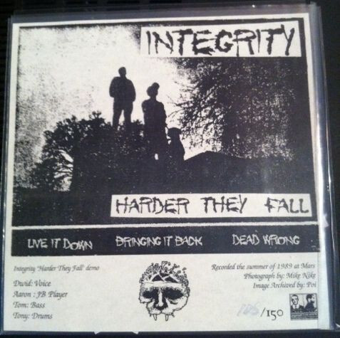
“Harder They Fall” was originally self-released in 1989 as a single-sided demo cassette tape, already featuring Lzh1. [More info on Discogs] Shown here is the 2019 anniversary reissue on Backbite Records.
License: All Rights Reserved.
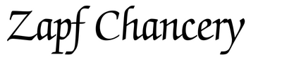
Cover of the 2011 reissue of “Harder They Fall” on Organized Crime Records. Credits are added in ITC Zapf Chancery. [More info on Discogs]
License: All Rights Reserved.
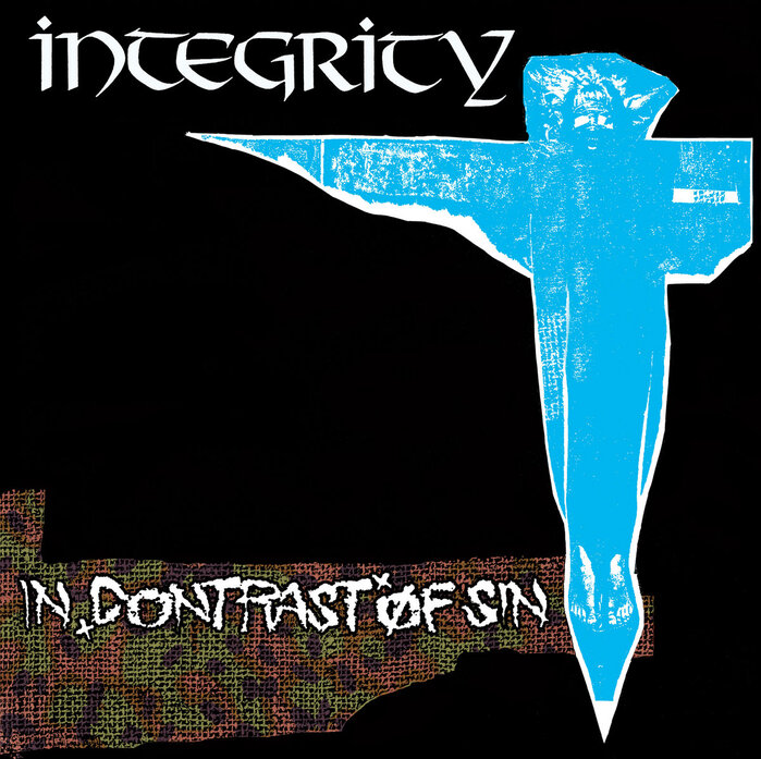
In Contrast of Sin, Victory Records, 1990. The band name here is set in Thor, fetauring the alternate Y. Design by Dwid Hellion. [More info on Discogs]
License: All Rights Reserved.
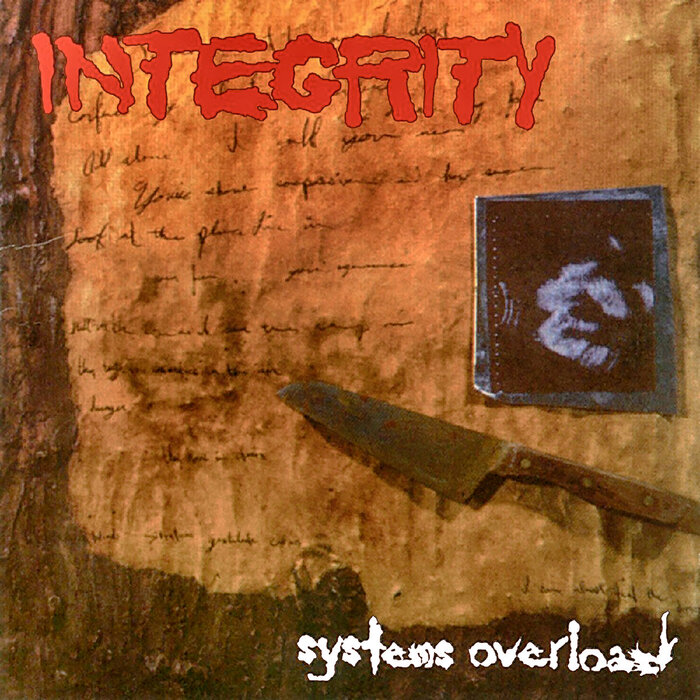
Systems Overload, Victory Records, 1995. Lzh1 (or Radical) is here used in lowercase letters, too. Design by Markus Greiner. [More info on Discogs]
License: All Rights Reserved.
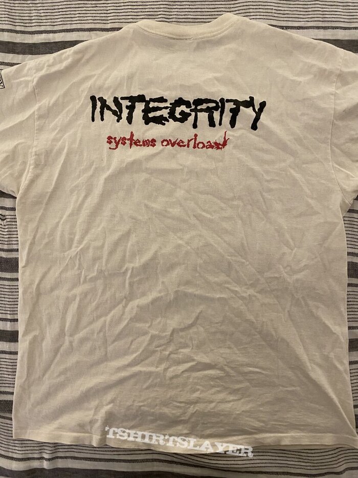
Systems Overload T-shirt
This post was originally published at Fonts In Use