INJU


©2026 INJU. License: All Rights Reserved.
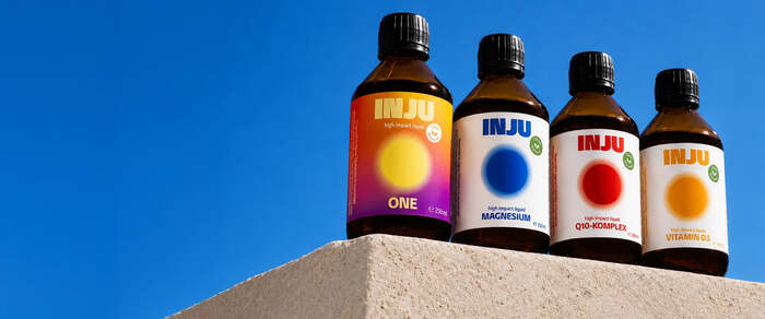
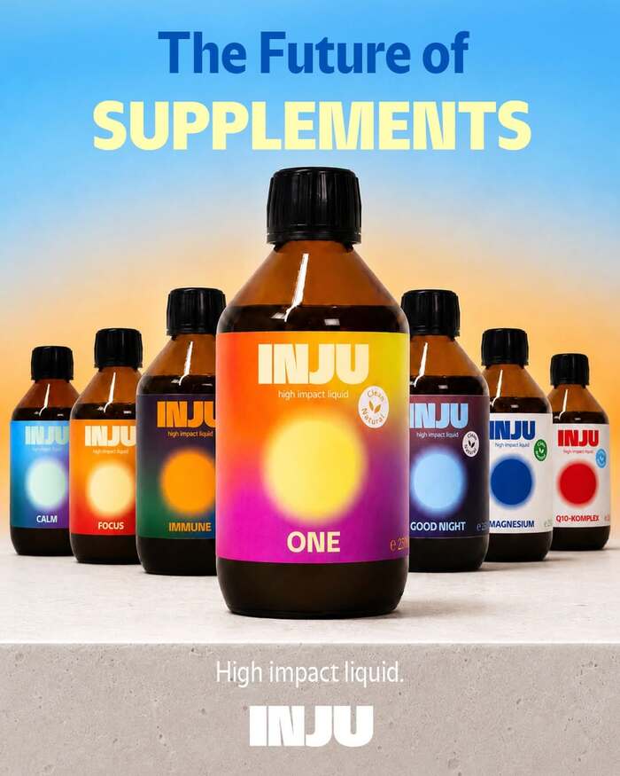
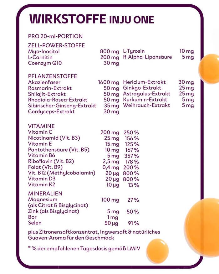
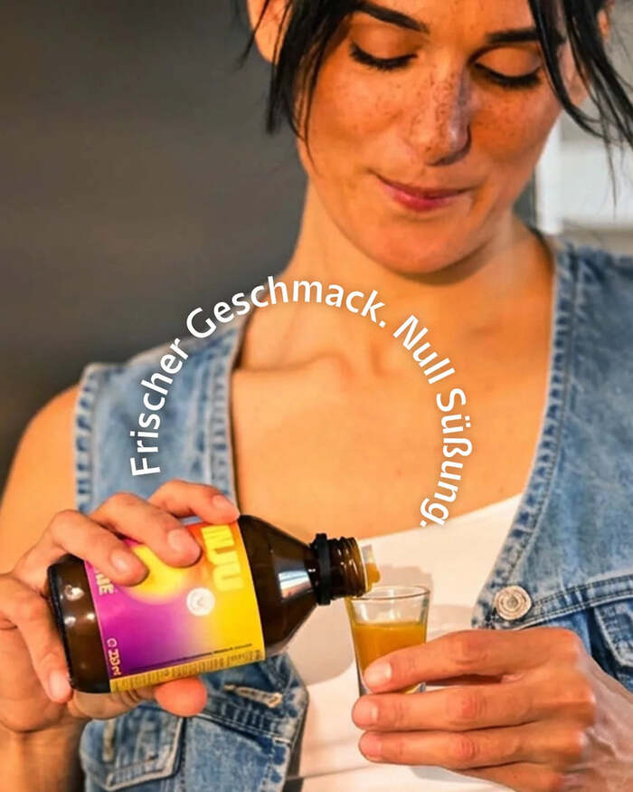
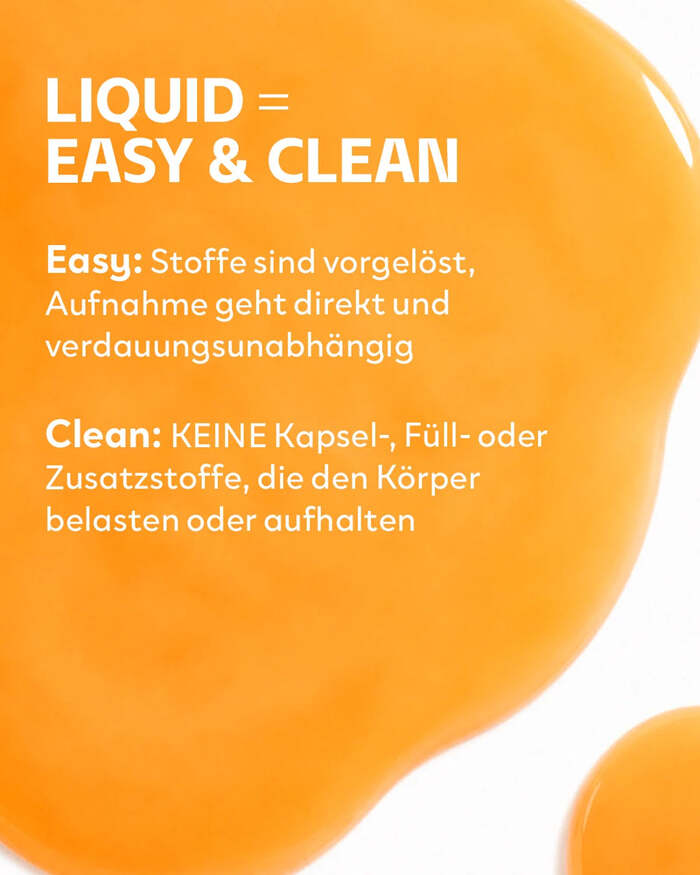
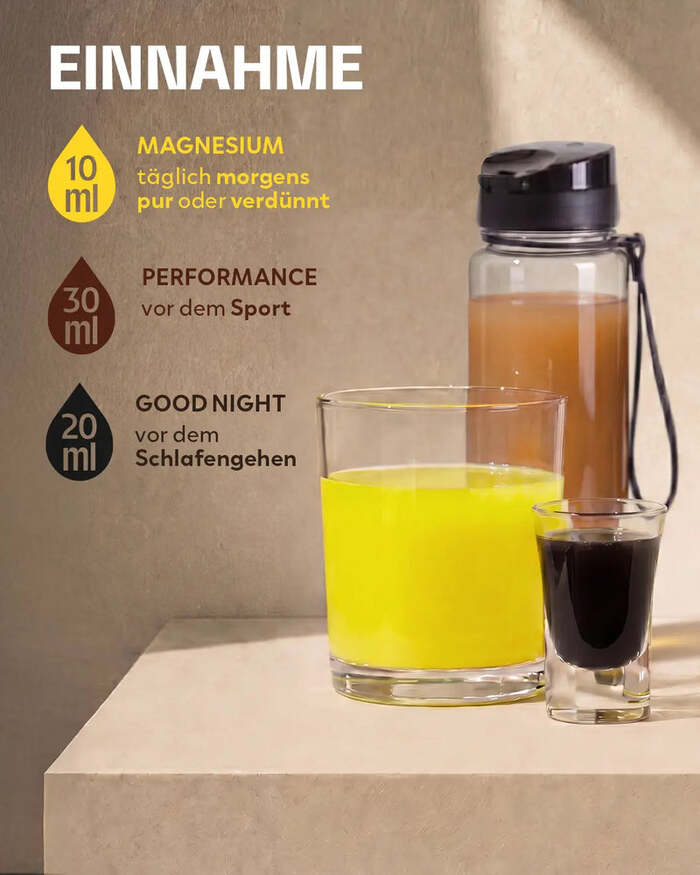
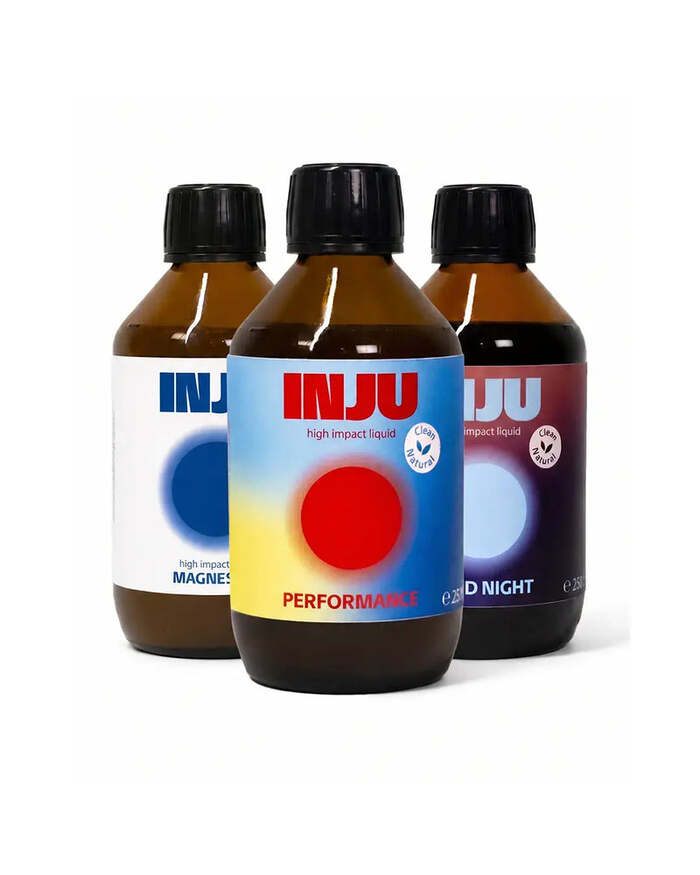
INJU is a German brand specializing in well-being, offering a new generation of liquid dietary supplements designed for optimal nutrient absorption. By combining scientifically proven formulas, premium-quality ingredients and cutting-edge delivery technologies, INJU develops products that promote energy, vitality and general well-being. Manufactured at its own production facility in Berlin, the brand’s products aim to create highly bioavailable nutritional solutions that help the body absorb and utilise essential nutrients more effectively.
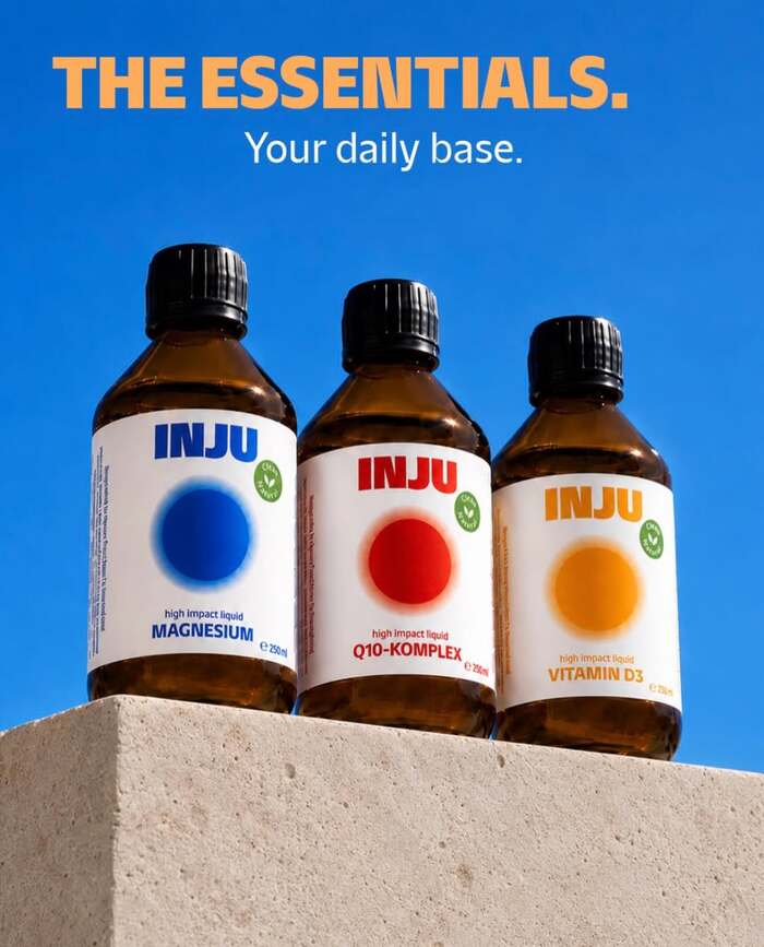
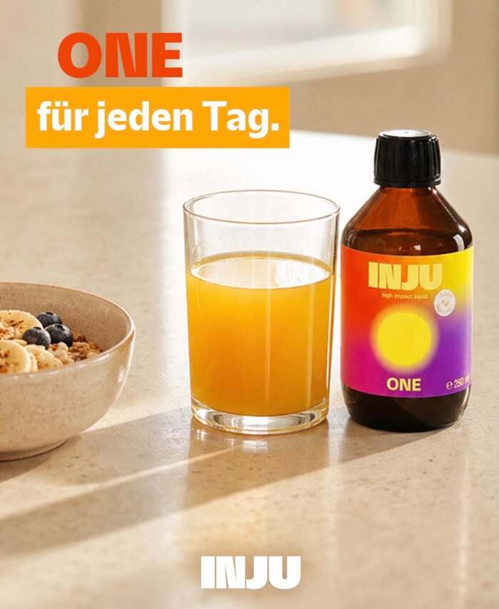
The visual identity uses NaN Hyena Noon for both the logo and headlines and Clother for all running texts. Both typefaces offer an interesting contrast. The friendly and elegant Clother, a rather minimalist geometric sans, is peppered with friendly details like the tails of the y and the g. On the other hand, Hyena’s acute terminals and pointy counterforms and inktraps offer a sharper look. This aligns well with the brand’s science-driven approach and the precision associated with nutritional supplements and vitamins.

©2026 INJU. License: All Rights Reserved.
©2026 INJU. License: All Rights Reserved.
©2026 INJU. License: All Rights Reserved.
©2026 INJU. License: All Rights Reserved.
©2026 INJU. License: All Rights Reserved.
©2026 INJU. License: All Rights Reserved.
©2026 INJU. License: All Rights Reserved.
©2026 INJU. License: All Rights Reserved.
©2026 INJU. License: All Rights Reserved.

©2026 INJU. License: All Rights Reserved.
This post was originally published at Fonts In Use