Howie
Source: newkid.services License: All Rights Reserved.


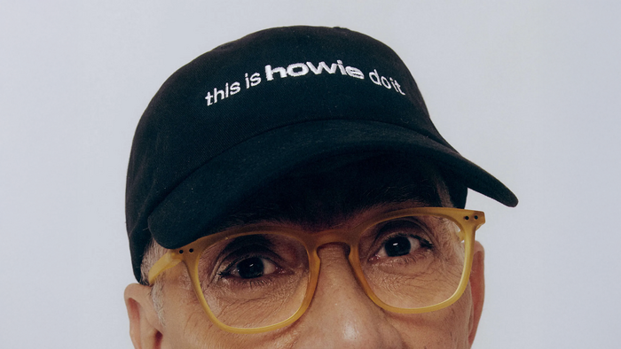
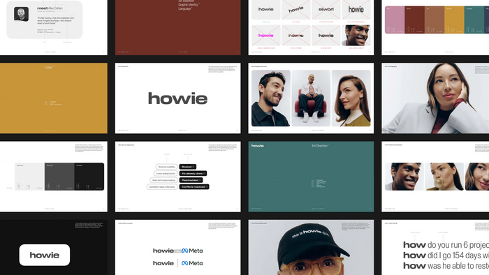
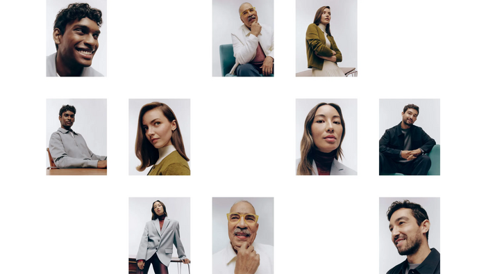
For the public launch of Howie, newkid – a Toronto-based branding agency founded by Alex Avendaño, Matt Donne, and Rich Brown – designed the visual identity and system for an AI assistant focused on managing email calendars. Howie was created by the Seattle-based startup co-founded by Austin Petersmith and Dave Newman, built around a simple but ambitious idea: automate meeting planning and coordination with the efficiency of a top-tier executive assistant, all directly from a user’s inbox.
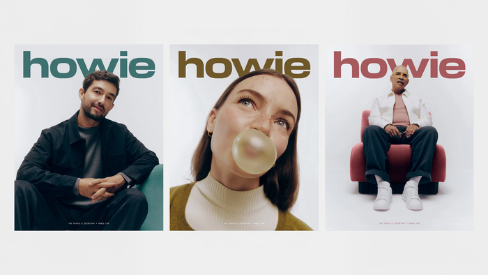
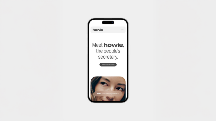
In line with the studio’s strategic approach – combining positioning, user research, and brand behaviors – Howie’s identity intentionally avoids the usual AI visual clichés. While many products rely on futuristic aesthetics and generic effects, newkid developed a visual language drawn from office tools, administrative interfaces, and familiar software systems. This approach grounds Howie in the professional everyday, turning the assistant into a practical tool rather than an abstract tech gadget.
Typography plays a central role in reinforcing this logic. Blaze Type’s Slussen provides modern clarity and readable hierarchy, while OCR‑A adds a technical, almost mechanical quality reminiscent of automated systems and data flows. Together, these type choices create an identity that prioritizes structure and efficiency over spectacle, visually expressing Howie’s promise: a reliable, unobtrusive assistant integrated seamlessly into real-world workflows.
Source: newkid.services License: All Rights Reserved.
Source: newkid.services License: All Rights Reserved.
Source: newkid.services License: All Rights Reserved.
Source: newkid.services License: All Rights Reserved.
This post was originally published at Fonts In Use