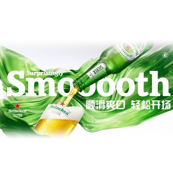
Heineken Silver Chinese market campaign
Heineken. License: All Rights Reserved.
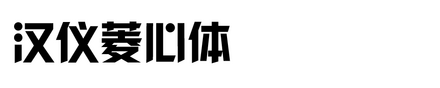
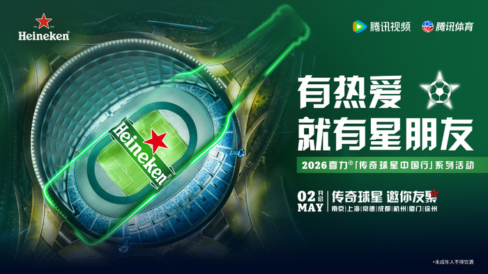
Heineken Silver used HY Lingxin in its Chinese market campaign. As a global beer brand, Heineken needs a Chinese typographic style that feels fresh, young, and energetic, while still matching its international brand image. HY Lingxin is a geometric display typeface with a strong structure and a lively rhythm. Its modern shapes help the Chinese headlines stand out clearly in posters, digital images, and promotional materials.
The font supports the campaign’s need for a clean but powerful visual voice. It gives the message a bold impression without making the design feel too heavy. For Heineken Silver, which focuses on a lighter and more refreshing drinking experience, this balance is important. The typeface helps the campaign feel modern, confident, and easy to recognize. It also allows the Chinese copy to work well together with the Latin brand elements, product photography, and green visual identity.
Heineken. License: All Rights Reserved.
Heineken. License: All Rights Reserved.
This post was originally published at Fonts In Use