Gustini

Source: koto.studio Koto. License: All Rights Reserved.


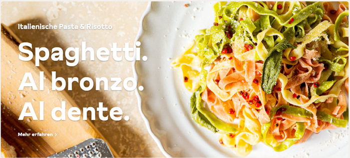
Koto did a brand update for food retailer Gustini, a company that focuses on bringing Italian food to the German public. Fonts in use are Sunset Gothic by Colophon and Blitz by Out of the Dark. The logo is based on Commercial Type’s Ergon, with a modified g. Koto wrote:
Our graphic identity balances traditional Italian aesthetics with modern sensibilities. The logo is inspired by ornate typography—offset by illustrations that reference classic fruit and vegetable tissue wrappers. In each of these patterns, we detail the artisanal craft behind the produce, heroing the innate care of their intricate cultivation. For added variation, not so dissimilar to produce, we created a series of supporting logos, further inspired by beloved Italian food labels.
Here we have a German company selling the idea of Italian culture, using a typeface inspired by Los Angeles street signs, halfway across the world. I think the chosen brand colors here match Sunset Gothic very well, but do they match the idea of Italian culture, or Californian culture, better? Both are sunny, idyllic and renowned for their vineyards and coastlines, so perhaps the distinction is moot in a world that is ever more globalized.

Source: koto.studio Koto. License: All Rights Reserved.

Source: koto.studio Koto. License: All Rights Reserved.
Source: koto.studio Koto. License: All Rights Reserved.

Source: koto.studio Koto. License: All Rights Reserved.

Source: koto.studio Koto. License: All Rights Reserved.
This post was originally published at Fonts In Use