Griddle Bakery
Source: www.griddlebakery.com ©2026 Griddle Bakery. License: All Rights Reserved.

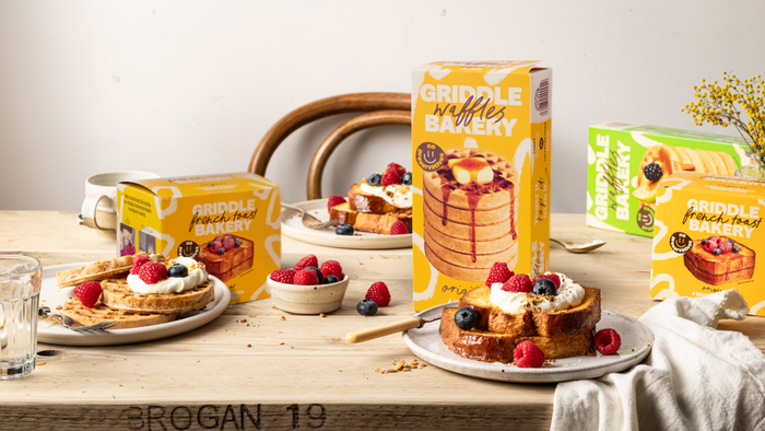
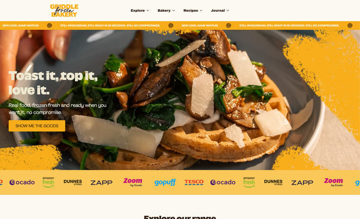
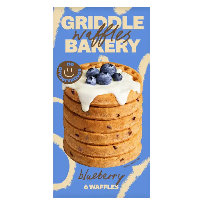
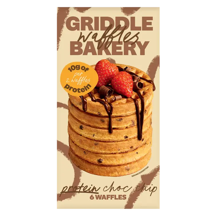
Griddle Bakery rebranded with London studio 20(SOMETHING) to reposition frozen bakery as premium, modern and quality-driven. Originally launched as Griddle, the company expanded beyond waffles into a wider bakery range focused on convenience without compromise. The new Griddle Bakery name and typography-led system help redefine frozen food as fresh, design-conscious and culturally relevant.
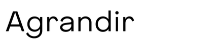
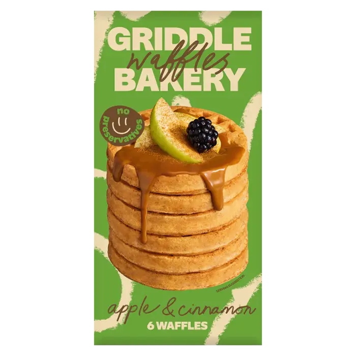
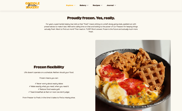
Central to the new identity is NaN SuperX Sans by NaN, whose bold and expressive character gives the brand a confident, contemporary voice. SuperX is used in alternance with what appears to be someone’s handwriting for the products names – which breaes the grid and brings some lightness and a kind of authenticity to the brand. On packaging designs and the website, we get to see Pangram Pangram’s Agrandir, which leans more in the direction of friendly and almost whimsical.

Source: www.griddlebakery.com ©2026 Griddle Bakery. License: All Rights Reserved.
Source: www.griddlebakery.com ©2026 Griddle Bakery. License: All Rights Reserved.

Source: www.griddlebakery.com ©2026 Griddle Bakery. License: All Rights Reserved.
Source: www.griddlebakery.com ©2026 Griddle Bakery. License: All Rights Reserved.
Source: www.griddlebakery.com ©2026 Griddle Bakery. License: All Rights Reserved.
Source: www.griddlebakery.com ©2026 Griddle Bakery. License: All Rights Reserved.
Source: www.griddlebakery.com ©2026 Griddle Bakery. License: All Rights Reserved.

Source: www.griddlebakery.com ©2026 Griddle Bakery. License: All Rights Reserved.
This post was originally published at Fonts In Use