Graille
Source: dirtypote.com Dirty Pote. License: All Rights Reserved.

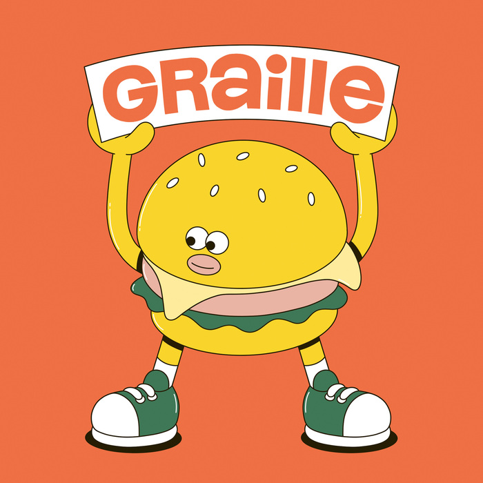
Graille is a no-holds-barred canteen for schools that don’t have a catering solution to offer their pupils. Meals are cooked with fresh, local produce every day by a chef in Lyon in their restaurant/kitchen. In addition, they are developing and installing vending machines directly in the schools, so that pupils can have healthy meals every day.
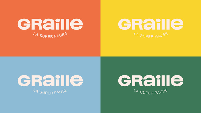
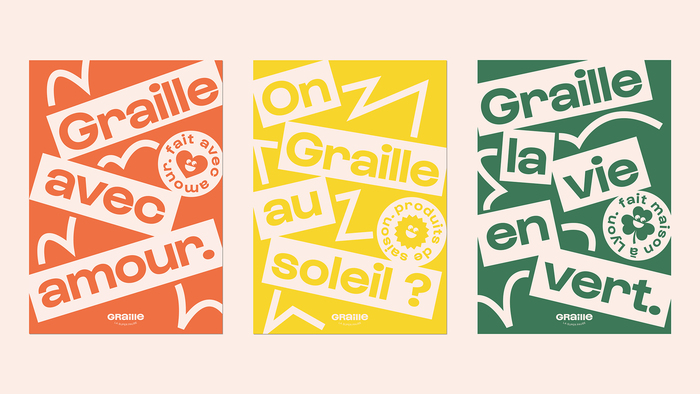
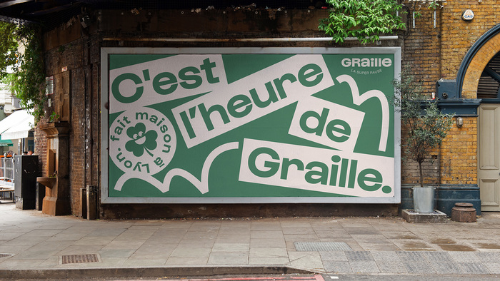
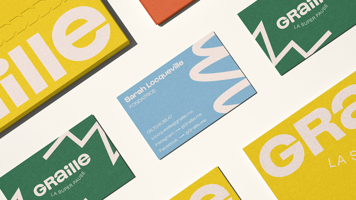
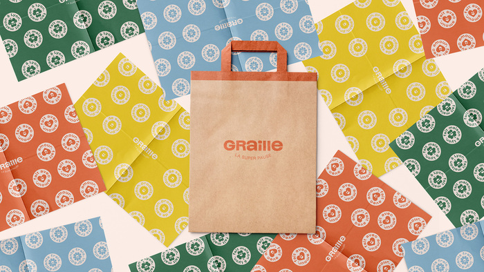
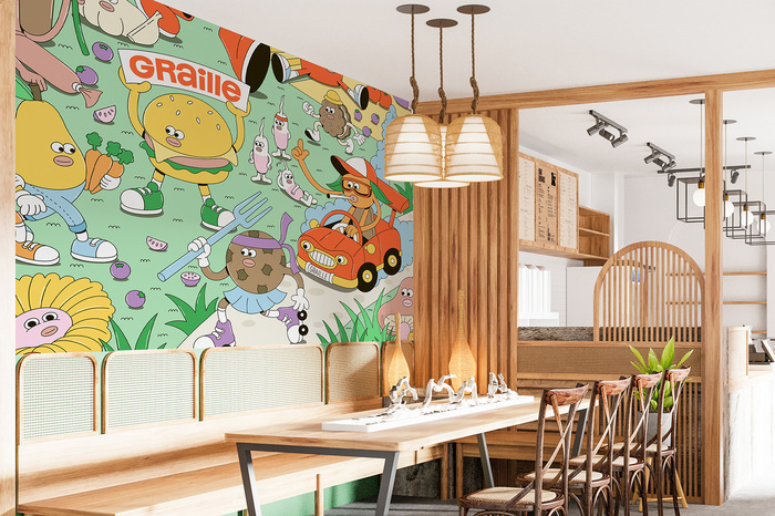
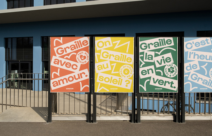
They contacted French art director Dirtypote to design their global identity. He developed a logo, a color scheme, and a typographic universe around “movement”, which refers to the products that fall from behind the glass of the dispenser into your hands.
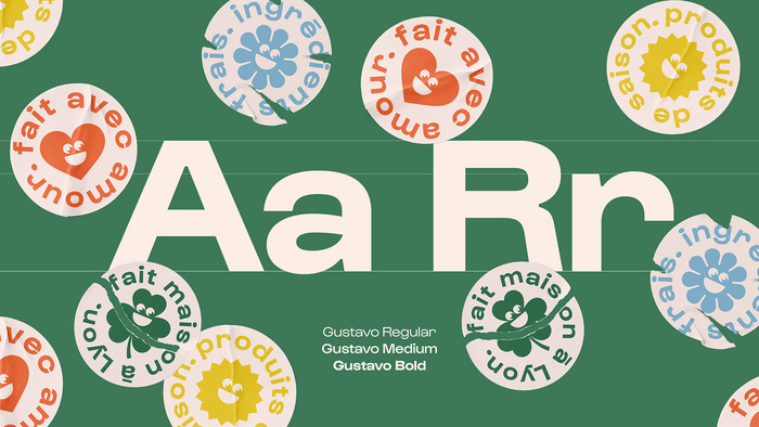
The font used for the project is Gustavo (from Lift Type), for the logo the lowercase a and e have been modified to match the size of the uppercase.
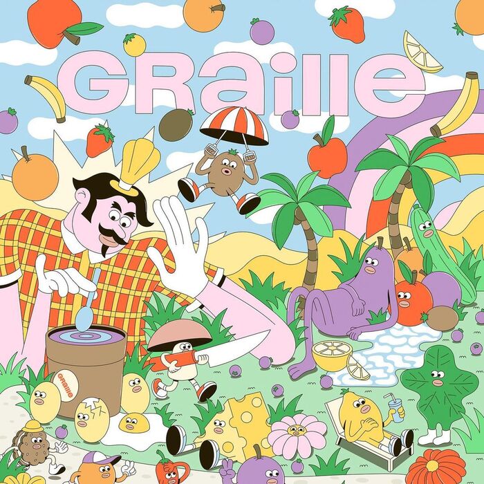
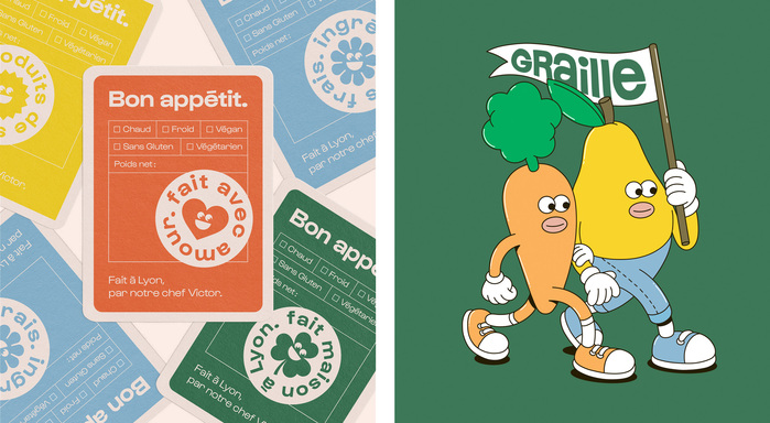
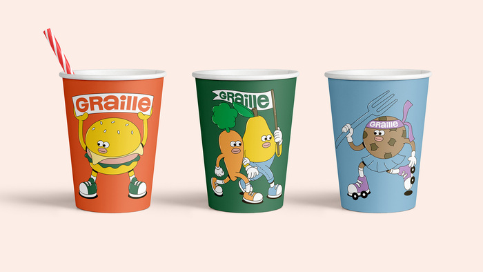
This identity is accompanied by illustrations featuring a multitude of culinary ingredients to show Graille’s interest in local, fresh produce.
Source: dirtypote.com Dirty Pote. License: All Rights Reserved.
Source: dirtypote.com Dirty Pote. License: All Rights Reserved.
Source: dirtypote.com Dirty Pote. License: All Rights Reserved.
Source: dirtypote.com Dirty Pote. License: All Rights Reserved.
Source: dirtypote.com Dirty Pote. License: All Rights Reserved.
Source: dirtypote.com Dirty Pote. License: All Rights Reserved.
Source: dirtypote.com Dirty Pote. License: All Rights Reserved.
Source: dirtypote.com Dirty Pote. License: All Rights Reserved.
Source: dirtypote.com Dirty Pote. License: All Rights Reserved.
Source: dirtypote.com Dirty Pote. License: All Rights Reserved.
Source: dirtypote.com Dirty Pote. License: All Rights Reserved.
This post was originally published at Fonts In Use