Genomic Gastronomy – Eyes on the Field: Porto
Source: www.behance.net © Bogi Balogh. License: All Rights Reserved.


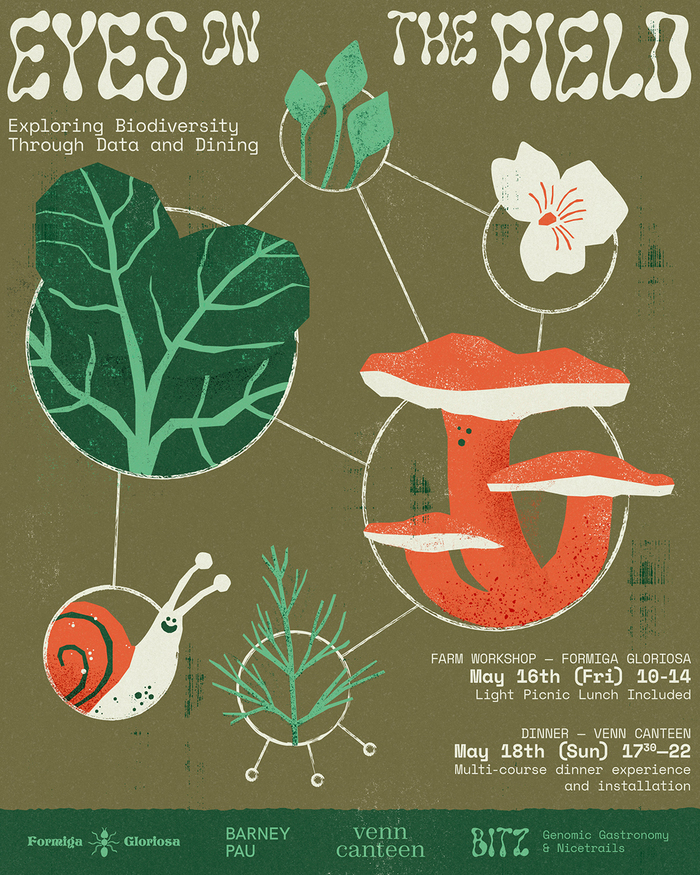
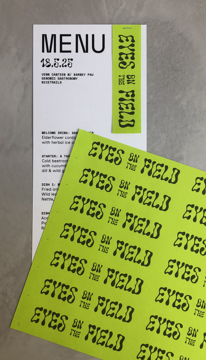
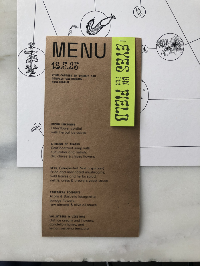
Genomic Gastronomy’s Eyes on the Field project uses typography to mirror its themes of experimentation, ecology, and global food systems. The display type is Solvent from PintassilgoPrints—an inky, fluid, all-caps face with forms that sit somewhere between liquid and oil. Its quirky, decorative shapes give the project an expressive vibe, emphasizing the potential for transformation. Supporting text is set in Space Mono from Colophon, a monospace sans serif designed for Google Fonts that offers structure and a technical edge to the brand.
The pairing creates a lively tension: Solvent’s organic, almost unstable quality set against Space Mono’s precise, engineered rhythm. Together, they underscore the project’s blend of art, science, and environmental storytelling.
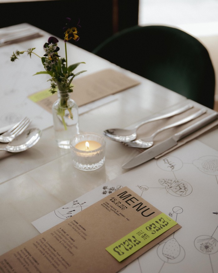
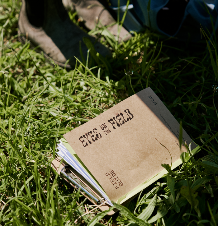
Eyes on the Field: Porto was a collaboration between Genomic Gastronomy, Nicetrails, Venn Canteen with Barney Pau, and Formiga Gloriosa and was supported by the E.U. S+T+ARTS MUSAE project. This event use the BITZ digital tool to facilitate participatory, place-based, species-quests in various landscapes.
Source: joaocruz.com © João Cruz. License: All Rights Reserved.
Source: joaocruz.com © João Cruz. License: All Rights Reserved.
Source: joaocruz.com © João Cruz. License: All Rights Reserved.
Source: joaocruz.com © João Cruz. License: All Rights Reserved.
This post was originally published at Fonts In Use