Gallardía
Source: www.creatorstudio.net creatorstudio. License: All Rights Reserved.


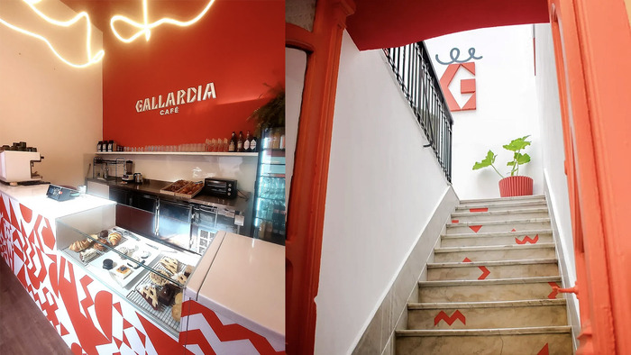
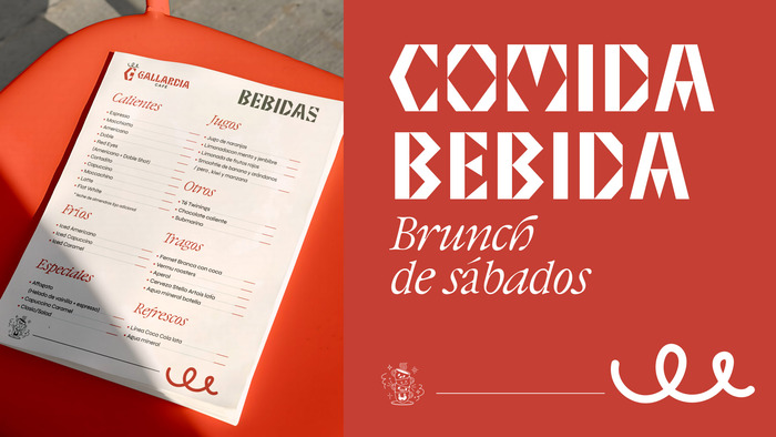
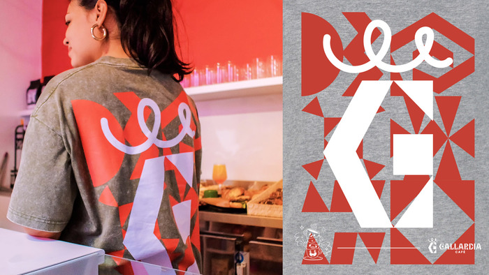
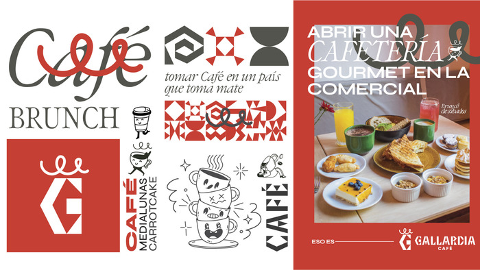
Gallardía’s visual identity was developed in collaboration with interior designer Elisa Uriarte, aligning the branding with the architecture of the historic house that hosts the café in Montevideo, Uruguay. The project responds to a distinct cultural context: while Uruguay has an emerging specialty coffee scene, mate—a traditional infusion widely consumed in the Southern Cone—remains the dominant everyday beverage. Creating a brand with a strong presence within this landscape required selecting a typeface with greater weight and character, moving away from the neutrality of a standard sans serif to establish a more defined visual voice. The logomark references the café’s interior lighting concept, taking inspiration from the light strokes incorporated into the spatial design. For the launch campaign, phrases were developed to reflect Uruguay’s cultural backdrop, including “drinking coffee in a country that drinks mate.”
Source: www.creatorstudio.net creatorstudio. License: All Rights Reserved.
interior designer Elisa Uriarte
Source: www.creatorstudio.net creatorstudio. License: All Rights Reserved.
Source: www.creatorstudio.net creatorstudio. License: All Rights Reserved.

Source: www.creatorstudio.net creatorstudio. License: All Rights Reserved.
interior designer Elisa Uriarte
Source: www.creatorstudio.net creatorstudio. License: All Rights Reserved.
This post was originally published at Fonts In Use