Form magazine (2021–2023)
Source: form.de form. License: All Rights Reserved.


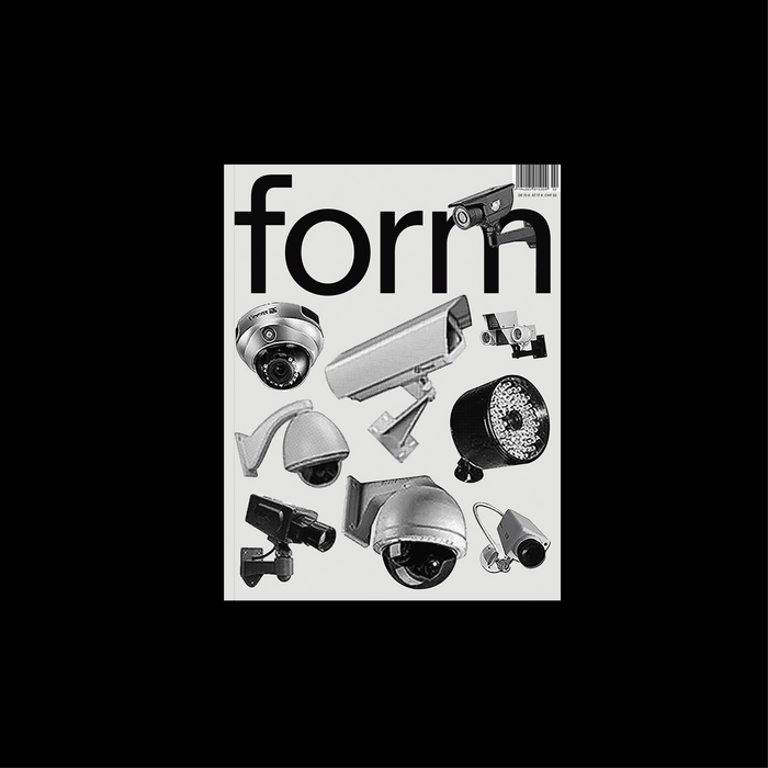
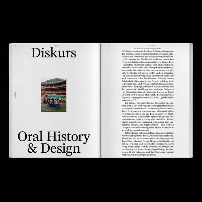
Outline Online’s OO Arketa in early use by Form. The typeface was specifically used as a pillar in the design magazine’s 2021 rebrand next to a custom version of ABC Diatype and Rosart. It was implemented by Autostrada Studios.
As the magazine wrote on the refresh (translated):
There are 63 years of design history between the first and the current edition of form. In 2021, the magazine underwent a redesign. Under the editorial direction of Anton Rahlwes and Nina Sieverding, the redesign respects the legacy of this iconic publication while also taking bold new steps.
“A redesign can happen for many reasons—business-driven, for optimization, or for ideological reasons. The most visible changes, like the layout of a magazine, are just the surface,” explains form’s editor-in-chief Anton Rahlwes. “For us, the redesign was about developing a clear visual and content-driven direction that supports our workflow and internal processes better than before.”
Leading the redesign was Max Hoffmann, Creative Director of Autostrada Studios in Berlin. “Max Hoffmann has a graphic style that is both precise and leaves room for new ideas. This combination felt very much in line with the version of form that we envisioned,” says Nina Sieverding, co-editor-in-chief of form. […]
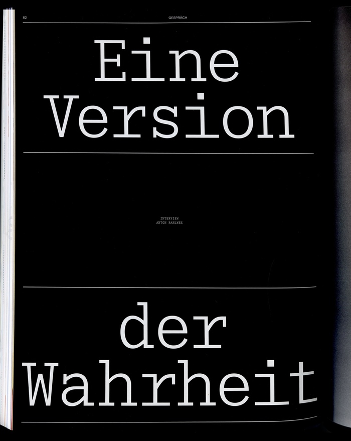
The iconic lowercase form logo has been preserved in its essence but carefully refined. The team collaborated with Dinamo Typefaces, a Swiss type foundry renowned for its expertise in contemporary type design.
“The logo is confident, not overly accommodating, and very much of the moment,” explains a team member from Dinamo.
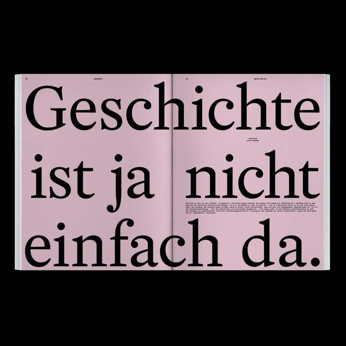
Dinamo not only designed the new form logo, featuring the characteristic lowercase “f,” but also developed a custom typeface, form Diatype, based on their existing “Diatype.” This typeface includes special features like a customized asterisk, which can be used as a gender-inclusive star in text—a detail especially important to the editorial team.
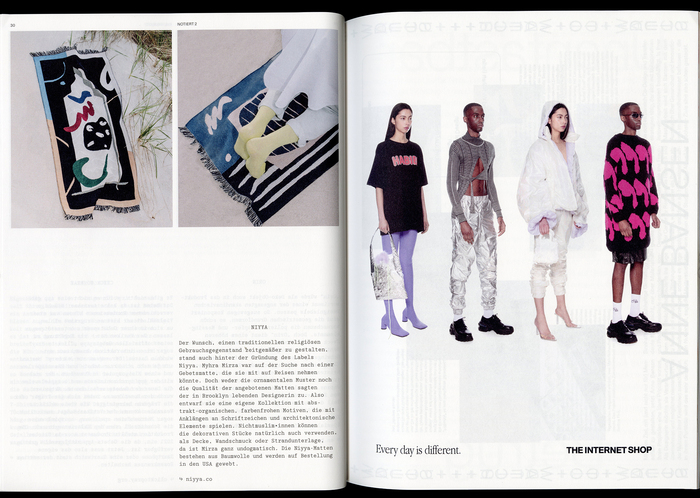
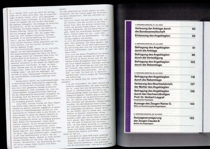
In addition to the new house typeface, two additional fonts have been introduced: the monospaced “Literature” [now named OO Arketa] by Laura Csocsán and Samira Schneuwly, and the serif “Rosart” by Katharina Köhler, distributed by Camelot Typefaces. These fonts add variety to recurring sections and allow for occasional visual breaks.
This look was introduced with issue 291 (March 2021) and used until the final double issue 300+301 (August 2023).
Outline Online. License: All Rights Reserved.

Outline Online. License: All Rights Reserved.
Outline Online. License: All Rights Reserved.

Outline Online. License: All Rights Reserved.
Outline Online. License: All Rights Reserved.
Source: form.de form. License: All Rights Reserved.
Outline Online. License: All Rights Reserved.
Outline Online. License: All Rights Reserved.
Outline Online. License: All Rights Reserved.
Outline Online. License: All Rights Reserved.
Source: form.de form. License: All Rights Reserved.
Outline Online. License: All Rights Reserved.
Source: form.de form. License: All Rights Reserved.

Outline Online. License: All Rights Reserved.
This post was originally published at Fonts In Use