Erika Guddemi identity
Published May 22, 2023
By FontsInUse
Contributed by Francesca Luzi
Source: francescaluzi.it Francesca Luzi. License: All Rights Reserved.


Source: francescaluzi.it Francesca Luzi. License: All Rights Reserved.
Source: francescaluzi.it Francesca Luzi. License: All Rights Reserved.
Source: francescaluzi.it Francesca Luzi. License: All Rights Reserved.

Source: francescaluzi.it Francesca Luzi. License: All Rights Reserved.

Source: francescaluzi.it Francesca Luzi. License: All Rights Reserved.

Source: francescaluzi.it Francesca Luzi. License: All Rights Reserved.

Source: francescaluzi.it Francesca Luzi. License: All Rights Reserved.
This post was originally published at Fonts In Use
Source: francescaluzi.it Francesca Luzi. License: All Rights Reserved.
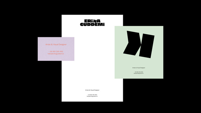
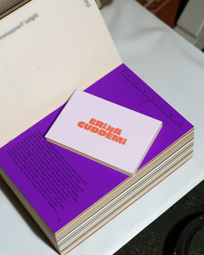
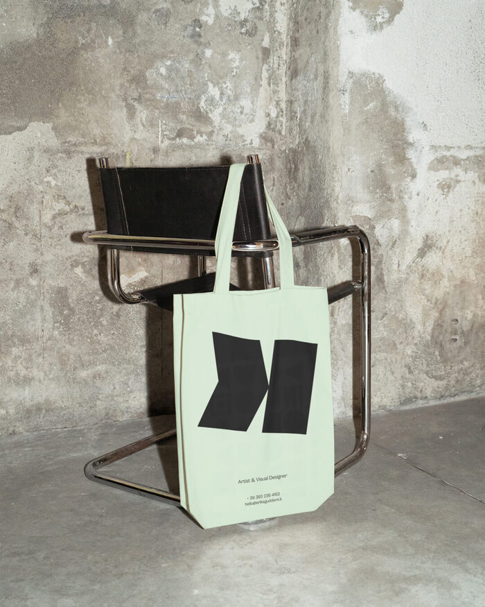
Erika Guddemi is a young artist and visual designer with a minimal and colorful style. Her projects range from UX-UI design to pyrography, which she also teaches in workshops, courses and events.
Her visual identity has been created by focusing on her versatility and ability to adapt from the digital world to the artistic one. The K, the distinctive letter of her name, has been modified in order to recreate a tip that recalls a pyrography, but also an arrow or a pencil. The oblique and on the contrary position is intended to underline the sense of dynamism and playfulness, which can also be found in the color palette and typographic choice.
Source: francescaluzi.it Francesca Luzi. License: All Rights Reserved.
Source: francescaluzi.it Francesca Luzi. License: All Rights Reserved.
Source: francescaluzi.it Francesca Luzi. License: All Rights Reserved.
Source: francescaluzi.it Francesca Luzi. License: All Rights Reserved.
Source: francescaluzi.it Francesca Luzi. License: All Rights Reserved.
Source: francescaluzi.it Francesca Luzi. License: All Rights Reserved.
Source: francescaluzi.it Francesca Luzi. License: All Rights Reserved.
This post was originally published at Fonts In Use
Read full story.
WRITTEN BY
FontsInUse
An independent archive of typography.
More from FontsInUse