Disinfo Radar brand identity

Source: www.behance.net License: All Rights Reserved.


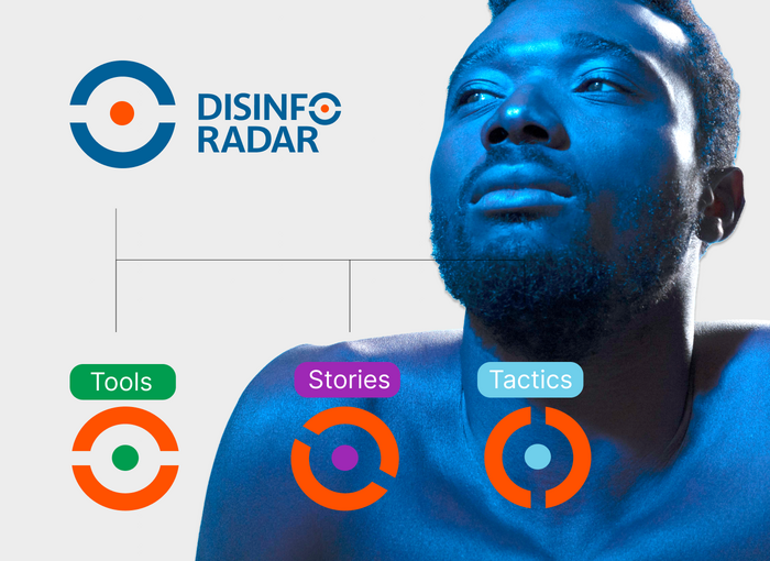
Disinfo Radar, under the Democracy Reporting International umbrella, is dedicated to raising social awareness and resilience against online disinformation threats. The project is structured around three main pillars: Tools, Tactics, and Stories, all designed to spot and counteract fake news.
Disinfo Radar operates much like a radar in the online medium: vigilant, open, and purpose-driven. The central symbol is flexible and emphasizes the three action pillars through the movement of the axis, embodying the clean and simple standards of navigational radar.
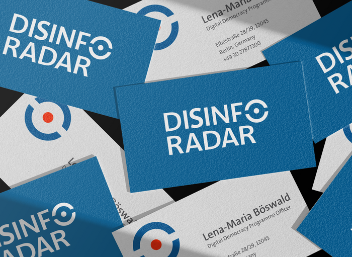
The logotype integrates the O as a radar analogy, simplified to serve as a discreet symbol attached to the logotype. This symbol can also stand alone, representing the vigilant and dynamic nature of Disinfo Radar.
Disinfo Radar's logo is based on Parisine Office, featuring a high x-height, clean and bold strokes. The visual identity utilizes Neuzeit-Grotesk Condensed Black for headlines, complemented by TheSans for body text.

License: All Rights Reserved.

License: All Rights Reserved.

License: All Rights Reserved.

License: All Rights Reserved.
License: All Rights Reserved.
License: All Rights Reserved.
This post was originally published at Fonts In Use