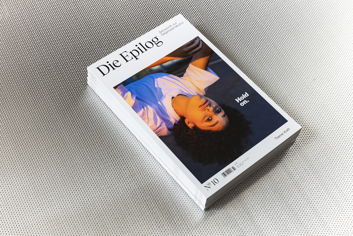
Die Epilog, issue 10: “Hold on. Thema: Kraft”
Source: www.die-epilog.de Photo: Die Epilog. Florian Reimann for Die Epilog. License: All Rights Reserved.


10th (and final) issue of Die Epilog, a German magazine that deals with the change of our society. By looking into the small things that are changing in our everyday lives, it wants to explore and welcome the bigger shift around us:
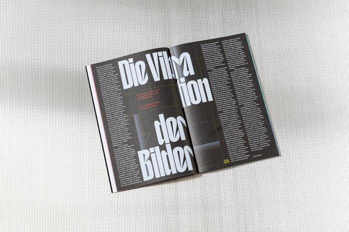
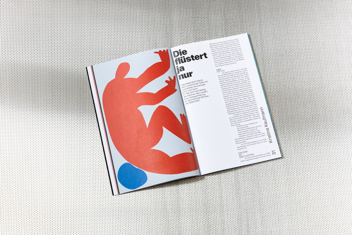
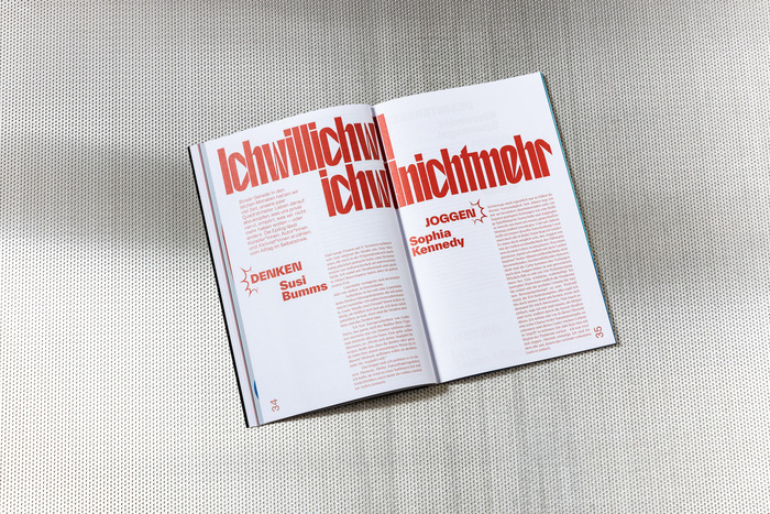
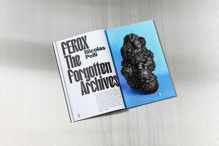
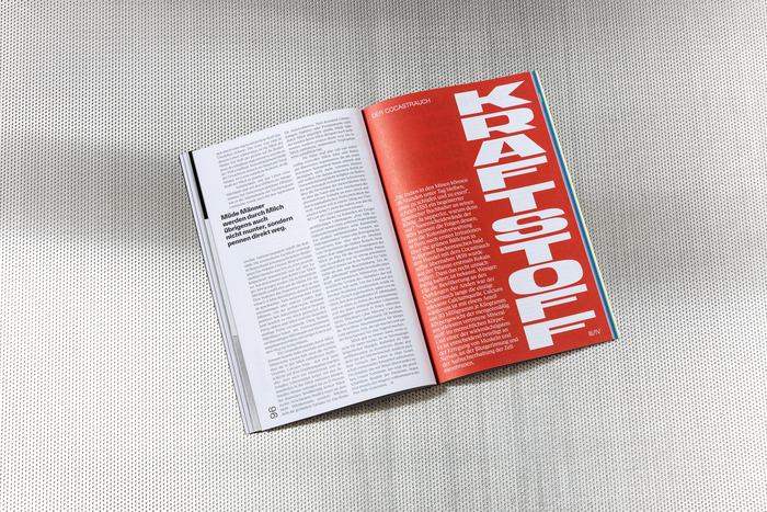
It’s going to get gross! Die Epilog is approaching an unpleasant concept: strength. The opposite of brains! Or is it? The raw, the crude! We set out to find the positive side of strength: how it moves, how it changes. How does political momentum arise? How do anabolic steroids work? Can we find it, this post-disgusting power? To do so, we’re taking the discourse to the gym and looking at the forces of our time: social, psychological, physical and magical forces that simmer, build up and erupt beneath the surface of culture, of things, of the earth’s crust. We look at mountains of muscle and beneath masks, and pull marble from its pedestal. A power-packed issue on the strength of parcel delivery workers, the power of anger, and the power of pumpernickel.
Die Epilog’s standard typefaces Tobias, Kern and Cardinal Short Italic were complemented by T1 Korium, TWK Everett and Generation Mono for this issue.
Source: www.die-epilog.de Photo: Die Epilog. Florian Reimann for Die Epilog. License: All Rights Reserved.
Source: www.die-epilog.de Photo: Die Epilog. Florian Reimann for Die Epilog. License: All Rights Reserved.
Source: www.die-epilog.de Photo: Die Epilog. Florian Reimann for Die Epilog. License: All Rights Reserved.
Source: www.die-epilog.de Photo: Die Epilog. Florian Reimann for Die Epilog. License: All Rights Reserved.
Source: www.die-epilog.de Photo: Die Epilog. Florian Reimann for Die Epilog. License: All Rights Reserved.
This post was originally published at Fonts In Use