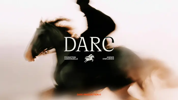
DARC
Source: www.elias.studio Elias. License: All Rights Reserved.


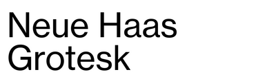
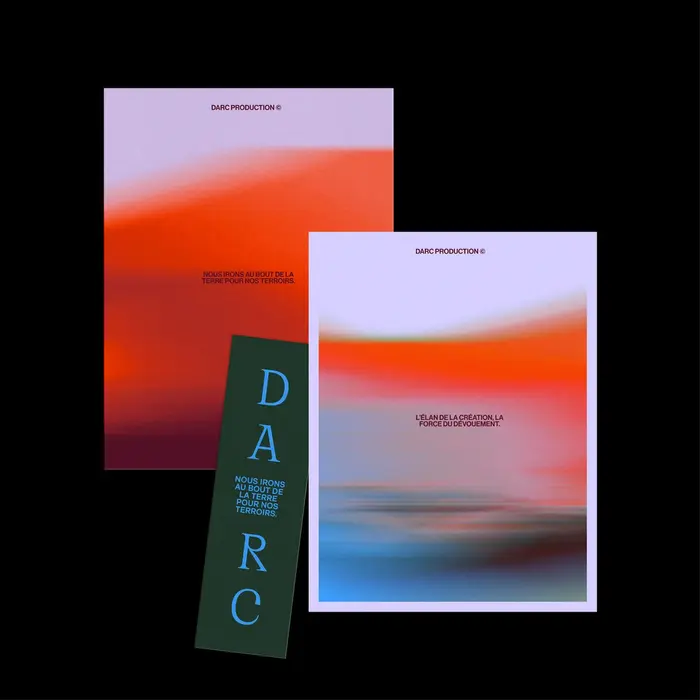
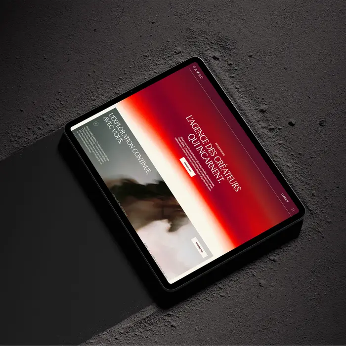
OT Jubilee and Neue Haas Grotesk are the typefaces used by Elias for the identity of DARC. The logo uses all-caps Cirka. From the studio’s case study (translated):
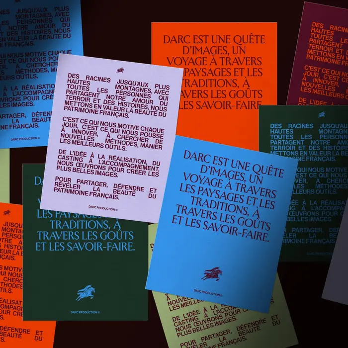
Darc is a next-generation agency that combines influencer marketing with video production. The agency excels in both areas. It identifies the right influencers, designs campaigns, and then produces high-quality content. This dual expertise ensures creative consistency and exceptional execution. Darc doesn’t outsource anything—it controls the entire value chain. […]
Darc takes its name from Joan of Arc—a symbol of bravery, authenticity, and purpose. The quest for the right images, the quest to elevate French heritage, the quest for growth. We built the brand around these values: authenticity versus artifice, creative courage versus timidity, elegance versus visual clutter. The quiet heroism of one who knows where she is going. A positioning that avoids the industry’s pitfalls—superficial coolness, forced youthfulness—to assert substance and ambition.
Source: www.elias.studio Elias. License: All Rights Reserved.
Source: www.elias.studio Elias. License: All Rights Reserved.

Source: www.elias.studio Elias. License: All Rights Reserved.
Source: www.elias.studio Elias. License: All Rights Reserved.
Source: www.elias.studio Elias. License: All Rights Reserved.
This post was originally published at Fonts In Use