Congresso Brasileiro de Gastronomia Entre Nós
Source: lanatta.com Lanatta. License: All Rights Reserved.

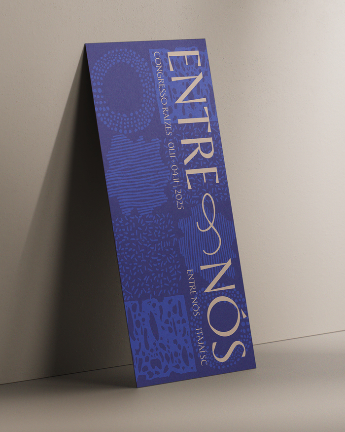
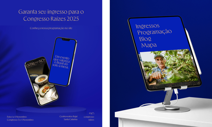
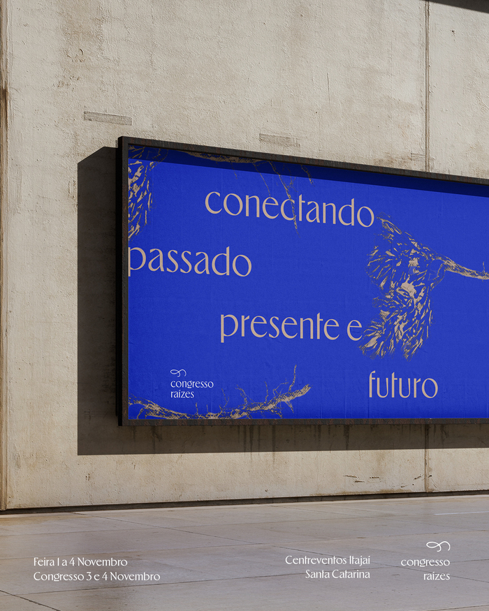
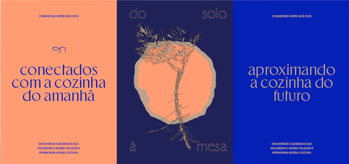
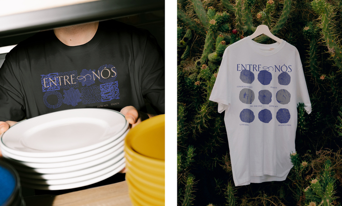
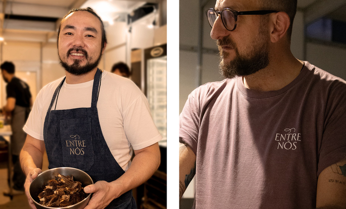
An update to the visual language of the Congresso Raízes, which is now known as Congresso Brasileiro de Gastronomia Entre Nós, or “Brazilian Gastronomy Congress Between Us”, celebrating the essential connections that drive gastronomy. The rebranding was done by design studio Lanatta, who had this to say about the design (translated):
Applying the personality of the color blue, already present in the previous brand, we reinforced the values of bringing together the expert and enthusiast audience to develop gastronomy at all points in the chain in a new icon, including the new language for photographic direction and applications in the Raízes brand's digital products.
The visual language is based on a strong use of the color blue, the typeface Ergon Light, a clear photographic art direction and a fluid shape as an icon for the event.
Source: lanatta.com Lanatta. License: All Rights Reserved.
Source: lanatta.com Lanatta. License: All Rights Reserved.
Source: lanatta.com Lanatta. License: All Rights Reserved.
Source: lanatta.com Lanatta. License: All Rights Reserved.

Source: lanatta.com Lanatta. License: All Rights Reserved.
Source: lanatta.com Lanatta. License: All Rights Reserved.
This post was originally published at Fonts In Use