clearvise

Source: www.arndtteunissen.de arndtteunissen. License: All Rights Reserved.

clearvise stands for environmentally friendly energy production through wind and solar parks as well as a biogas plant in Europe, combining sustainable values with attractive returns. As part of a strategic reorientation, a new brand name, an independent corporate design and an innovative website were created to meet the highest visual and technical standards.
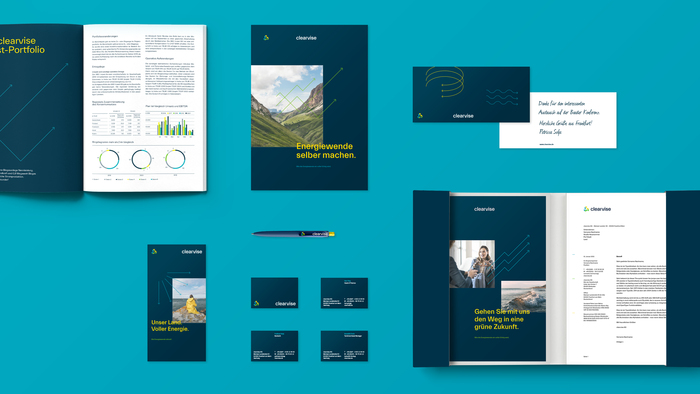
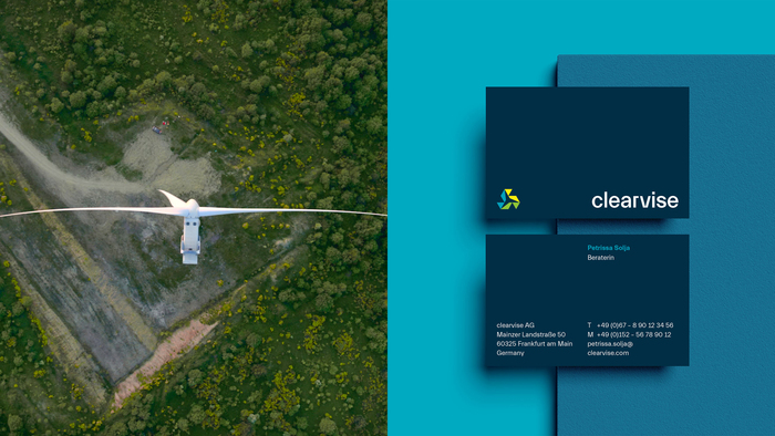
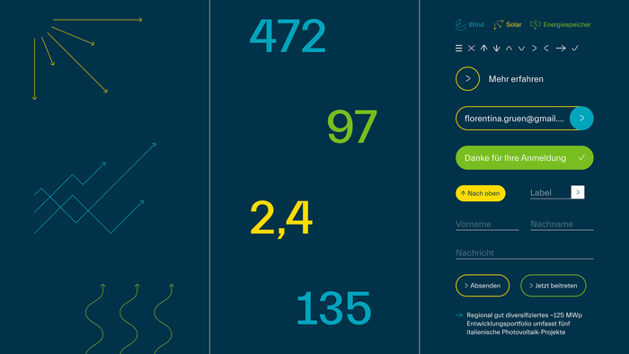
The new logo, inspired by a stylized wind turbine, symbolizes movement, energy and innovation. The brand name clearvise combines clarity and consulting, reflecting the commitment to sustainable projects with vision, expertise and long-term success. Dynamic arrow elements, inspired by natural forces such as wind and sun as well as the dynamics of the financial world, create a lively and energetic brand identity.
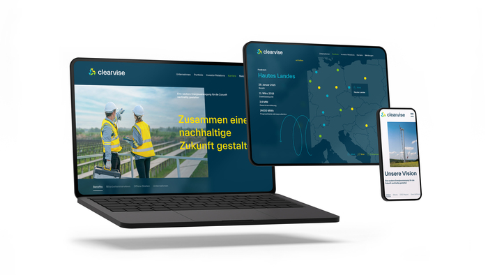
The site combines modern design with innovative web technology: fast load times ensure a seamless user experience, while dynamic content is delivered flexibly and efficiently. The result is a platform that is both visually appealing and functionally optimized, tailored to the needs of investors and stakeholders.
Professional brand communication is reinforced by the typography in TWK Everett, which blends organic forms with a clean, technical aesthetic. The color palette – with bold shades of dark blue complemented by vibrant accents of yellow, green and blue – creates trust and emphasizes the focus on renewable energy sources. In this way, clearvise combines high-quality design with sustainable energy and a clear vision for the future.
Source: www.arndtteunissen.de arndtteunissen. License: All Rights Reserved.
Source: www.arndtteunissen.de arndtteunissen. License: All Rights Reserved.

Source: www.arndtteunissen.de arndtteunissen. License: All Rights Reserved.
Source: www.arndtteunissen.de arndtteunissen. License: All Rights Reserved.
Source: www.arndtteunissen.de arndtteunissen. License: All Rights Reserved.

Source: clearvise.de License: All Rights Reserved.
This post was originally published at Fonts In Use