Claremont Savings Bank logo
Published May 24, 2026
By FontsInUse
Contributed by Richard Sheaff
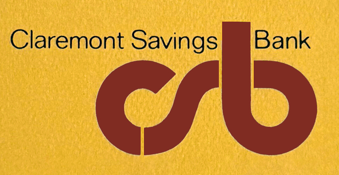
Richard Sheaff. License: All Rights Reserved.


This post was originally published at Fonts In Use
Richard Sheaff. License: All Rights Reserved.
Looking through my way-back files, I found that I used Letraset’s Pump for a second logo project in the early 1970s. I used Pump because it was an absolute natural for combining the three lowercase initials, c s b. They flow one into the other in a satisfying way. In my mind's eye I saw it further as a three-dimensional tubular metal sculpture set on a patch of lawn in front of the bank, but that was not in the cards.
This post was originally published at Fonts In Use
Read full story.
WRITTEN BY
FontsInUse
An independent archive of typography.
More from FontsInUse