Children’s Cancer Run

Source: thisisrice.com Rice Studios, Children's Cancer Run 2024.
The Children’s Cancer Run united change-makers in Vietnam, to push cancer treatment forward. Organized by the Canadian Chamber of Commerce Vietnam, VinaCapital Foundation and Vietnam Children’s Fund, the run raised much-needed funds and set into motion an annual and growing event and community.
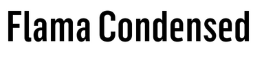
Flama Condensed Black, as the primary font, allows for a bold and strong statement, as Children’s Cancer Run wants to be recognized as a brand. The secondary font, Neue Helvetica Roman (not shown in this image selection), also supports Vietnamese. It helps express long information, body text, or cases in which a neat and neutral font is required.
Each step taken improved lives, raised awareness, built momentum, and ignited hope for a brighter future. Rice is honored to have crafted an identity that amplified the mission. The simple and bold message-driven identity will serve for years to come.
See the full case study.

Source: thisisrice.com Rice Studios, Children's Cancer Run 2024.

Source: thisisrice.com Rice Studios, Children's Cancer Run 2024.

Source: thisisrice.com Rice Studios, Children's Cancer Run 2024.

Source: thisisrice.com Rice Studios, Children's Cancer Run 2024.
This post was originally published at Fonts In Use