Chico Loco
Source: withanak.com License: All Rights Reserved.


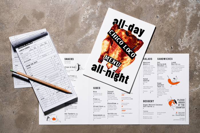
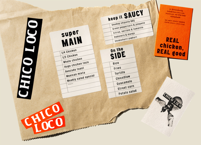
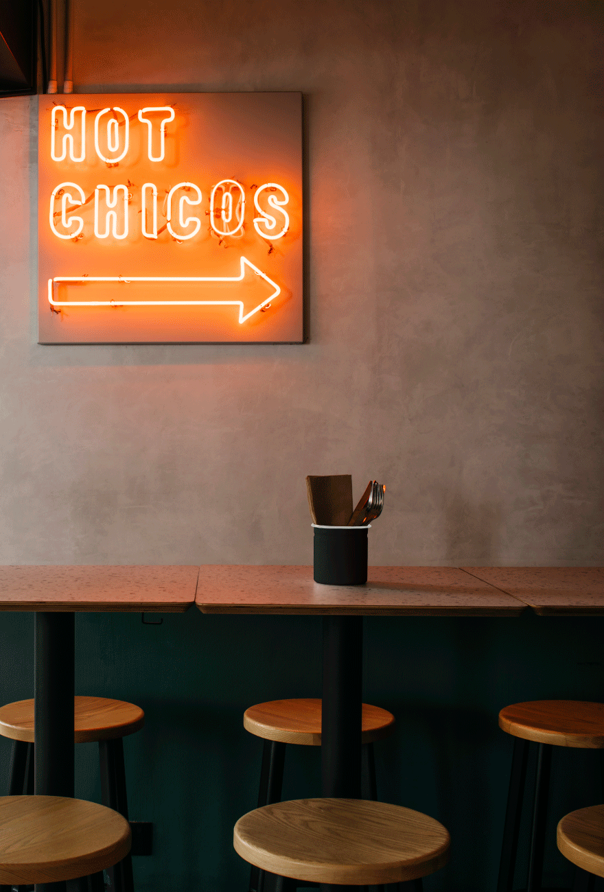
Branding for a healthy fast-casual concept focusing on authentic Mexican grilled chicken in Singapore. It had to shout “healthy” – because it was. But it couldn’t feel boring – because it wasn’t. The branding was more than just a new identity, but a completely fresh approach to the health-food category as a whole. Dubbed the ‘dirty health’ movement, an entire way of life championed by Chico Loco, the makers of food worth getting dirty for.
The typography pairs two contrasting typefaces with the same name: Elephant (Playtype) was utilised in the wordmark; the organic, hand-rendered quality of the letterforms encapsulating the eat-with-your-hands, ‘dirty-health’ spirit of the new brand. As a tonal complement, Elephant (Alias) lent a bold voice to the brand that was contemporary and characterful.

Source: withanak.com License: All Rights Reserved.
Source: withanak.com License: All Rights Reserved.
Source: withanak.com License: All Rights Reserved.

Source: withanak.com License: All Rights Reserved.

Source: withanak.com License: All Rights Reserved.
This post was originally published at Fonts In Use