Casio G-SHOCK 6900 watch series
License: All Rights Reserved.
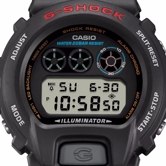
Front-view of the DW-6900U-1ER, one of the first models ever released and considered the entry point to the 6900 series.



While not the first G-SHOCK to use a rounded form, the 6900 is undeniably the most iconic variant of it. Since its release in 1995, the watch not only gained its credibility from street fashion but has also uniquely cemented itself into the world of hip-hop, with much of the same reliability and fervour as any other G-SHOCK has.
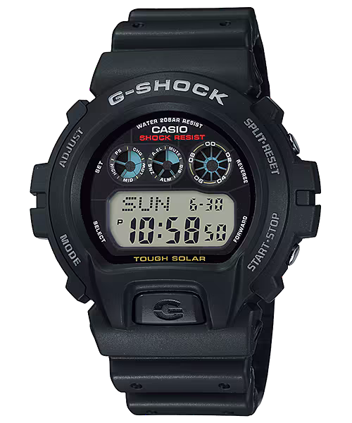
In usual Casio fashion, the entire dial of the 6900 primarily uses Eurostile for its various wordmarks. The LCD font does vary depending on the model with newer models such as the Tough Solar variant having a bolder font for its dial.
Around the time the 6900 lineup was launched, Casio began to use a new square sans-serif mainly on their round G-SHOCKS. Bizzarely, this font can only be seen in the etched wording on the case. At first, it kind of resembles Eurostile but letters such as the S can be spotted at a glance and mark it as a different font.
Source: www.casio.com License: All Rights Reserved.
The G-6900-1, a version with Tough Solar
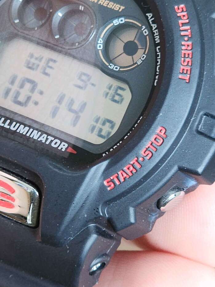
Photo: Alex Nguyen. License: All Rights Reserved.
A closeup of my DW-6900TR-1
Source: www.casio.com License: All Rights Reserved.
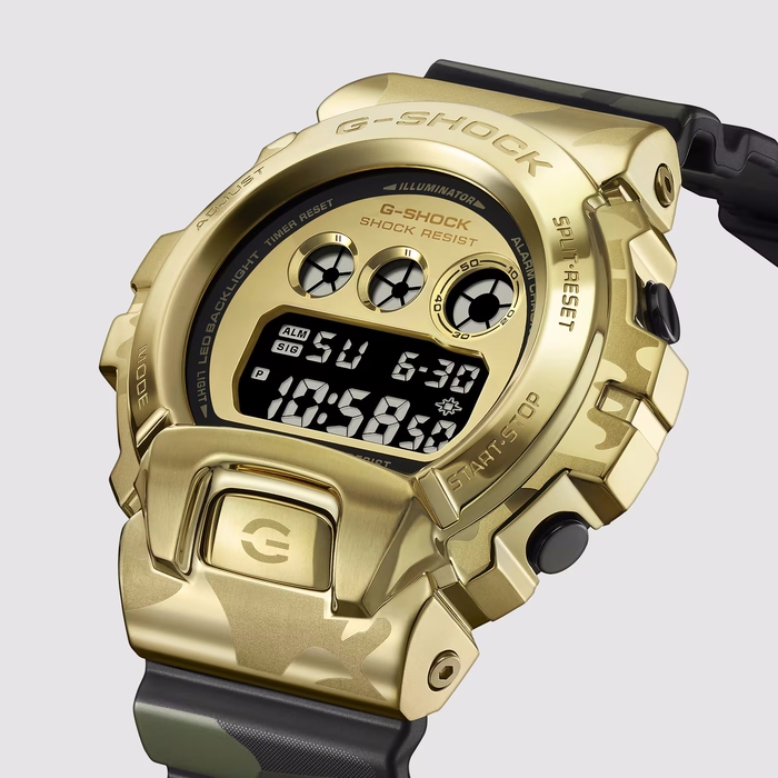
A side-view of the GM-6900CMG-3, a half-metal variant released as part of G-SHOCK’s “Bold Camo” series
License: All Rights Reserved.
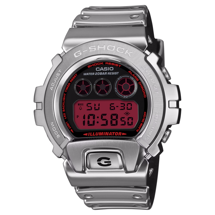
Front view of the GM6900YRA-8, another half-metal version
Source: www.reddit.com License: All Rights Reserved.
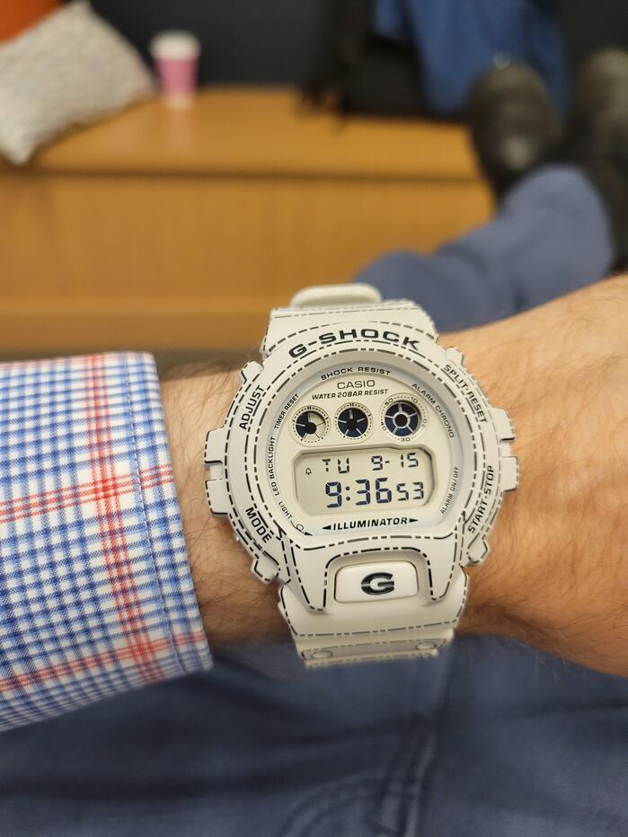
A Reddit user wearing the DW-6900RGM
This post was originally published at Fonts In Use