Carmen Cheung
Published September 29, 2026
By FontsInUse
Contributed by Alina Skyson
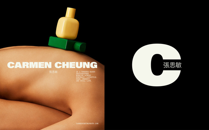
Source: alinaskyson.com Photos: Carmen Cheung. Design: Alina Skyson. License: All Rights Reserved.


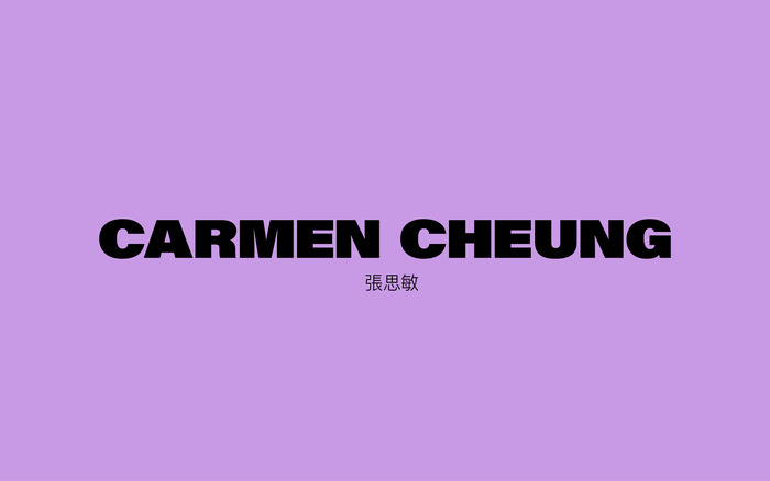
Source: alinaskyson.com Photos: Carmen Cheung. Design: Alina Skyson. License: All Rights Reserved.
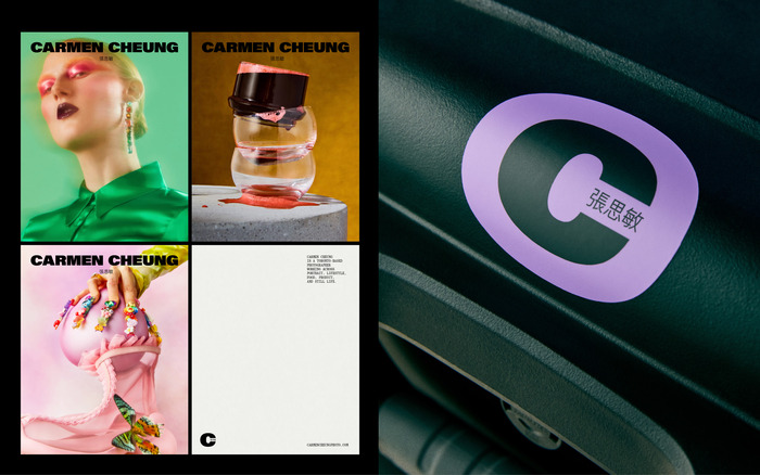
Source: alinaskyson.com Photos: Carmen Cheung. Design: Alina Skyson. License: All Rights Reserved.
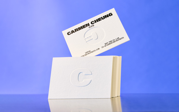
Source: alinaskyson.com Photo: Alina Skyson. Photos: Carmen Cheung. Design: Alina Skyson. License: All Rights Reserved.
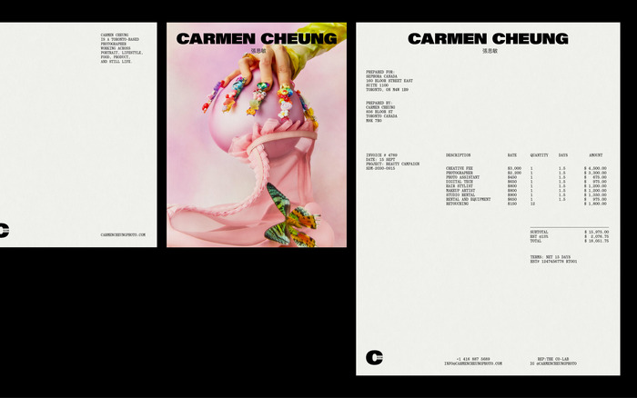
Source: alinaskyson.com Photos: Carmen Cheung. Design: Alina Skyson. License: All Rights Reserved.
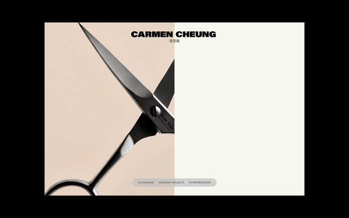
Source: alinaskyson.com Photos: Carmen Cheung. Design: Alina Skyson. License: All Rights Reserved.
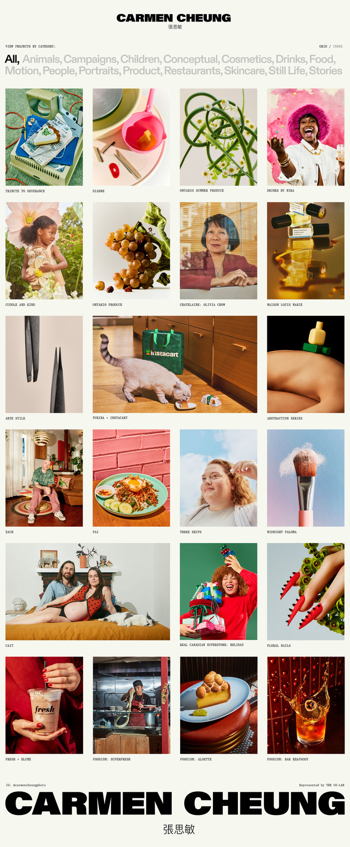
Source: alinaskyson.com Photos: Carmen Cheung. Design: Alina Skyson. License: All Rights Reserved.
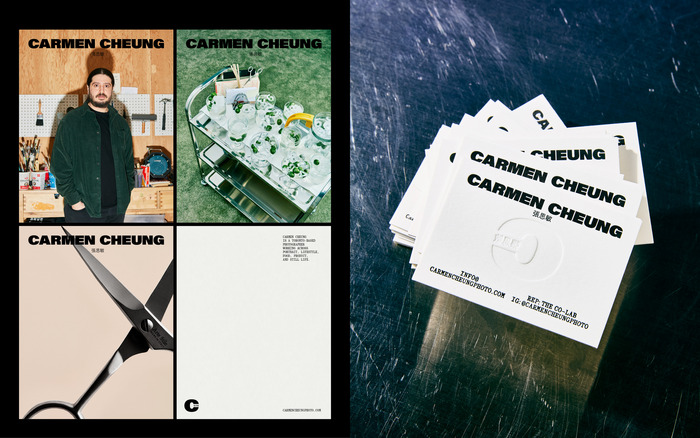
Source: alinaskyson.com Photos: Carmen Cheung. Design: Alina Skyson. License: All Rights Reserved.
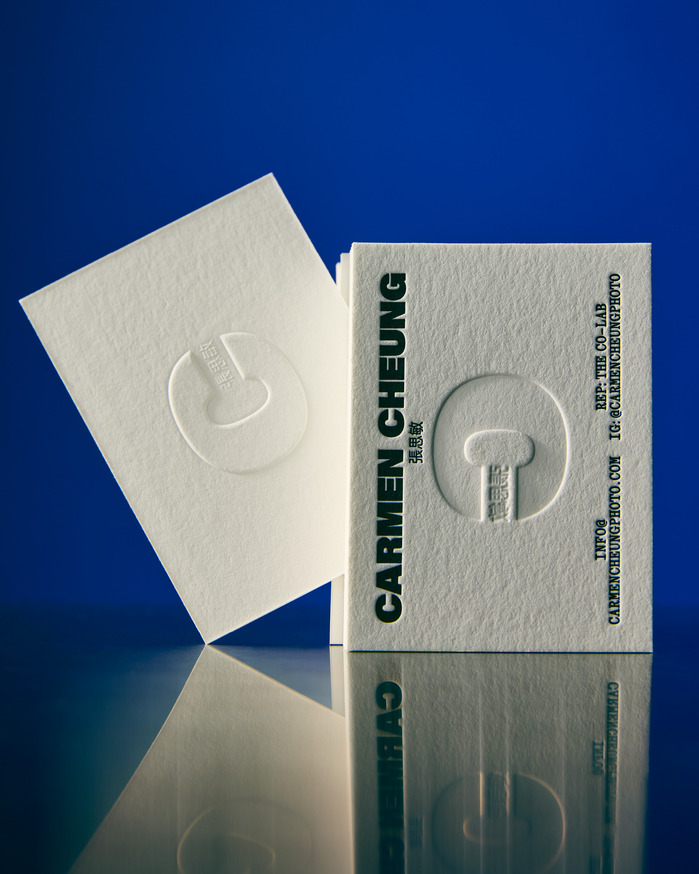
Source: alinaskyson.com Photos: Carmen Cheung. Design: Alina Skyson. License: All Rights Reserved.
This post was originally published at Fonts In Use
Source: alinaskyson.com Photos: Carmen Cheung. Design: Alina Skyson. License: All Rights Reserved.
Carmen Cheung os a Toronto-based photographer whose work spans portrait, lifestyle, food, product and still life.
Her new visual identity is anchored by a custom bilingual wordmark pairing Carmen’s English and Chinese names, alongside a custom C symbol used across print and digital applications. ABC Diatype Bold from Dinamo and Quadrant Text Mono from Matter of Sorts are used throughout, creating a consistent visual language while allowing the photography to remain the focus. The fonts used for the logo are PingFang from DynaComware and Adobe’s Acumin Ultra Black.
The identity extends across the website and printed pieces, including letterpress and blind-embossed business cards, stationery and promotional stickers.
Source: alinaskyson.com Photos: Carmen Cheung. Design: Alina Skyson. License: All Rights Reserved.
Source: alinaskyson.com Photos: Carmen Cheung. Design: Alina Skyson. License: All Rights Reserved.
Source: alinaskyson.com Photo: Alina Skyson. Photos: Carmen Cheung. Design: Alina Skyson. License: All Rights Reserved.
Source: alinaskyson.com Photos: Carmen Cheung. Design: Alina Skyson. License: All Rights Reserved.
Source: alinaskyson.com Photos: Carmen Cheung. Design: Alina Skyson. License: All Rights Reserved.
Source: alinaskyson.com Photos: Carmen Cheung. Design: Alina Skyson. License: All Rights Reserved.
Source: alinaskyson.com Photos: Carmen Cheung. Design: Alina Skyson. License: All Rights Reserved.
Source: alinaskyson.com Photos: Carmen Cheung. Design: Alina Skyson. License: All Rights Reserved.
This post was originally published at Fonts In Use
Read full story.
WRITTEN BY
FontsInUse
An independent archive of typography.