Call of Duty 4 Modern Warfare video game
Source: www.thecoverproject.net License: All Rights Reserved.


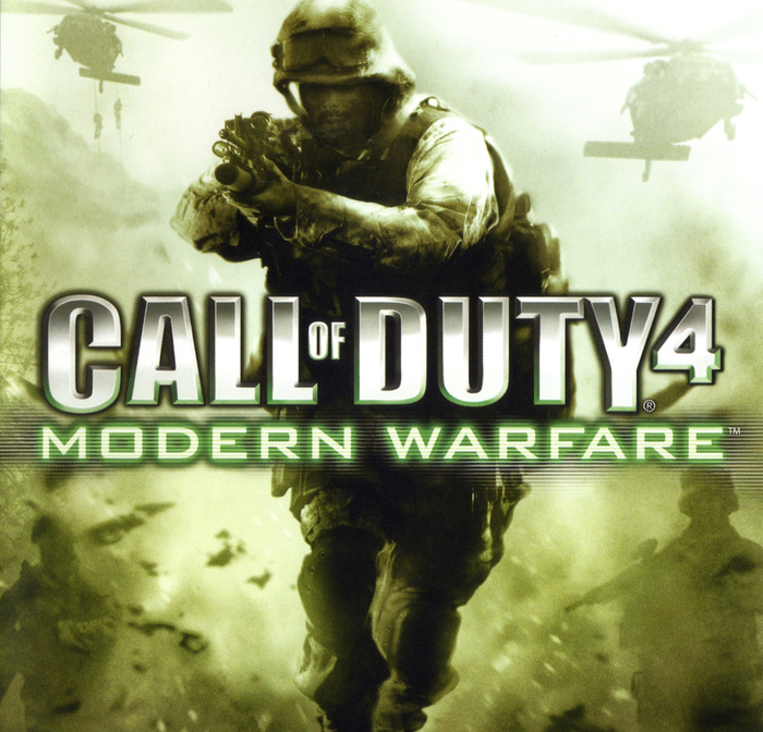
Call of Duty 4: Modern Warfare is the fourth installment in the Call of Duty franchise. It is the first to be set in the modern times, straying away from its World War 2 roots. The game’s overall look is heavily based on 2000s military (movies) aesthetics. The typography reflects this with imposing, geometric typefaces that evoke a feeling of power and a maybe tinge of futurism, since the game takes place in a fictional 2011.
The series’ logo used Impact, with bevel and chrome effect applied. The “Modern Warfare” text is set in Bank Gothic, which is glowing green and is likely a reference to night vision goggles. A majority of the user interface uses ITC Conduit Regular for both short and long text. It is complimented with Carbon Bold, which is used sparingly for important information.
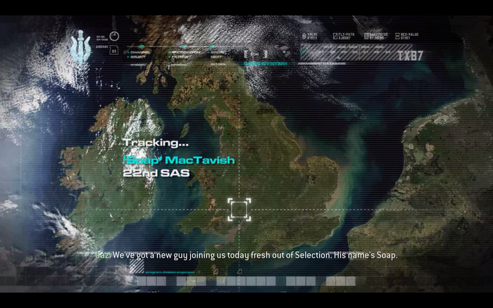
The briefing cut-scenes between each chapter use Eurostile’s normal and extended width for most information. Another blocky typeface (or lettering?) is additionally used for small text. It’s located at the top right of most cut-scenes.
Source: en.m.wikipedia.org License: All Rights Reserved.
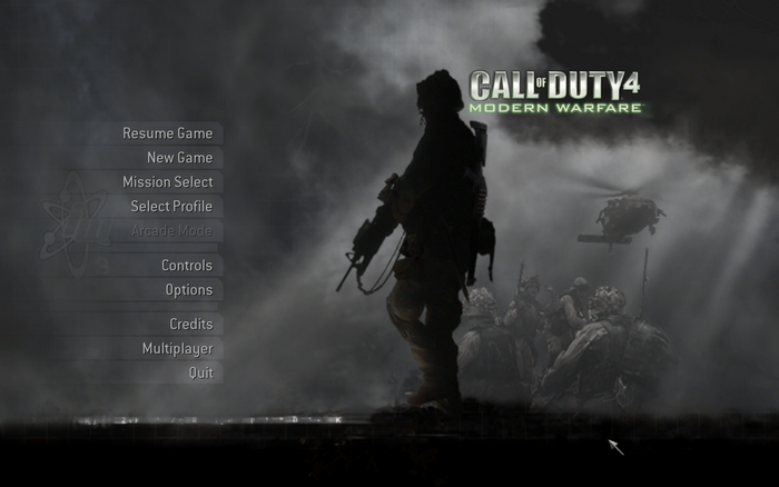
Game logo
License: All Rights Reserved.
Main menu for the arcade mode
License: All Rights Reserved.
The first cut-scene you watch in the game. Eurostile Extended Bold can be seen used for both big and small text. The unknown typeface I had mentioned appears at the top right, at the “TX87” text.
License: All Rights Reserved.
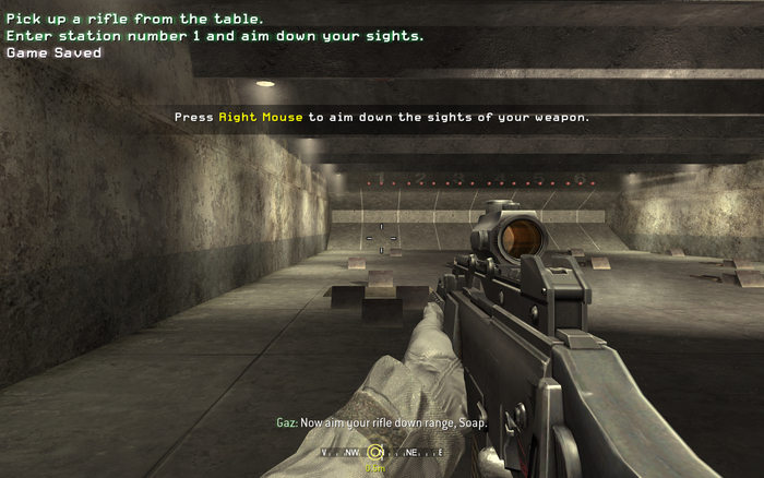
Learning the basics at the target range. Carbon is used to display newly added mission objectives and the occasional button prompt. ITC Conduit is seen below.
License: All Rights Reserved.
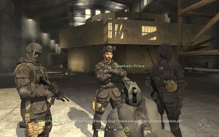
When looking at friendly characters, their name appears and is set in Carbon. Here, Captain Price is belittling Soap for his name.

License: All Rights Reserved.
Loading screen in multiplayer

License: All Rights Reserved.
Choosing a loadout before a match

License: All Rights Reserved.
Multiplayer HUD. Carbon is used with the exception of the compass and the amount of grenades you have stored.
This post was originally published at Fonts In Use