Byrne Eyecare
Source: goodam.studio License: All Rights Reserved.


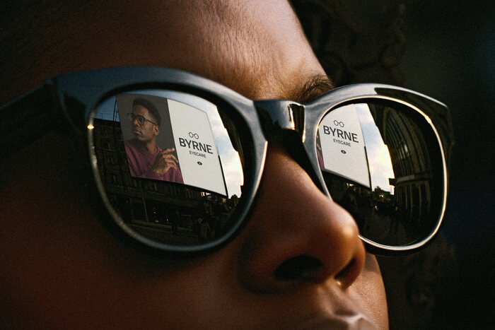
Byrne Eyecare is an independent optician built on a more personal, appointment-led approach to eyecare. With the opening of a new location in New Ross, the brand needed to evolve, becoming more confident and considered while maintaining the trust already established in Kilkenny.
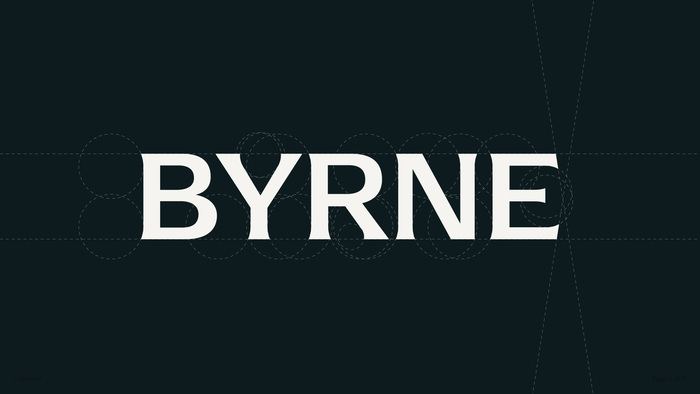
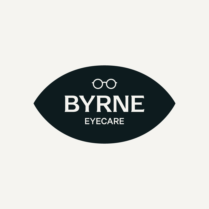
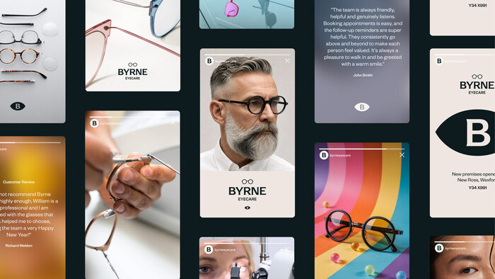
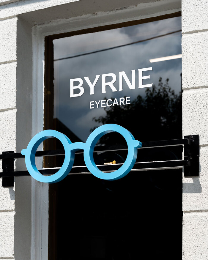
The project focused on evolution rather than reinvention. The logo is based on Arpona byFloodfonts, refined with subtle flared details that reference the curvature of optical lenses. A clean sans-serif – Founders Grotesk from Klim Type Foundry – supports the system, creating contrast and reinforcing readability across applications.
A restrained palette of warm neutrals creates a calm and considered foundation, while a refined blue provides clarity and a connection to the optical category. The existing Byrne Eyecare blue was retained and refined as part of the evolution of the identity. Rather than acting as the dominant brand colour, it was repositioned as a more restrained accent within the wider system.
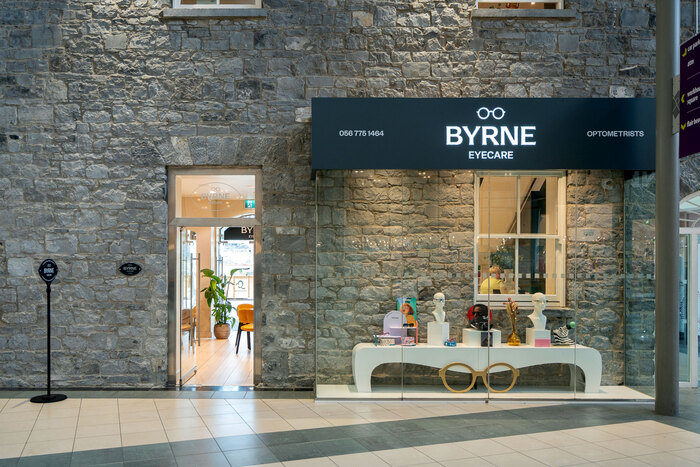
The new identity was brought to life across both Byrne Eyecare locations, with the signage designed to feel clear, distinctive and consistent within each setting.
Source: goodam.studio License: All Rights Reserved.
Source: goodam.studio License: All Rights Reserved.
Source: goodam.studio License: All Rights Reserved.
Source: goodam.studio License: All Rights Reserved.
Source: goodam.studio License: All Rights Reserved.
This post was originally published at Fonts In Use