Britney Spears – Blackout album and singles cover art

Source: alliwantispop.blogspot.com License: All Rights Reserved.
Blackout cover art


From Wikipedia:
Blackout is the fifth studio album by American singer Britney Spears. It was released on October 25, 2007, by Jive Records. Its production and release occurred as Spears’ personal struggles were highly publicized and overshadowed her professional projects.
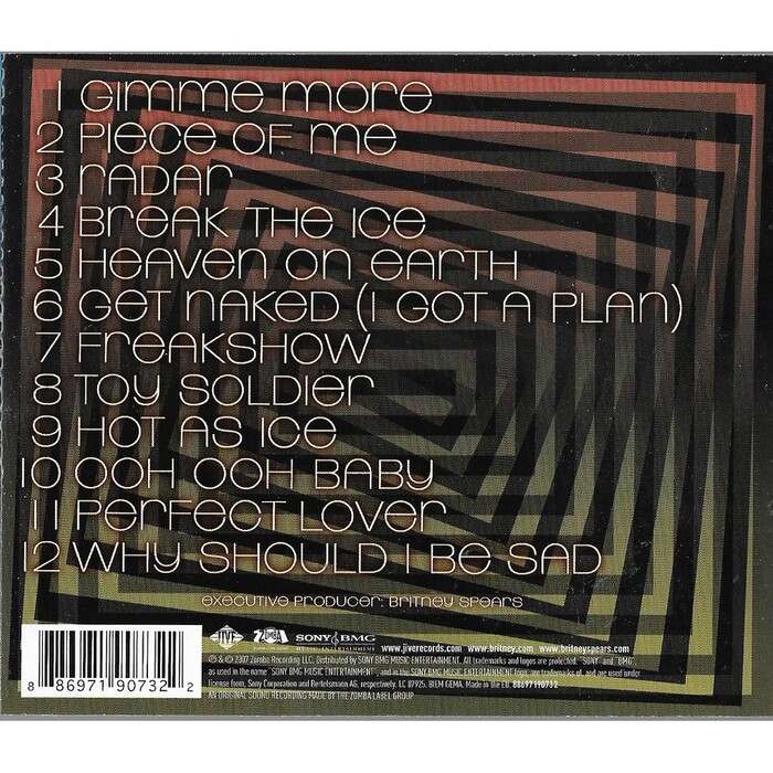
The album art and three of the singles (“Piece of Me”, “Break the Ice”, and “Radar”) use Linear for the titles, and much of the secondary text like tracklists and liner notes. Linear is one of those fonts that encourages the mixing of capitals and lowercase, by making the capital height the same as the x-height. There are actual ascenders and descenders but they extend by only a tiny amount (in l, p and y for example), but here they have all been eliminated by choosing whichever form avoids the extension.
The consistency of “Britney Spears” in particular makes it a wordmark used for a short period (the fans agree too, it often appears in fan art associated with this period).
Art direction and design by Glen Nakasako, Jackie Murphy, and Jeri Heiden, with photography by Ellen von Unwerth.
Source: www.cdandlp.com License: All Rights Reserved.
Blackout, CD back cover
Source: immaculatebritneycollection.blogspot.com License: All Rights Reserved.
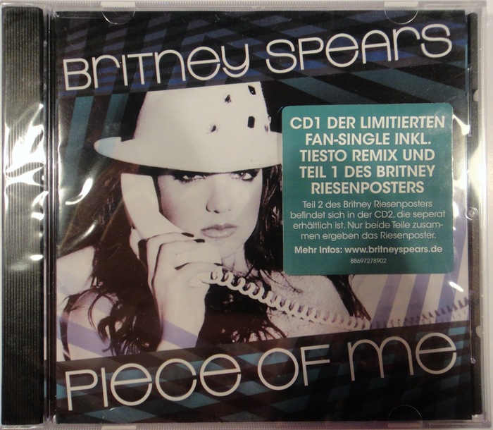
“Piece of Me” CD single cover, limited edition. The sticker with German text uses ITC Avant Garde Gothic.
Source: booklet-landia.blogspot.com License: All Rights Reserved.
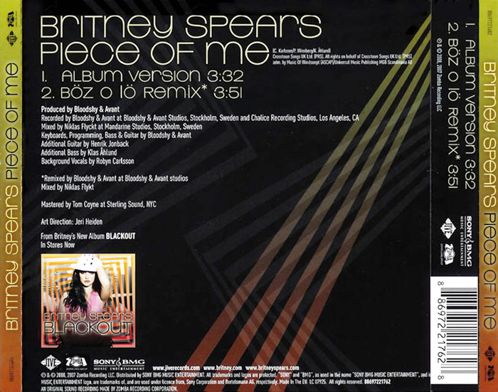
“Piece of Me” back of CD single

Source: www.imdb.com License: All Rights Reserved.
Artwork for official music video for “Break the Ice”; appears to be the same as the single, but possibly with a vignette effect added. Note shadow effect to suggest the lettering is suspended above the background.

Source: booklet-landia.blogspot.com License: All Rights Reserved.
CD art. Note the text is not rotated. Until you put it in a CD player.

License: All Rights Reserved.
“Break the Ice” CD single back cover. Small text appears to be in Trade Gothic.

Source: britneyspears.fandom.com License: All Rights Reserved.
“Radar” CD art, promo version
This post was originally published at Fonts In Use