Bottega Longo packaging
Source: www.rsztype.com License: All Rights Reserved.


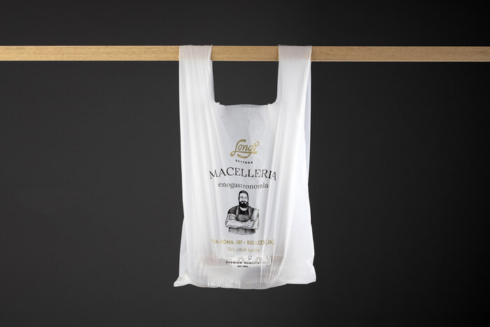
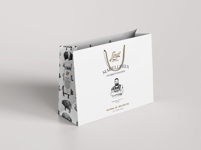
Bottega Longo is a butcher’s shop in Bellizzi, Salerno (Italy), known for the production of quality sausages and for the sale of first choice meats, gastronomic products, and selected wines
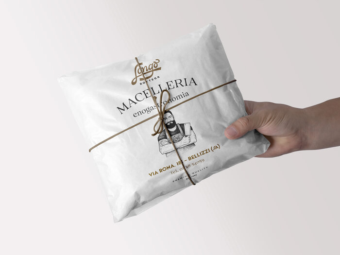
Basile and Resistenza have designed the logotype using original lettering. We also created elegant and contemporary packaging that differentiates itself from competitors, allowing the brand to enter the market, attracting the consumer’s attention using a Pantone gold.
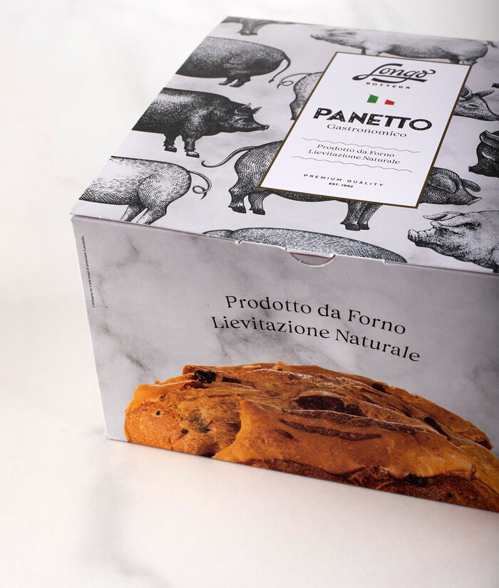
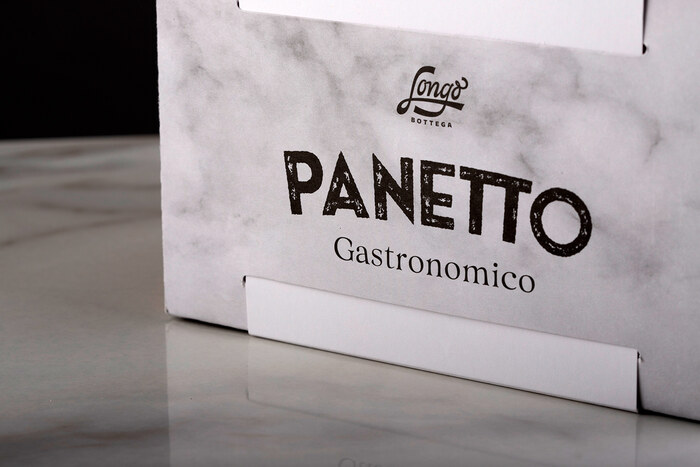
For the packaging we have been using a combination of Nostalgia and The Luxx with black ink. In the word Panetto, we utilized a ligature for the double T.
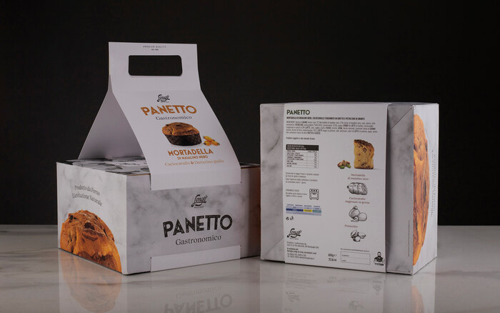
The characterising element of the pack are the illustrations, which evoke the craftsmanship of the product and give the pack a vintage style in a modern key.
Few carefully calibrated elements to give the packaging authenticity and excellence. The result is a distinctive and captivating design that communicates the corporate values and is aimed at an attentive consumer with a refined taste.
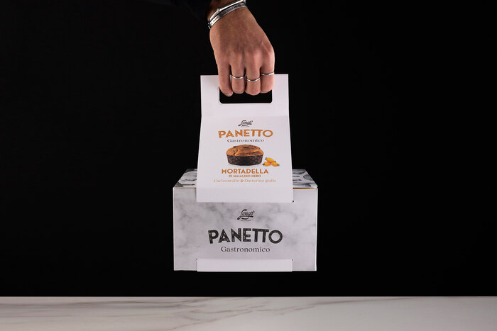
One more thing about the functionality of the 2022 pack: the band that acts as a handle, inserted through the cuts in the primary packaging, allows at the same time to differentiate the various references, make the product transportable without the aid of shoppers and facilitate recycling for the end user.
Source: www.rsztype.com License: All Rights Reserved.
Source: www.rsztype.com License: All Rights Reserved.
Source: www.rsztype.com License: All Rights Reserved.
Source: www.rsztype.com License: All Rights Reserved.
Source: www.rsztype.com License: All Rights Reserved.
Source: www.rsztype.com License: All Rights Reserved.
This post was originally published at Fonts In Use