Bloom brand and packaging redesign
Published April 7, 2023
By FontsInUse
Contributed by Paul Marcucilli
Source: riser.design Riser. License: All Rights Reserved.


Source: riser.design Riser. License: All Rights Reserved.
Source: riser.design Riser. License: All Rights Reserved.
Source: riser.design Riser. License: All Rights Reserved.
Source: riser.design Riser. License: All Rights Reserved.
Source: riser.design Riser. License: All Rights Reserved.
This post was originally published at Fonts In Use
Source: riser.design Riser. License: All Rights Reserved.
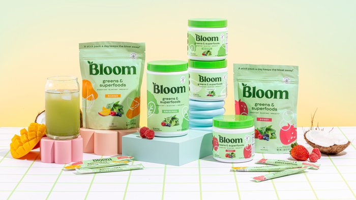
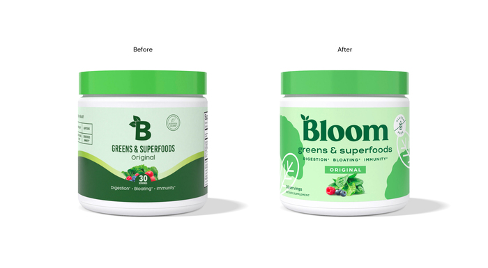
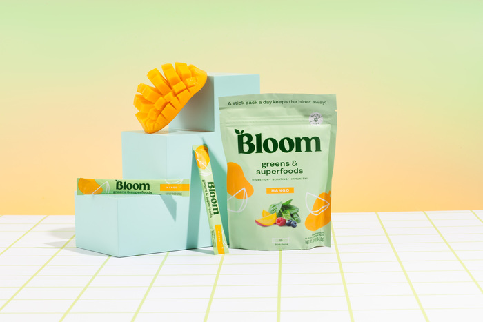
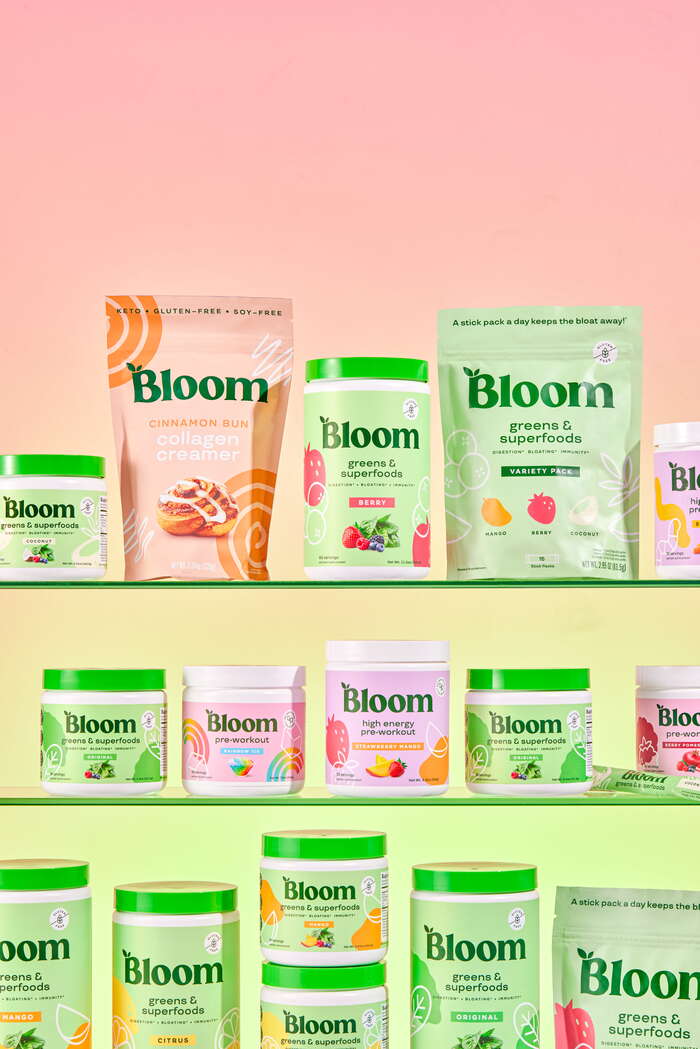
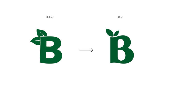
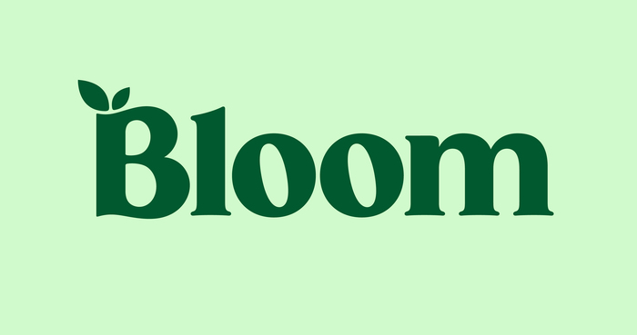
Bloom was created to help women who are intimidated by supplements (and fitness overall) meet their full potential. The branding utilizes stylized ingredient illustrations to add modernity and charm, while a cleaned-up communication hierarchy brings focus to each SKU’s unique benefit. The logomark is a custom form of the typeface Gazpacho, transitioning the existing B into a more elevated, memorable, and curvaceous “Bloom” that health-conscious females can relate to. TT Travels and Timesquare serve as the brand’s primary fonts, used for all brand messaging.
Source: riser.design Riser. License: All Rights Reserved.
Source: riser.design Riser. License: All Rights Reserved.
Source: riser.design Riser. License: All Rights Reserved.
Source: riser.design Riser. License: All Rights Reserved.
Source: riser.design Riser. License: All Rights Reserved.
This post was originally published at Fonts In Use
Read full story.
WRITTEN BY
FontsInUse
An independent archive of typography.
More from FontsInUse