BBC Sound Effects No. 1–9 album series
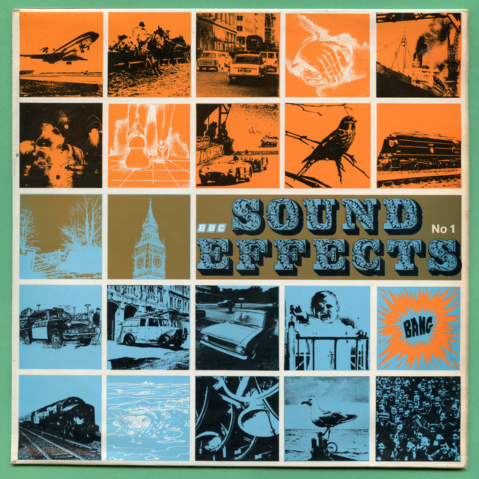
Source: www.flickr.com Leo Reynolds. License: All Rights Reserved.
Cover of the original 1969 album, with “No 1” added in Helvetica













Starting in 1969 the BBC began releasing albums compiling sound effects from the BBC Sound Effects Library. A large number of albums would follow in this series, covering a range of themes and topics, with the last one being released in 1984.
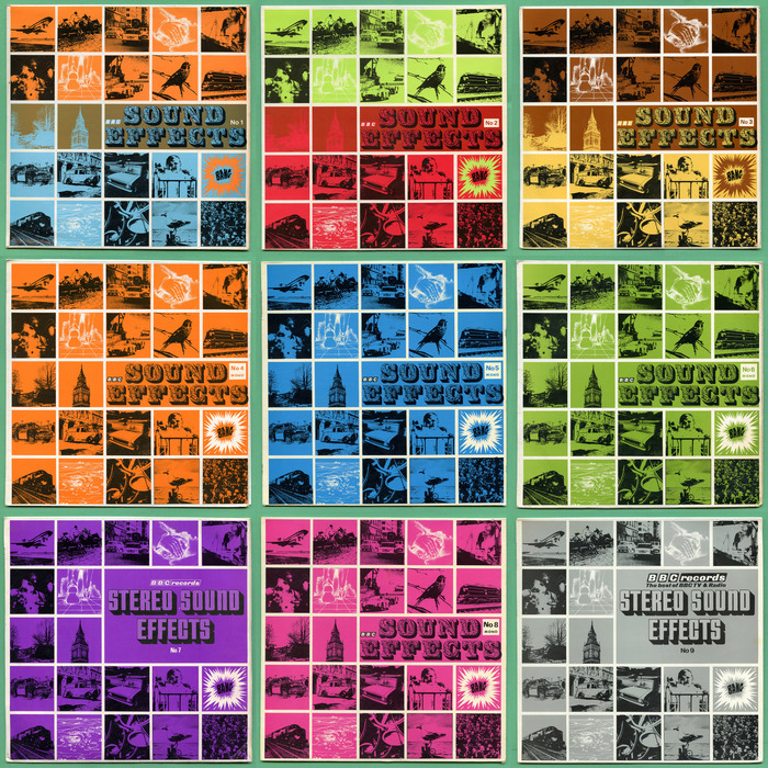
For the first nine releases, a consistent design was used: A collage of images in a grid, tinted in a small number of colours to create a striking effect. For No. 1 to 6 and 8, the title was set in a two-color setting of Lettres Ornées. No. 7 and 9 instead use Stark Raving.
The first nine albums were later reissued with completely different cover designs. These new ones featured a different font for each release, which are covered individually below.
The design for the first four albums is credited to Roy Curtis-Bramwell. No designers are credited for the remaining albums or the reissues.
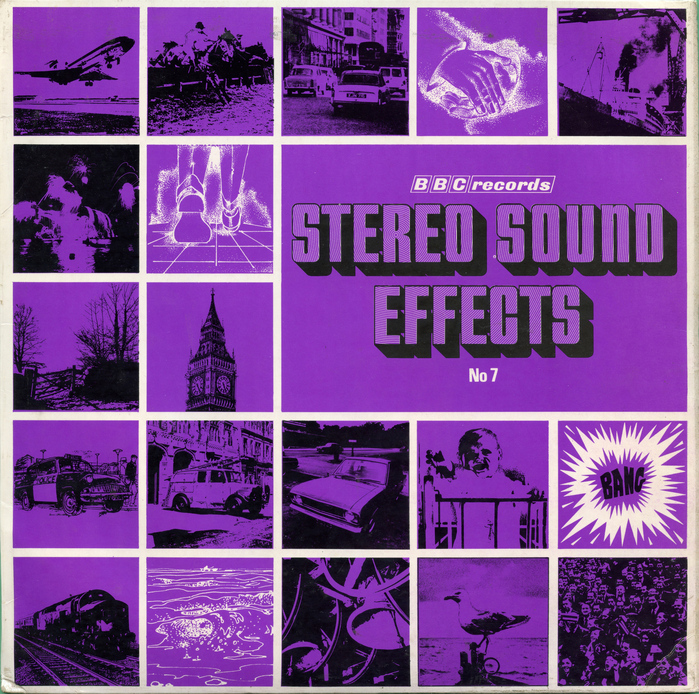
Source: www.flickr.com Leo Reynolds. License: All Rights Reserved.
Volume 7, the first to use Stark Raving for the title. “No 7” is added in Univers Bold Condensed.
Source: www.flickr.com Leo Reynolds. License: All Rights Reserved.
A compilation of all nine original album covers
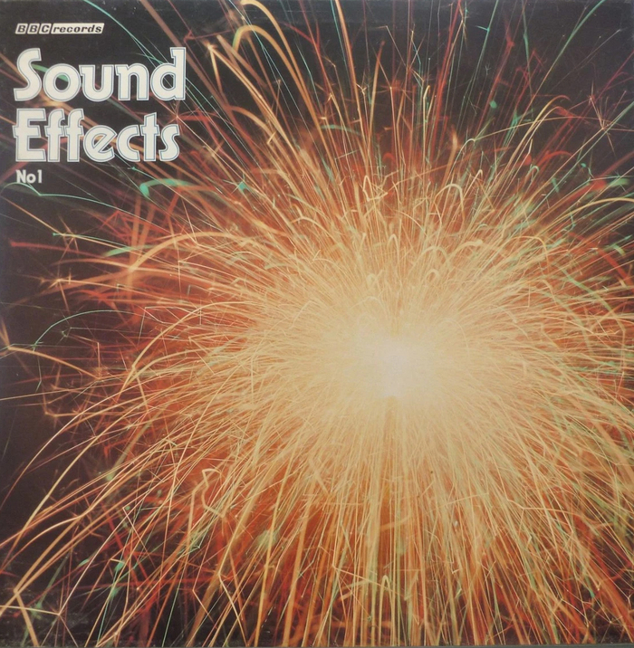
Source: www.ebay.co.uk License: All Rights Reserved.
The reissue of No. 1 features Warlock Inline.
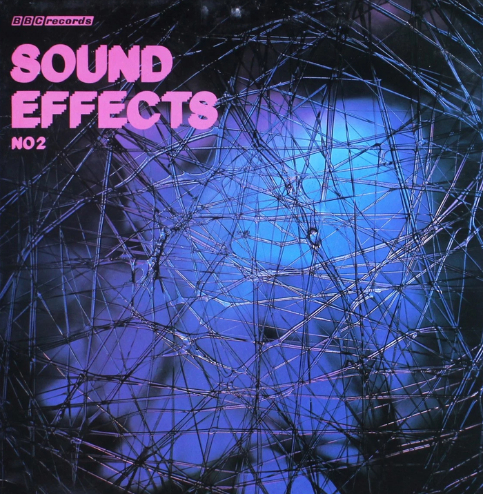
Source: www.ebay.co.uk License: All Rights Reserved.
Up & Down for the reissue of No. 2
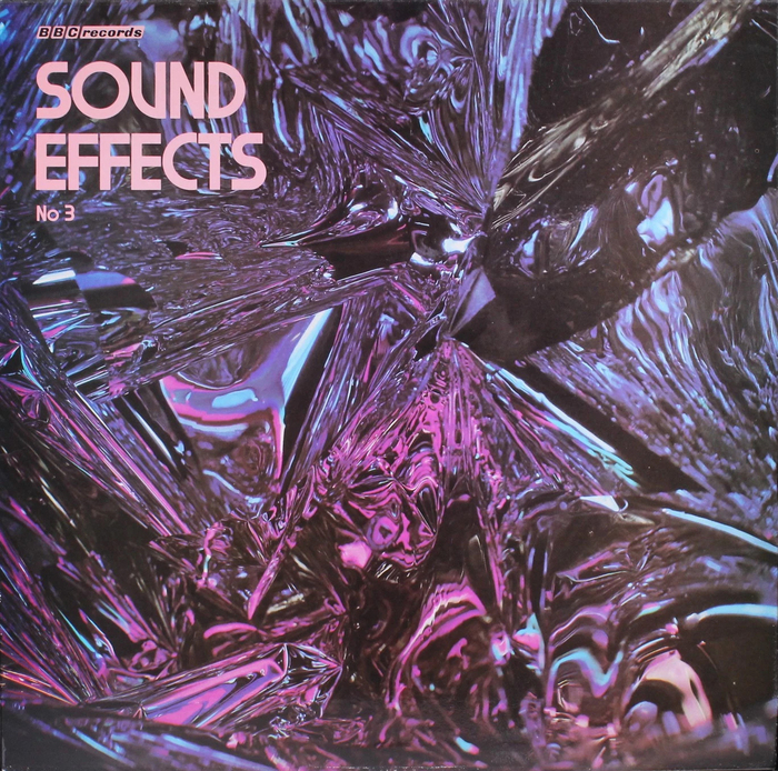
Source: www.ebay.co.uk License: All Rights Reserved.
The typeface chosen for the reissue of No. 3 is unknown. Perhaps Alpha?
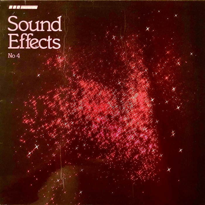
Source: oldmanvinylrecordsllc.com License: All Rights Reserved.
Italia for the reissue of No. 4
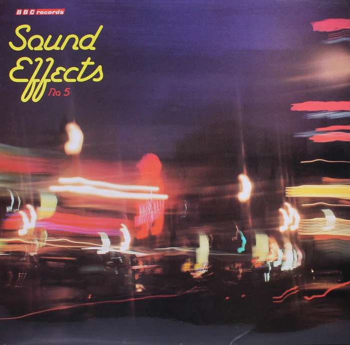
Source: www.ebay.co.uk License: All Rights Reserved.
The reissue of No. 5 uses Mickey Tick.
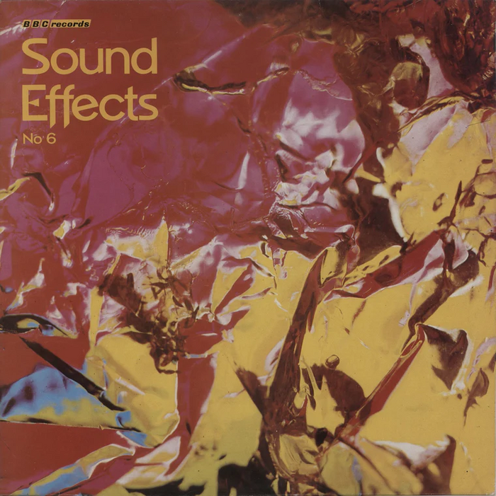
Source: uk.rarevinyl.com License: All Rights Reserved.
We get to see Napoli Serial for the reissue of No. 6.
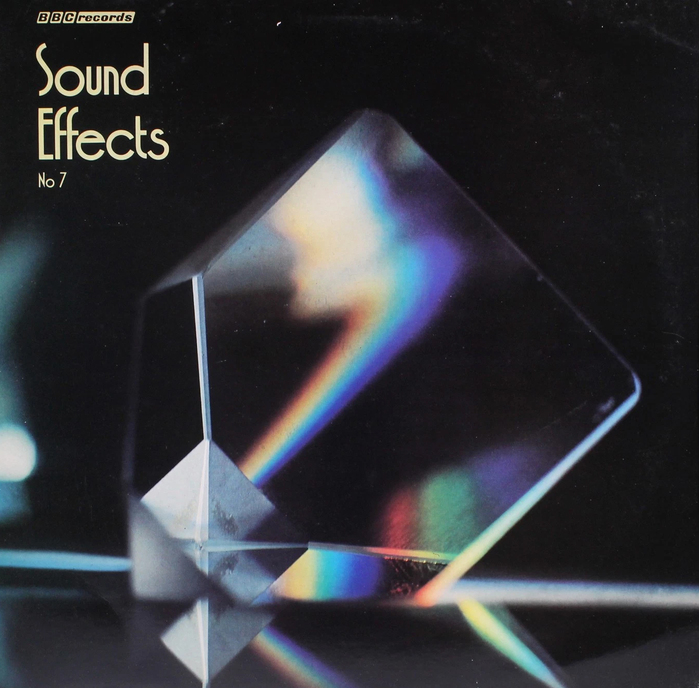
Source: www.ebay.co.uk License: All Rights Reserved.
Syncopation was chosen for the reissue of No. 7.
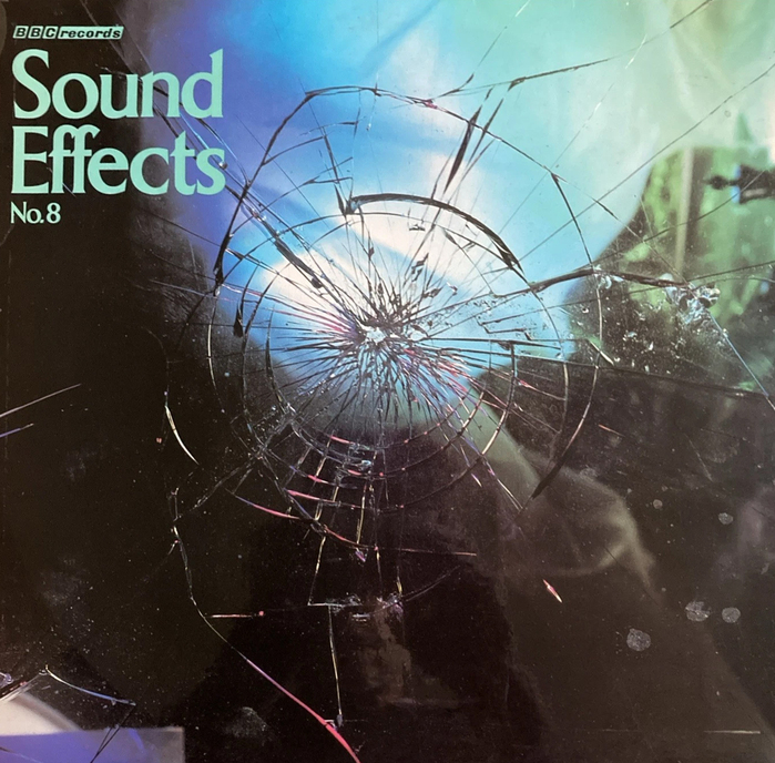
License: All Rights Reserved.
The new cover for No. 8 has broken glass and the elusive Brutus.
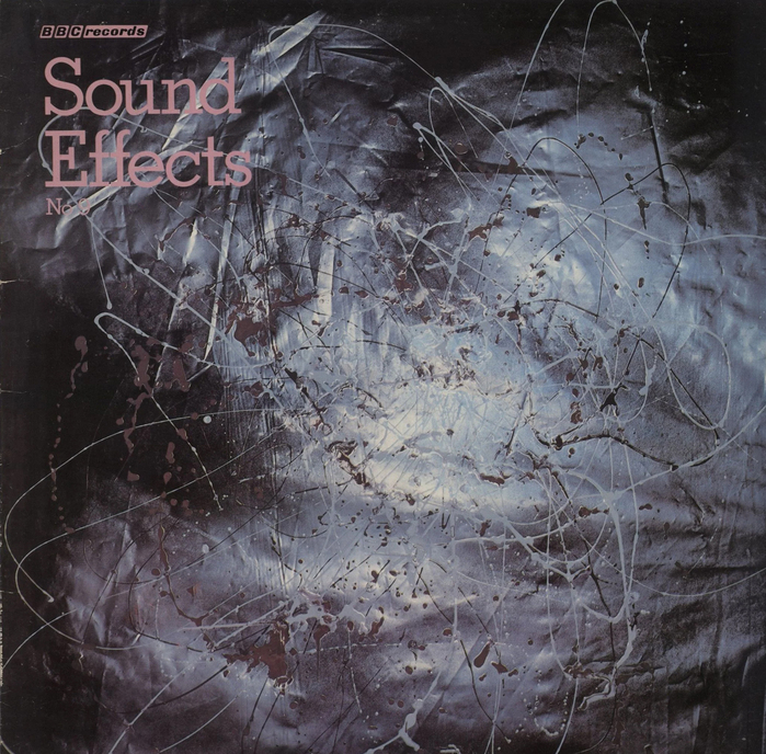
Source: uk.rarevinyl.com License: All Rights Reserved.
Lastly, the reissued No. 9 uses Stymie.
This post was originally published at Fonts In Use