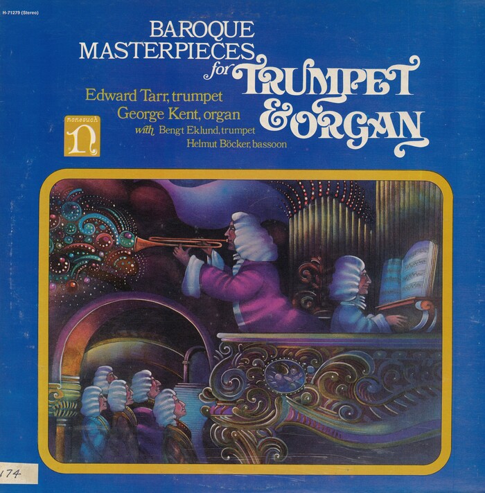
Baroque Masterpieces for Trumpet & Organ album art
Source: archive.org Internet Archive. License: All Rights Reserved.


I get that a Baroque-themed album asks for some extravagance. Still, using swash alternates for every single glyph is a bit too much, isn’t it? But hey, we get to see the ampersand of Davison Art Nouveau! Or at least one of it – there might have been some alternates. This record featuring Edward Tarr and George Kent with Bengt Eklund and Helmut Böcker was released by Nonesuch Records (H-71279) in 1973, two years before the swashy bold roman premiered as the Dune font.
Cover design by Jo Ann Gruber, with art by Gordon Kibee and art direction from Robert L. Heimall
Source: www.ebay.de tinkalib (edited). License: All Rights Reserved.
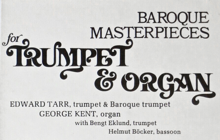
Detail from the back cover, with Davison Art Nouveau and all-caps Bookman, both with too tight spacing, as well as Melior.

Source: archive.org Internet Archive. License: All Rights Reserved.
The record company’s address in the bottom right corner is added in Palatino.
This post was originally published at Fonts In Use