Aretha Franklin – Take a Look album art
Published April 28, 2024
By FontsInUse
Contributed by Florian Hardwig
Source: www.ebay.com Haight Street Records. License: All Rights Reserved.


This post was originally published at Fonts In Use
Source: www.ebay.com Haight Street Records. License: All Rights Reserved.
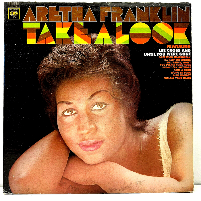
Baby Teeth in early use on Take a Look, a compilation album by Aretha Franklin, released in September 1967 by Columbia Records. The uncredited designer filled Milton Glaser’s graphic letterforms with a four-color stripe pattern of alternating rotation.
The song names are in Twentieth Century Ultrabold, which was carried by PLINC as Futura Ultra Bold. Interestingly, “Featuring” uses a different, almost identical typeface: judging from the wide A, the round G, and the thin middle bars in E and F, this is Airport Black.
This post was originally published at Fonts In Use
Read full story.
WRITTEN BY
FontsInUse
An independent archive of typography.
More from FontsInUse