Amor wordmark and campaign
Published February 22, 2024
By FontsInUse
Contributed by eschenlauer sinic
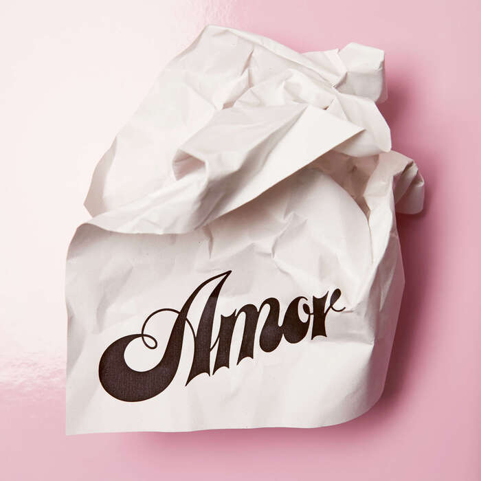
Source: eschenlauer-sinic.fr Photo: eschenlauer sinic. photo by Doriane Terraillon. License: All Rights Reserved.


Source: eschenlauer-sinic.fr License: All Rights Reserved.

Source: eschenlauer-sinic.fr License: All Rights Reserved.
Source: eschenlauer-sinic.fr License: All Rights Reserved.
Source: eschenlauer-sinic.fr License: All Rights Reserved.
Source: eschenlauer-sinic.fr License: All Rights Reserved.
Source: eschenlauer-sinic.fr License: All Rights Reserved.
Source: eschenlauer-sinic.fr License: All Rights Reserved.

Source: eschenlauer-sinic.fr License: All Rights Reserved.
This post was originally published at Fonts In Use
Source: eschenlauer-sinic.fr Photo: eschenlauer sinic. photo by Doriane Terraillon. License: All Rights Reserved.
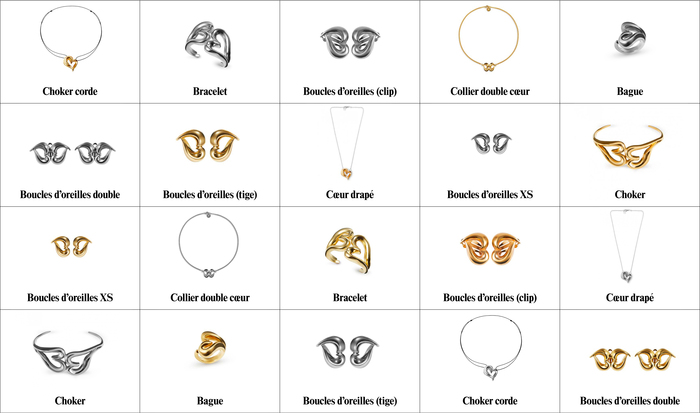
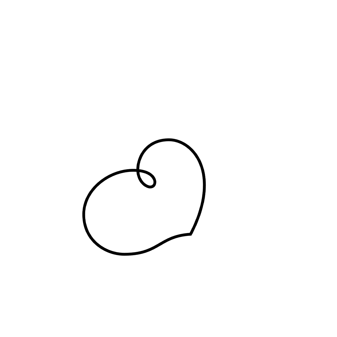
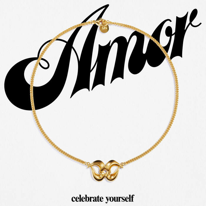
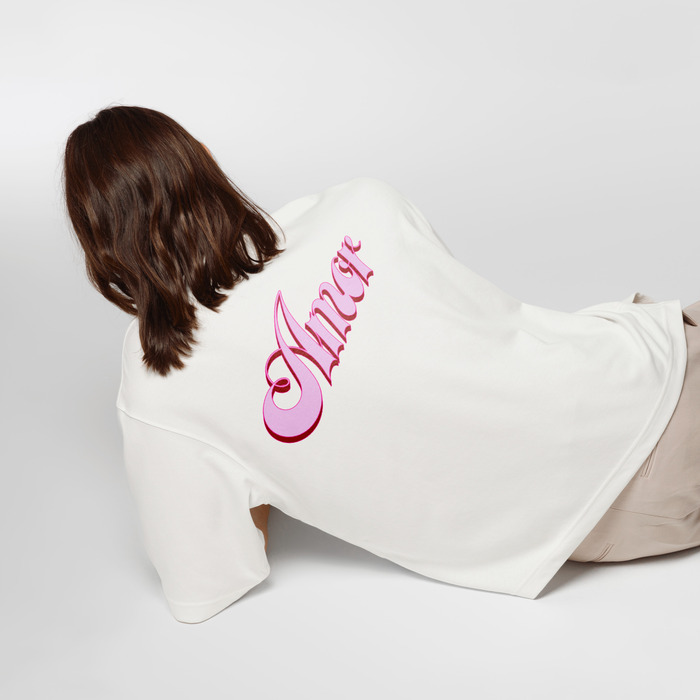
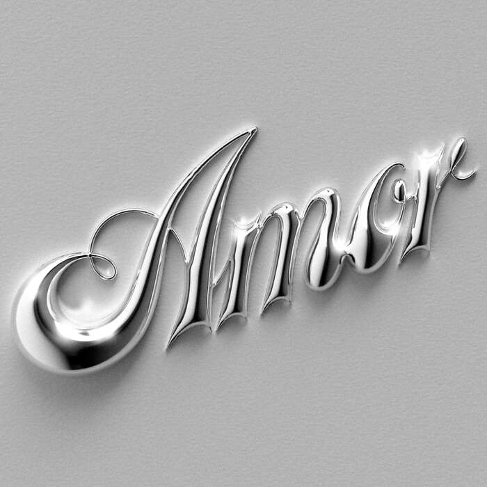
Amor is a jewelry collection signed by Parisian designer and sculptress Annelise Michelson. The wordmark, designed by eschenlauer sinic, authentically captures the essence of the collection: empowerment and self-love. In addition to the typeface taking up the curved shapes, both generous and sharp of the jewels in this collection, the letter A hides a heart shape in its drawing. A comprehensive digital campaign with a pop, light and joyful tone reflecting the spirit of the collection was designed alongside the wordmark.
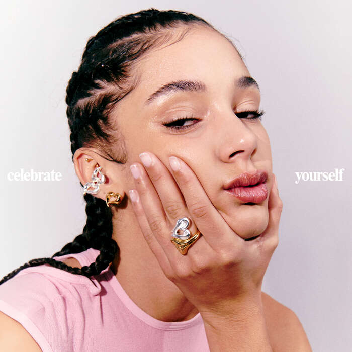
Graphic design by eschenlauer sinic. Campaign photographs by Teresa Ciocia, with styling by Nelly Carle and post production by Gloria Torquati.
Source: eschenlauer-sinic.fr License: All Rights Reserved.
Source: eschenlauer-sinic.fr License: All Rights Reserved.
Source: eschenlauer-sinic.fr License: All Rights Reserved.
Source: eschenlauer-sinic.fr License: All Rights Reserved.
Source: eschenlauer-sinic.fr License: All Rights Reserved.
Source: eschenlauer-sinic.fr License: All Rights Reserved.
Source: eschenlauer-sinic.fr License: All Rights Reserved.
Source: eschenlauer-sinic.fr License: All Rights Reserved.
This post was originally published at Fonts In Use
Read full story.
WRITTEN BY
FontsInUse
An independent archive of typography.
More from FontsInUse