Aeroméxico logo (1972–1981)


Source: archive.org Aeroméxico. License: All Rights Reserved.
An Aeroméxico DC-10-30 as shown on a postcard from 1975
Founded in 1934, Aerovías de México is the flag carrier of Mexico. In February 1972, the airline shortened its name to Aeroméxico and introduced a new color scheme – orange and black – as well as a new logo.
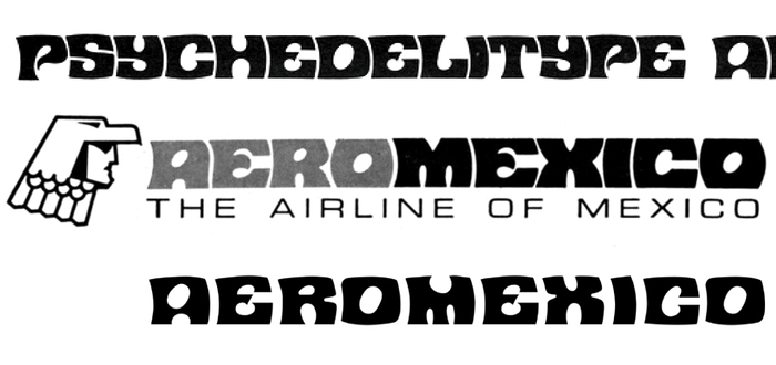
This logo is custom drawn, but clearly based on a typeface that originated as Davison Psyche. Drawn by Dave Davison for Photo-Lettering, it features blocky caps with punched-out oval counters and flat tops and bottoms. The bold wide letterforms are additionally warped to feature concave lefts and convex rights. Psyche was first shown in the Psychedelitypes booklet from 1968. Shortly after, Mecanorma produced a close copy for dry transfer lettering named Contest.
Composite: Florian Hardwig. License: All Rights Reserved.
The Aeroméxico logo (middle, from a 1975 print ad) compared to Davison Psyche (top, as shown in PLINC’s Psychedelitypes, 1968, scan courtesy of Alex Jay) and Mecanorma Contest (bottom, digital version by ITF)
The unknown logo designer modified all letterforms to various extents – for example, the bite out of the top of M isn’t as huge – but kept other characteristic details like the oblique counters. The O was made convex on both sides, which kind of works between R and M, but less so for the second one following C. The execution may leave something to be desired. Still, I find it rad that a national airline went with such a spacy lettering style. Only in the 1970s!
The wordmark is used together with the Eagle Knight emblem. Inspired by the ancient culture of Mexico, it is “a symbol of courage, leadership, and fearlessness”. [Aeroméxico] See more images on Vintage Airliners.
In 1981, the logo was replaced by a new one which, according to Sandy Campbell, was designed by Raúl Pérez-Duarte Viesca. LoGoLOOK has an overview of the evolution of the Aeroméxico logo.
Happy Cinco de Mayo to those who celebrate!
Source: www.ebay.com thejumpingfrog. License: All Rights Reserved.
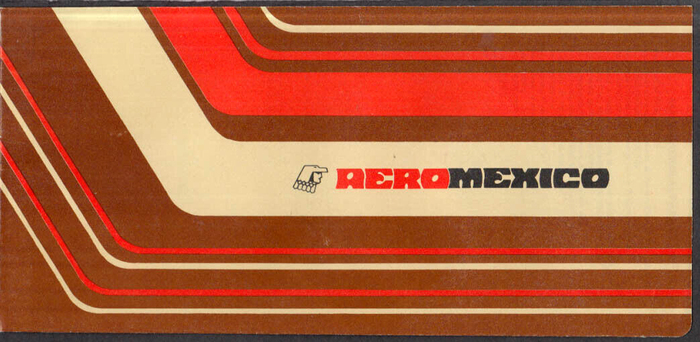
Ticket wrapper. The subline “The Airline of Mexico” is in Eurostile Extended, the text at the top in Helvetica.
Source: www.ebay.com caraninfo. License: All Rights Reserved.
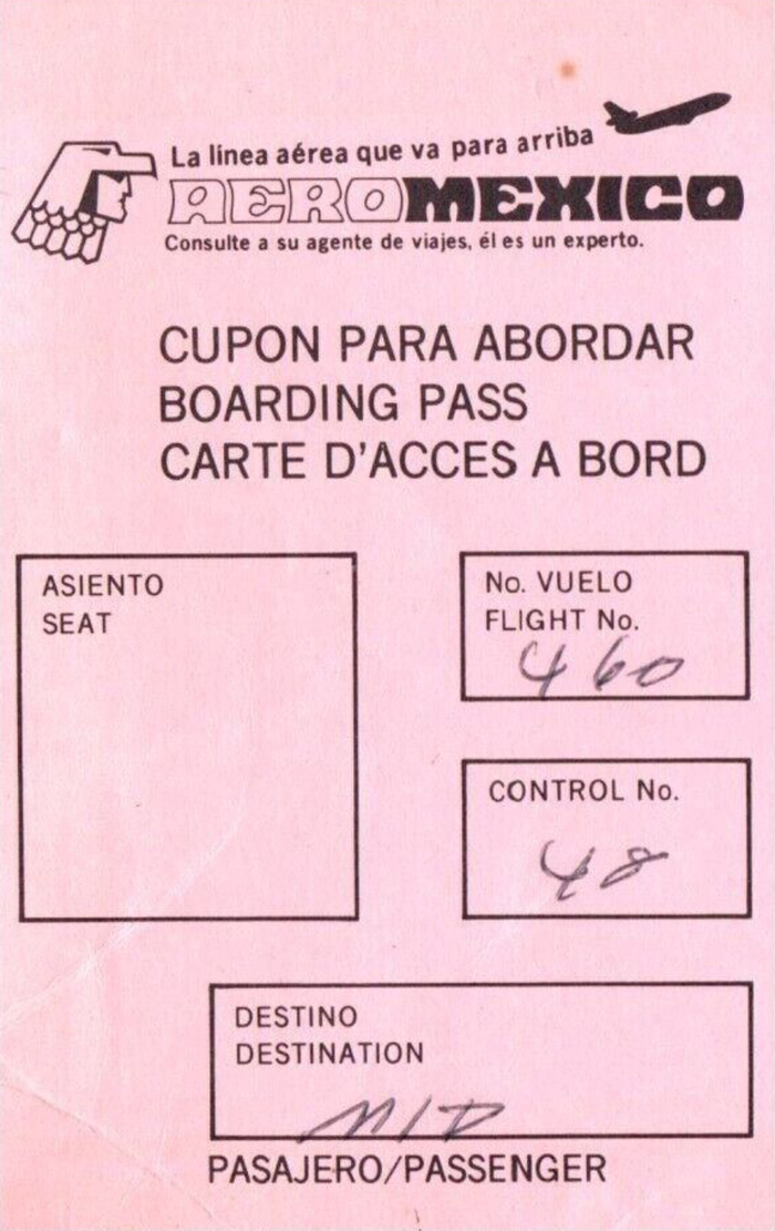
Boarding pass. The typeface used for the text is News Gothic.


Source: archive.org Aeroméxico. License: All Rights Reserved.
An Aeroméxico DC-9 as shown on a postcard from 1974

Source: archive.org Aeroméxico. License: All Rights Reserved.
An Aeroméxico DC-9 as shown on a 1970s postcard
This post was originally published at Fonts In Use