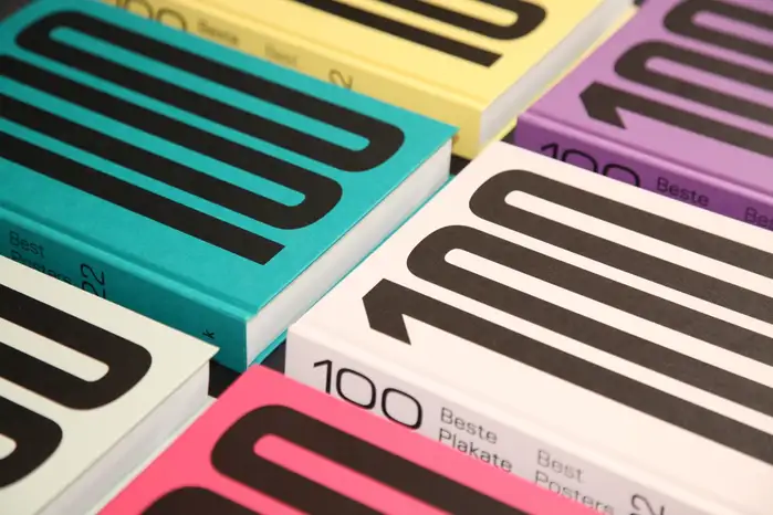
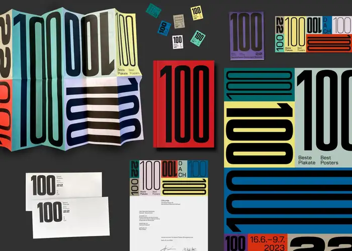
100 Beste Plakate 22
Source: lindhorst-emme-hinrichs.de License: All Rights Reserved.

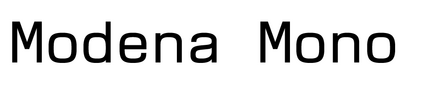
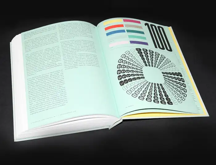
EK Modena is a variable superfamily designed by Erkin Karamemet that consists of a variety of styles in six widths and eight weights. The upright shapes are joined by corresponding italics as well as monospace versions. Numerous OpenType features enable a wide range of stylistic alternates. From compressed headline styles to proper widths for long copy and sturdy shapes, EK Modena’s diverse and colorful design space provides a visual bouquet of applications.
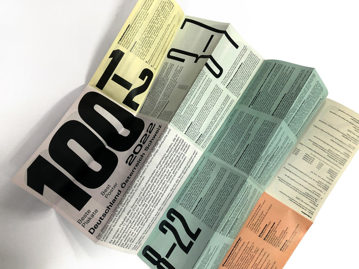
Studio Lindhorst-Emme+Hinrichs was invited to design the CI and the book for the 100 Beste Plakate / 100 Best Posters 22 competition:
The design itself is clear, simple, and uncluttered. The design’s starting point is a book bound in ten different coloured papers, with ever-changing coloured endpapers – the cover as well as the front and back endpapers are never the same colour. The variability of the colours also applies to the typographic design. EK Modena, with its many cuts and weights, was exactly the right choice.
The reduction to these two factors or means in the design was important to us: colour, initially determined by the materiality of the coloured paper, in combination with only one varied but clear typeface. With these means and an emphasis on the number “100,” which is what this is all about, we forged a concept to implement the design for the 100 best posters 2022.

Source: lindhorst-emme-hinrichs.de License: All Rights Reserved.
Source: lindhorst-emme-hinrichs.de License: All Rights Reserved.
Source: lindhorst-emme-hinrichs.de License: All Rights Reserved.
Source: lindhorst-emme-hinrichs.de License: All Rights Reserved.

Source: lindhorst-emme-hinrichs.de License: All Rights Reserved.
This post was originally published at Fonts In Use