¡ROMA! identity
Semibold. License: All Rights Reserved.


Semibold, the design practice of Scott Bolton, crafted a charming visual identity for ¡ROMA!.
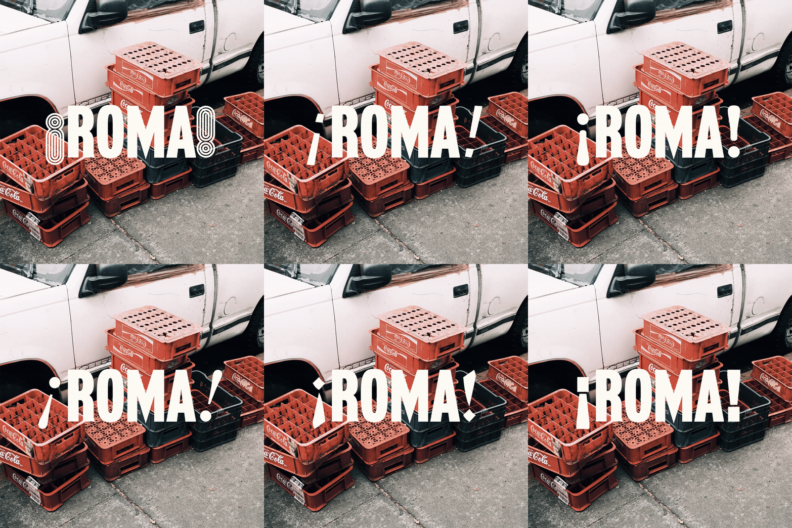
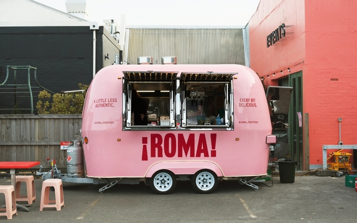
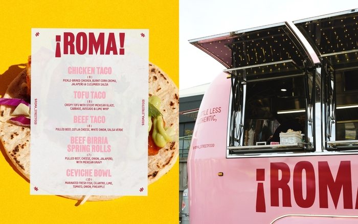
Named after the beating heart of Mexico City’s food scene, Roma specialises in Mexican-inspired street food, with some ‘less authentic’ takes on classics – like their famous beef birria spring rolls.
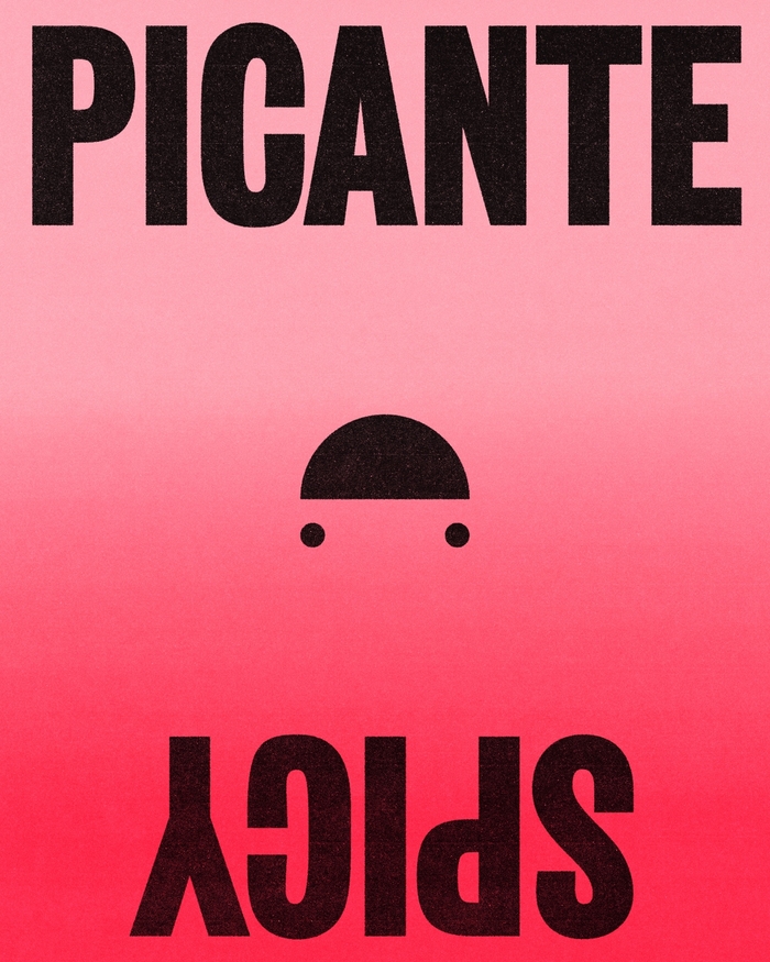
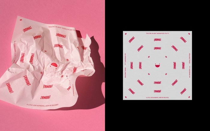
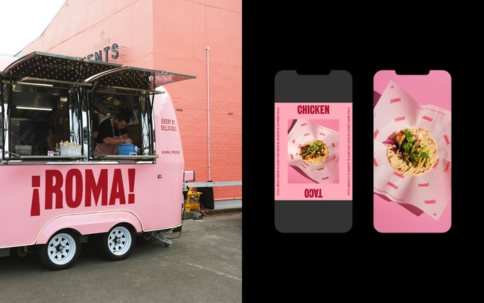
Roma’s logotype and visual language were positioned around the inverted exclamation marks used specifically in the Spanish language — personifying the wordmark as a street vendor shouting their offering. This system extends to posters, social media, and a small brand motif (that features at the centre of their greaseproof paper) — which can be seen as either a folded taco on wheels or a happy face depending on which way you look at it.
Farmacia by Nguyen Gobber is used for Roma’s wordmark and Carrie by Vocal Type for all further typography.
Semibold. License: All Rights Reserved.
Semibold. License: All Rights Reserved.
Semibold. License: All Rights Reserved.
Semibold. License: All Rights Reserved.
Semibold. License: All Rights Reserved.
This post was originally published at Fonts In Use