To Øl Milk Stout
Published February 11, 2025
By FontsInUse
Contributed by Tiffany Wardle
Source: www.instagram.com To Øl. License: All Rights Reserved.

Source: www.instagram.com To Øl. License: All Rights Reserved.
Source: www.instagram.com Kasper Ledet. License: All Rights Reserved.
This post was originally published at Fonts In Use
Source: www.instagram.com To Øl. License: All Rights Reserved.
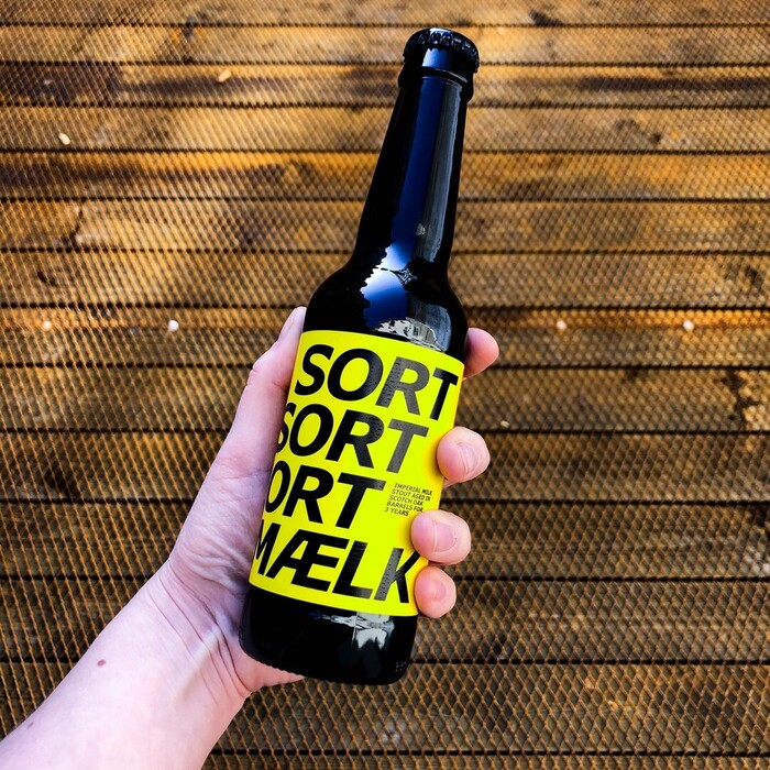
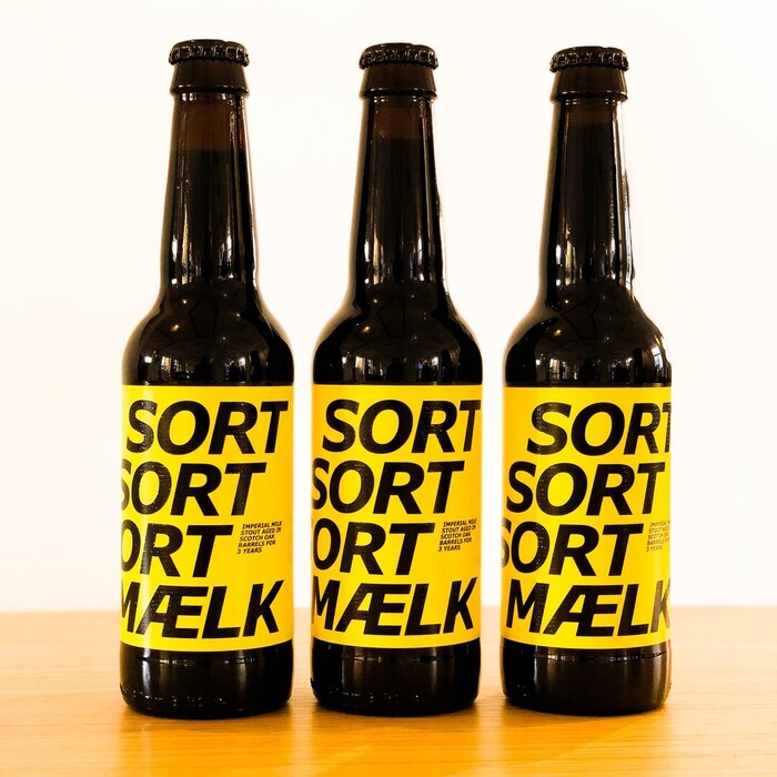
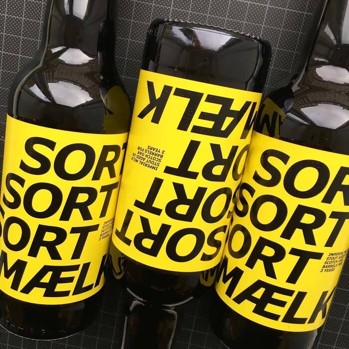
Carter & Cone’s Verdana makes for a strong and unexpected choice on these labels designed by Kasper Ledet for To Øl brewery. This high-quality milk stout “has enough bite for even the bravest,” and I thought that the choice of Verdana echoed the rest of their youthfully rebellious brand. Verdana was initially designed for on-screen use with clarity and versatility in mind. But I feel as if Verdana Pro, now with two widths, adaptability has been increased. I think this packaging proves the point—it’s ready for use beyond the screen.
Source: www.instagram.com To Øl. License: All Rights Reserved.
Source: www.instagram.com Kasper Ledet. License: All Rights Reserved.
This post was originally published at Fonts In Use
Read full story.
WRITTEN BY
FontsInUse
An independent archive of typography.